
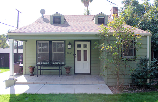
Introducing our Pasadena Cottage!
Happy 2015 all! I hope you all had a wonderful holiday season full of family, friends, and love. :)
Yippee! It’s cottage time! As I mentioned in the last post, discovering, visiting, applying, and getting the Pasadena Cottage all happened within 24 hours. I knew great places went quickly in this city, so I had to have faith that when it was meant to be, we would be the lucky recipients of a 24-hour whirlwind. And indeed that happened… we blinked and then suddenly had a new home!
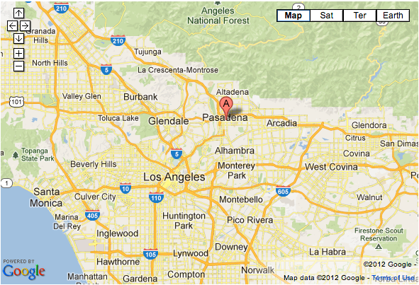
Here is a bit about our lovely new cottage: The cottage is located in the gorgeous Mid Central neighborhood of Pasadena, making it very close (1-1.5 miles) to Old Town Pasadena and walk-able to public transportation to get us there (or anywhere!). As you can see (for those unfamiliar with the Los Angeles area), we simply moved directly east about 15 minutes from where we were before in lower Burbank.
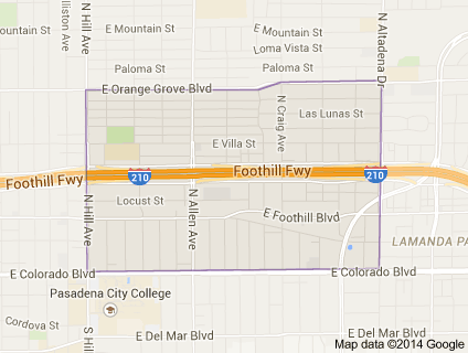
Mid Central Pasadena
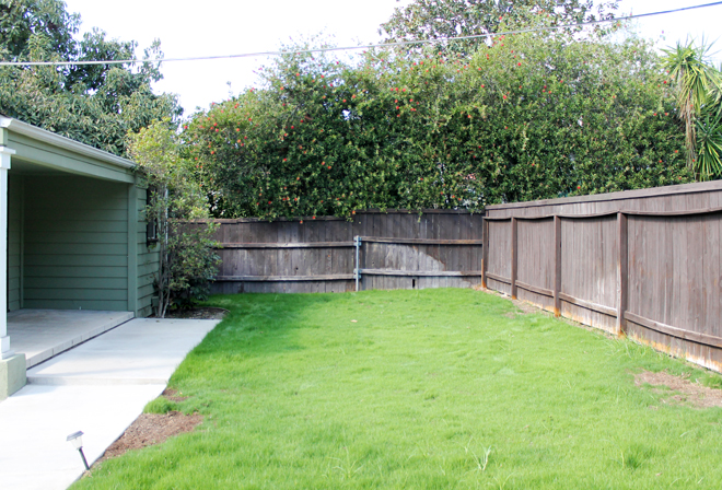
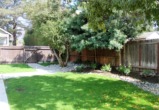
It is a charming craftsman rear house that was built in 1922. It’s about 900 square feet (double the size of our Burbank apartment) and has 2 bedrooms, 1 bath (with a tub!), a fireplace, new laundry machines (eeee!), a dishwasher, central air/heat, a driveway with up to 4-5 parking spaces (plus a basketball hoop!), and best of all, a HUGE private fenced yard. We could probably fit about 6 of our old Burbank yard inside of our new one! To top it all off, the grass is brand new (they replaced it in October and is now getting very lush) and is taken care of by automatic sprinklers and a gardener that comes once a week! Woooo! No more dead yard! We are going to be so spoiled!
On top of it all, they had no issue with us putting in a dog door for the furry king of the house, so I used my DIY skills the weekend we moved in to install a SureFlap electronic pet door. It is so cool! We can set it to lock (i.e. pets can come in only) for the few-hour window the gardeners come, and then automatically unlock when they have left. We can program it to do all kinds of cool things that will give us flexibility with Bo when we are at work!
We were also lucky enough to be able to pick our paint colors and have the place painted before we arrived! We chose:

(Existing white trim and cabinets)
Behr Light Mint 480C-1: Kitchen, Bathroom
Behr Amazon Stone 790F-5: Master Bedroom
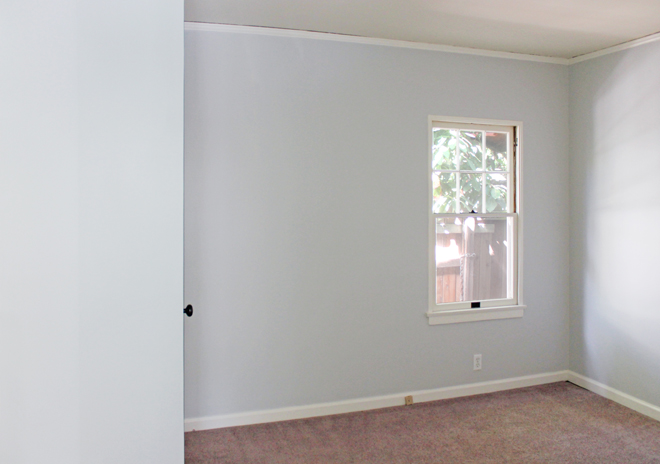
Behr Sterling 780E-3: Living Room, Hall, Guest Room, Office Nook
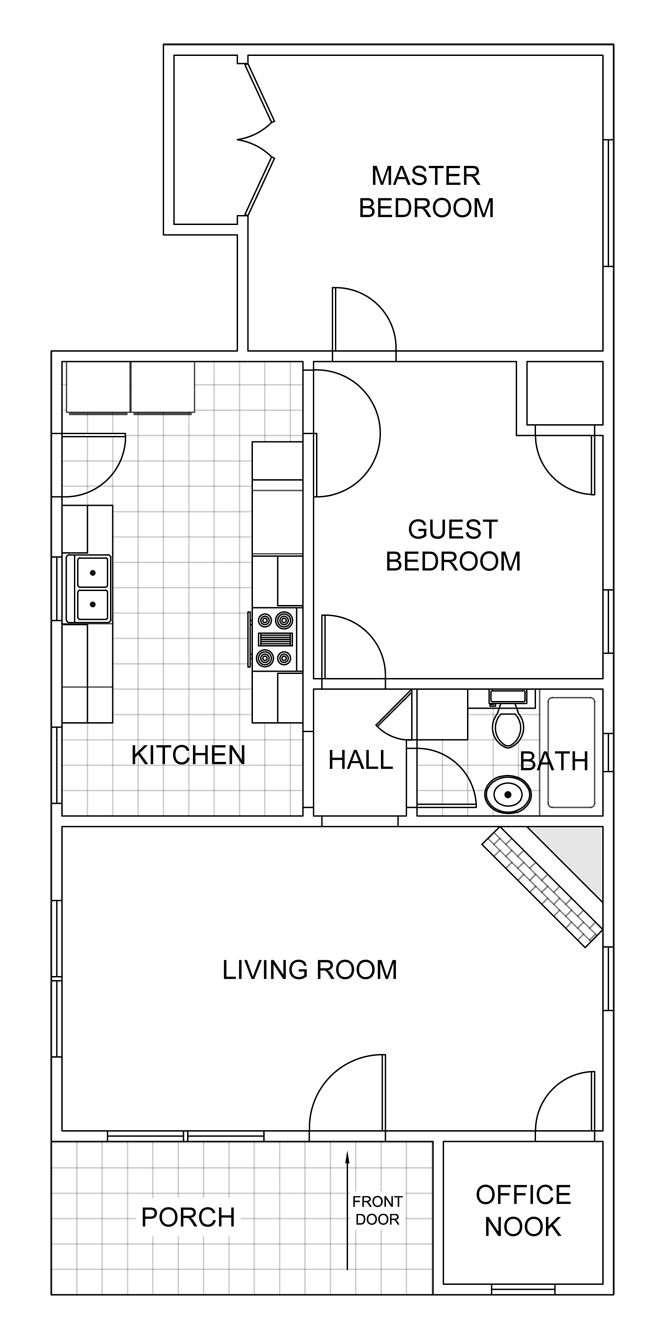
One last piece of business before pictures… a floor plan to give everything a bit of context (click on it to enlarge)!
So, the moment you have all been waiting for… here are a few “before” photos I took before the movers arrived with just our freshly-painted walls.

Welcome to the Pasadena Cottage!
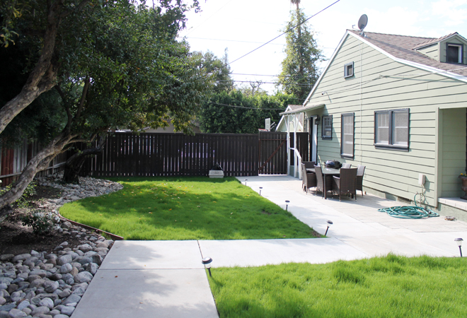
View of the side yard from the front gate. Our driveway is behind that fence through the back gate.
View of the front yard.
View of the front gate (plus the front house) and sidewalk from the back gate.
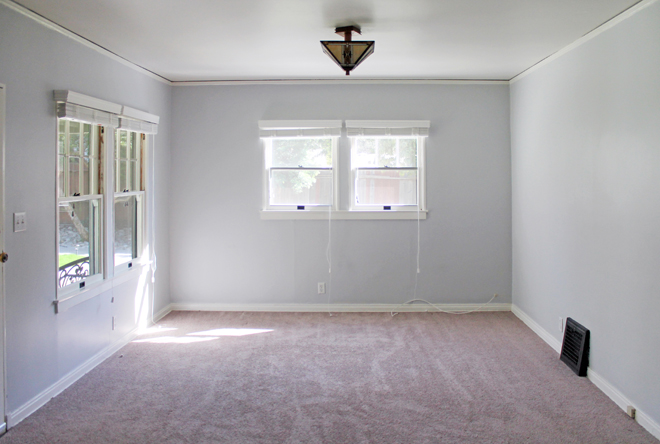
Once in the front door, looking left into the living room.
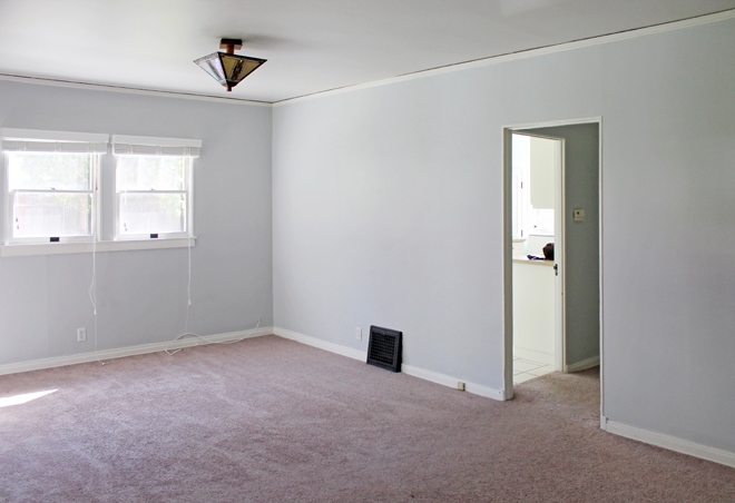
Standing at the front door looking slightly left.
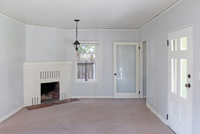
Right side of the living room.
Office nook on the right side of the living room.
Tiny office nook!
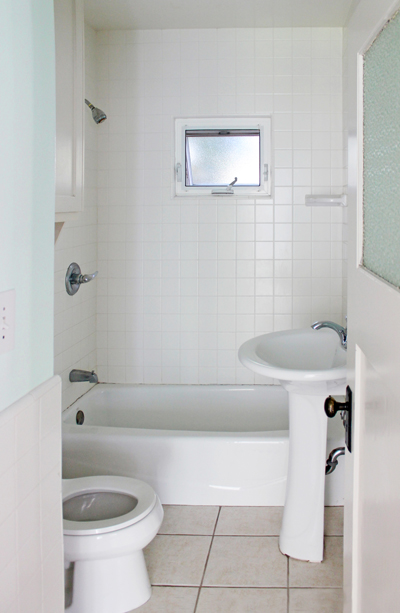
Bathroom off of the hall.
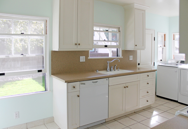
Entering the kitchen from the hall.
Opposite side of the kitchen!
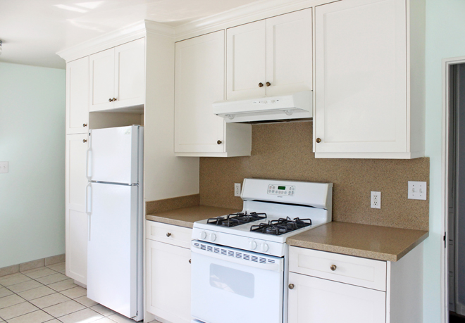
The front wall of the kitchen and door to the hall.
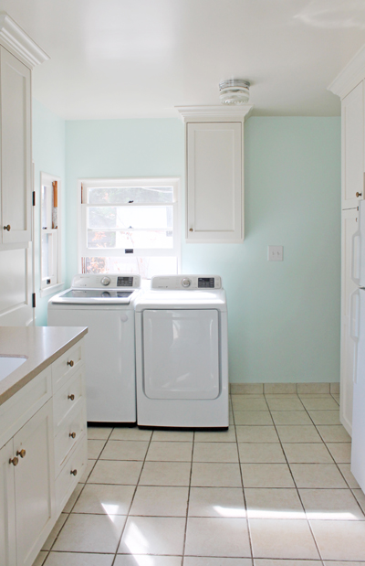
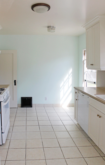
At the back of the kitchen is the laundry area and back door.
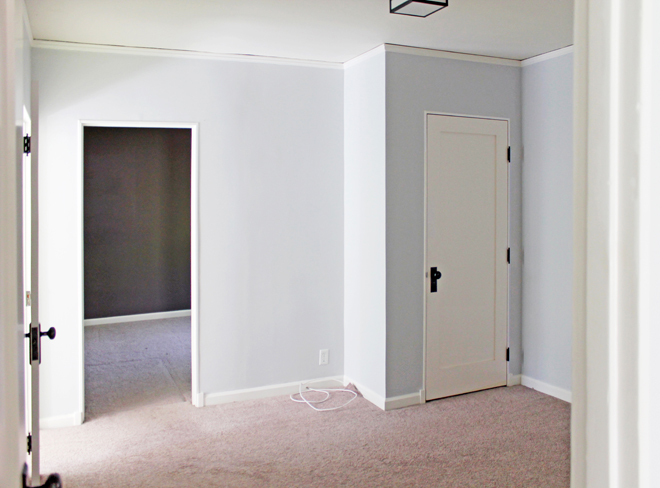
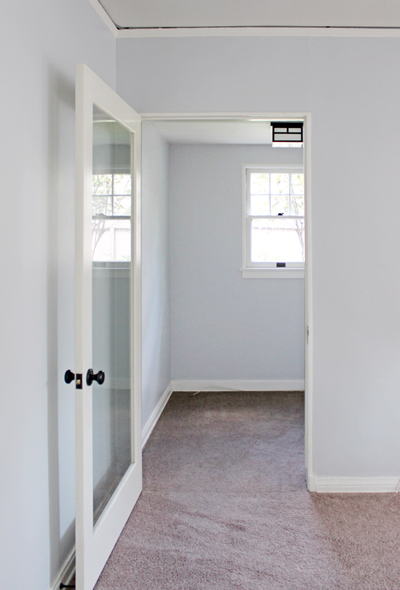
Guest bedroom from the hall.
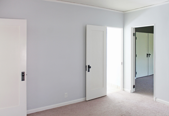
Guest bedroom facing hall entrance on left and kitchen entrance on right. Entrance to the master bedroom as well!
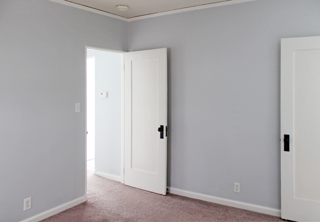
Guest bedroom facing entrance from hall.
Guest Bedroom from kitchen entrance facing window.
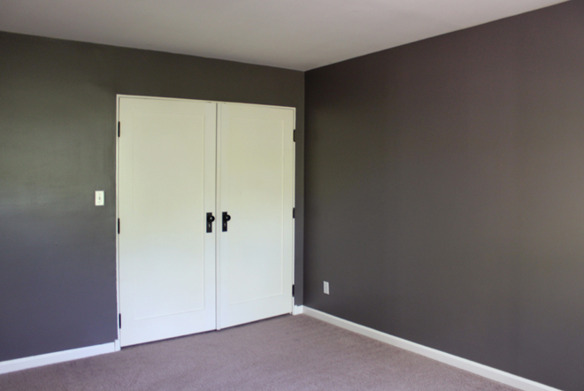
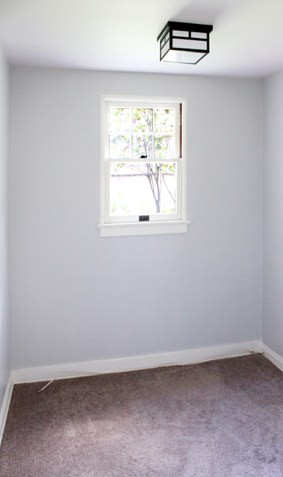
Master bedroom facing closet.
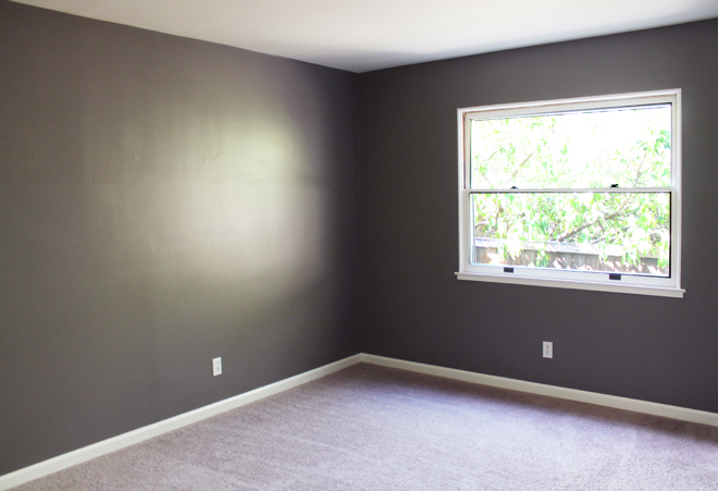
Master bedroom facing window.
The only downside so far (other than actually having to move) is the longer commute. While we are still trying to master the best route, we went from having a 30-45 minute commute to having about a 45-60 minute commute each way. However, those extra few minutes are worth it for such a fantastic upgrade in our home and yard. Plus, I have been killing the commute by listening to audio books… recommendations needed!
We will have photos of the furnished place in progress shortly, but in the meantime, check out our Pasadena Cottage pinterest board to see the latest ideas for our new place, and follow me on Instagram for some sneak peeks!


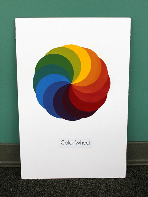
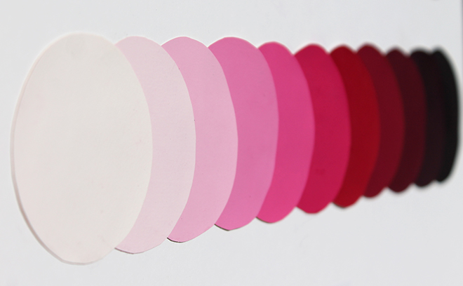
 The next assignment was to understand the different values of a hue. In order to do this, we were asked to make one grey scale using only black and white, followed by one color value scale using only one color (I chose magenta) with either black or white added in. For those who are curious, pure magenta is located in position number seven.
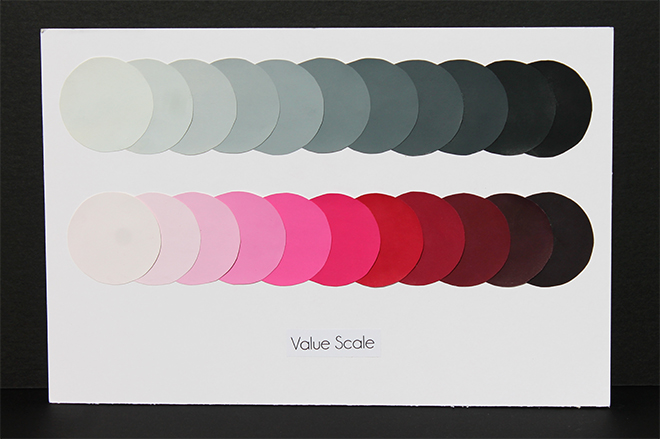 The professor emphasized that the grey scale and the color value scale should really match each other in intensity/value and that, if you took a black and white photo of your project, the scales should look almost the same in an ideal world. So for experiment’s sake, I desaturated the picture above and I think my scales are pretty darn close! *Pats herself on the back*
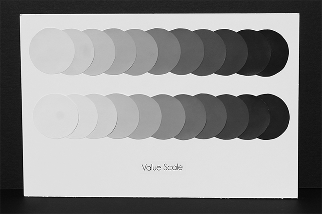
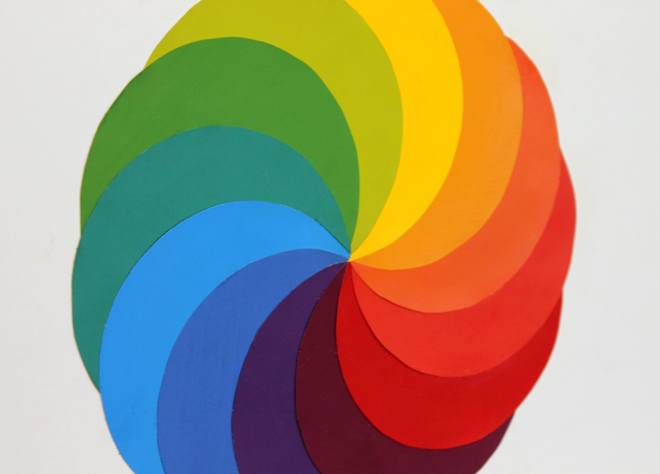
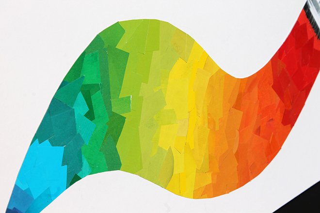
 The third assignment was a fun one, but I destroyed about 43 magazines to get it right. We were supposed to cut little swatches of the color wheel hues and make a collage that demonstrated the idea of warm to cold colors. You didn’t have to use every hue (I didn’t use any violet hues), but it had to seamlessly flow from one color to the next. The hardest part was finding color-accurate, solid, intense colors in magazines… so many of them were shades or tints of the color wheel colors or had a pattern/texture to them.
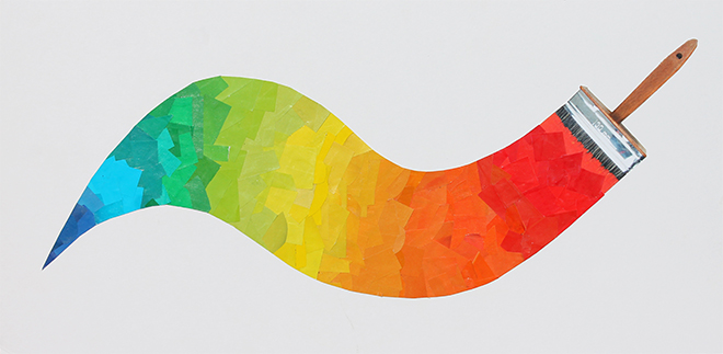
 Back to the Gouache paint! The next assignment was the toughest for me because it seemed to defy my rational thought. We had to create this design that showed how to create neutrals by mixing complementary colors. We started by making accurate swatches of all primary and secondary colors. Then we took compliments and tried to get a color that looked “neutral.” Ummmm…. what? It didn’t make sense until we started making the three little squares off to each side, which is the middle “neutral” color with only white added to it to make a nice grey. AHA! I get it… we were trying to make similar greys in the end. It was a TON of trial and error because I would add white and the grey would look TOTALLY different than I expected. Yellow/violet was the most difficult for me, followed by red/green then blue/orange. Once I had my middle neutral and its corresponding grey, I made the other two in-between neutrals by adding just a smidgen of the compliment to a color. All difficulty aside, I was very happy (as was the professor) with the accuracy of the result.
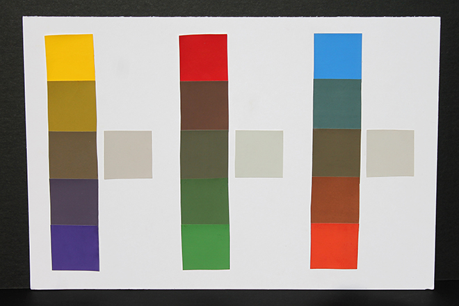 The next assignment was a lot of fun! We had to used colored paper to cut out shapes to demonstrate various designs using the elements and principles of design.
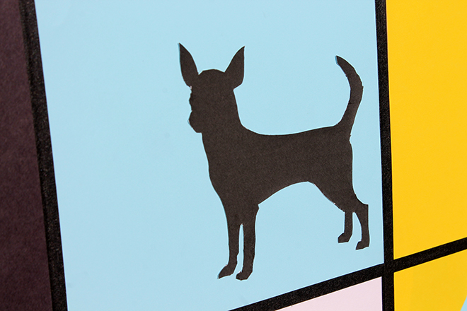
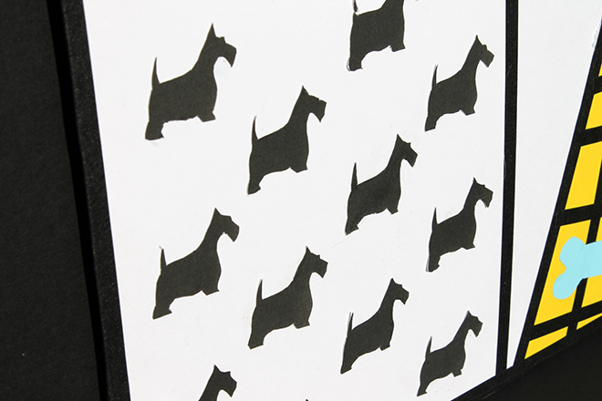
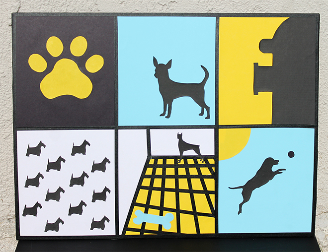
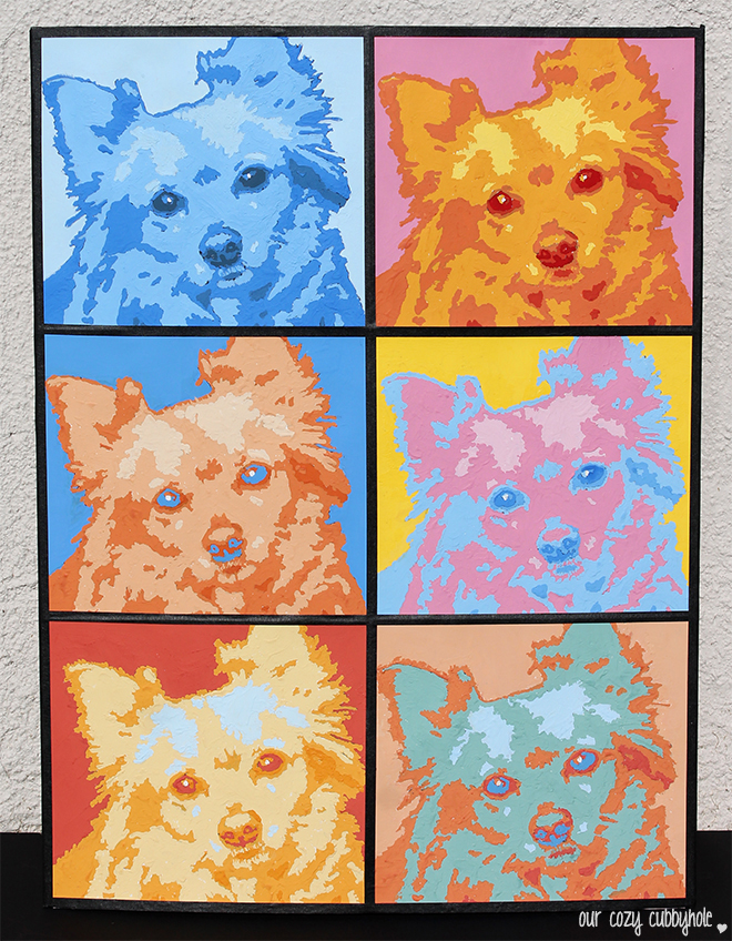
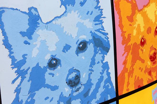
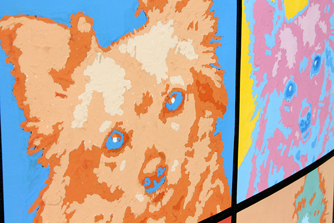
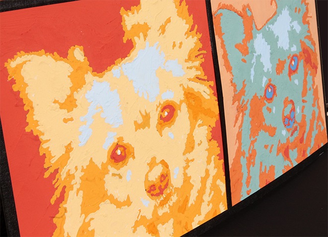
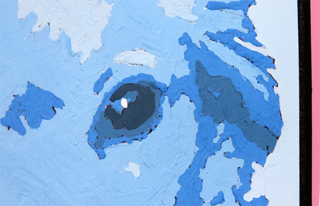 I had a lot of fun with the rough texture on this one! We spent the entire quarter trying to make our swatches perfectly smooth so I intentionally went for a rough, hand-painted look. We love it so much that I think we are going to get it framed for the house! :)