

FIDM Winter 2013 Quarter Schoolwork Update: Color
G ood morning (well, afternoon to you east-coasters) everyone! I was very flattered by the response to yesterday’s drafting schoolwork update! I am back again this morning to share another class and I think you will like these… they are a lot of fun!
One class I took this quarter was called Color and Design Theory. It was mainly a study on color and how it applies to the world of design. We used Gouache paint in this class, which is actually quite difficult to work with since it is water-soluble like watercolors. Most projects were made by painting clean, smooth (harder than it looks!) swatches of hand-mixed color onto painter’s paper. Then I cut the desired shape out of the swatch and mounted it on the artboard with rubber cement.
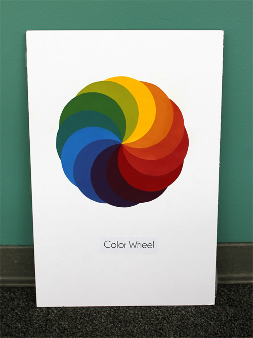
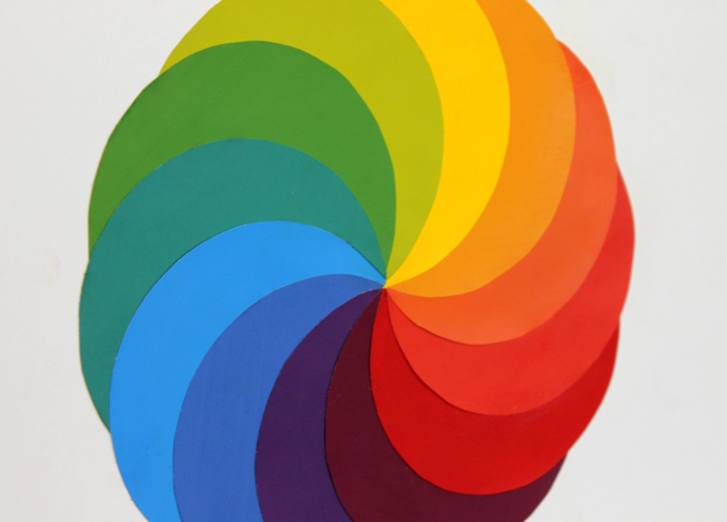
So, without further ado, my work! I know I already shared the first assignment but I feel like it is easier to see the progression if I show it again in sequence. The first project was to learn how to properly mix and create specific colors by creating a color wheel. Contrary to my original thought, you don’t get “green” by mixing half blue and half yellow. Each paint has it’s own characteristics (i.e. blue is actually the weakest paint and requires a little extra, yellow is SUPER vibrant and the color stains everything, red is ridiculously concentrated and a little goes a LONG way, etc.) so it was a big experiment working with these three colors (plus magenta for the the three violet hues because it is warmer than red) to produce 12 accurate hues for the wheel.
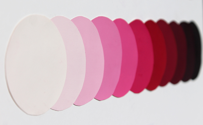
 The next assignment was to understand the different values of a hue. In order to do this, we were asked to make one grey scale using only black and white, followed by one color value scale using only one color (I chose magenta) with either black or white added in. For those who are curious, pure magenta is located in position number seven.
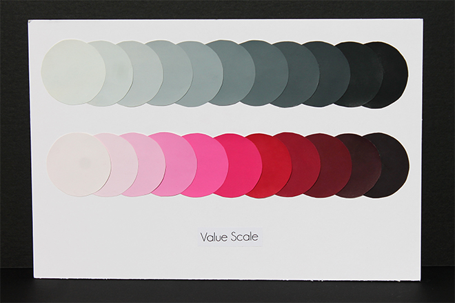 The professor emphasized that the grey scale and the color value scale should really match each other in intensity/value and that, if you took a black and white photo of your project, the scales should look almost the same in an ideal world. So for experiment’s sake, I desaturated the picture above and I think my scales are pretty darn close! *Pats herself on the back*
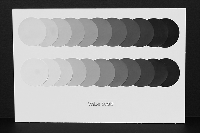
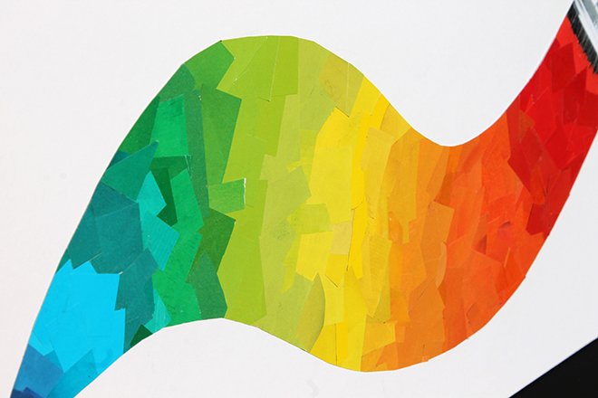
 The third assignment was a fun one, but I destroyed about 43 magazines to get it right. We were supposed to cut little swatches of the color wheel hues and make a collage that demonstrated the idea of warm to cold colors. You didn’t have to use every hue (I didn’t use any violet hues), but it had to seamlessly flow from one color to the next. The hardest part was finding color-accurate, solid, intense colors in magazines… so many of them were shades or tints of the color wheel colors or had a pattern/texture to them.
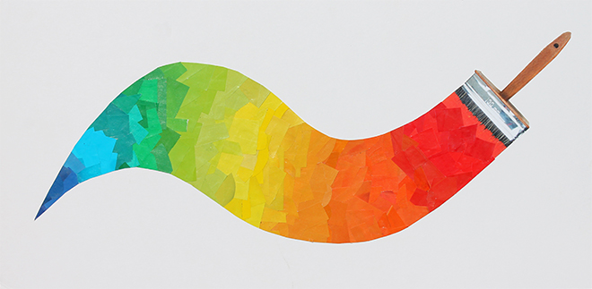
 Back to the Gouache paint! The next assignment was the toughest for me because it seemed to defy my rational thought. We had to create this design that showed how to create neutrals by mixing complementary colors. We started by making accurate swatches of all primary and secondary colors. Then we took compliments and tried to get a color that looked “neutral.” Ummmm…. what? It didn’t make sense until we started making the three little squares off to each side, which is the middle “neutral” color with only white added to it to make a nice grey. AHA! I get it… we were trying to make similar greys in the end. It was a TON of trial and error because I would add white and the grey would look TOTALLY different than I expected. Yellow/violet was the most difficult for me, followed by red/green then blue/orange. Once I had my middle neutral and its corresponding grey, I made the other two in-between neutrals by adding just a smidgen of the compliment to a color. All difficulty aside, I was very happy (as was the professor) with the accuracy of the result.
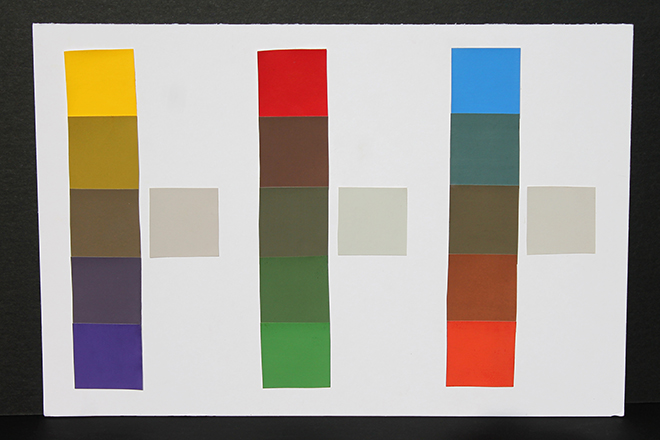 The next assignment was a lot of fun! We had to used colored paper to cut out shapes to demonstrate various designs using the elements and principles of design.
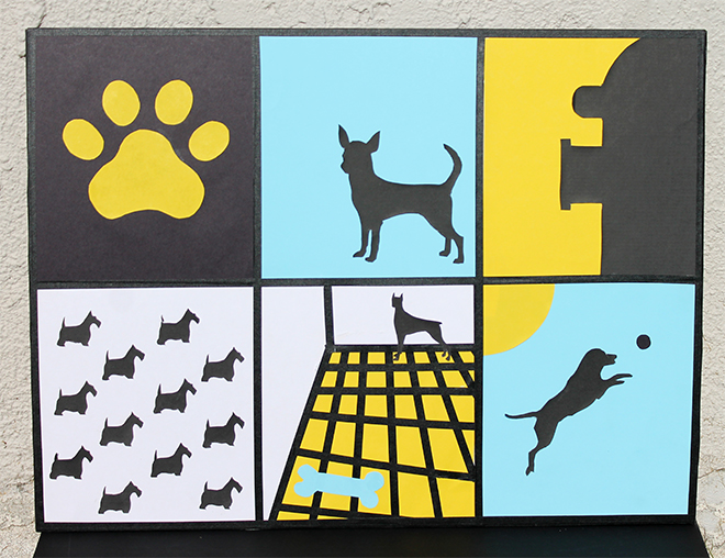
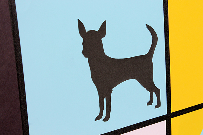
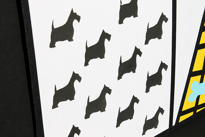
Box 1 – A symmetrical, balanced design with a central focal point
Box2 – An asymmetrical but balanced design with an off-center focal point
Box 3 – Positive/negative design that creates an interchange of form (i.e. your eye jumps back and forth between the two colors/spaces)
Box 4 – Pattern using repition
Box 5 – Illusion of three dimensional space
Box 6 – Illusion of motion
And finally, the one many of my Twitter followers have been waiting for (I posted a sneak peak!), my final project! The idea was to use the Gouache paint to demonstrate various color schemes in the boxes. When the professor described the project, I immediately thought of Andy Warhol and decided to create a design inspired by his art. Naturally, I chose Bo’s face as my subject (HOW COULD I NOT?! HE’S SO CUUUUUTE!). Contrary to the other projects, this one was hand painted straight onto the painting paper in one shot (no cutouts on this one).
Before you praise me for being a crazy artist, I have to admit I helped myself out by creating a template on the computer that basically broke up the photo of Bo into 5 color zones. Then I managed to create only outlines of those areas, essentially making myself a paint-by-number template of sorts. So it wasn’t all freehand, since I wanted the paintings to look identical with the exception of the colors (like good old Andy). Maybe I will do a DIY tutorial of this one later on if anyone is interested.
Okay, so the color schemes are as follows (in this order): monochromatic (using only one color from the color wheel: blue), analogous (three-five hues next to each other on the color wheel: red, red-orange, orange, yellow-orange, yellow), complimentary (blue, orange), triad (three hues equally spaced on the color wheel: blue, red, yellow), split complimentary (a color and the two colors on either side of its compliment: blue, yellow-orange, red-orange), and double complimentary (two hues next to each other and their compliments: blue, blue-green, orange, red-orange). You could also use black and white in each scheme to create different values of each color but I only used white.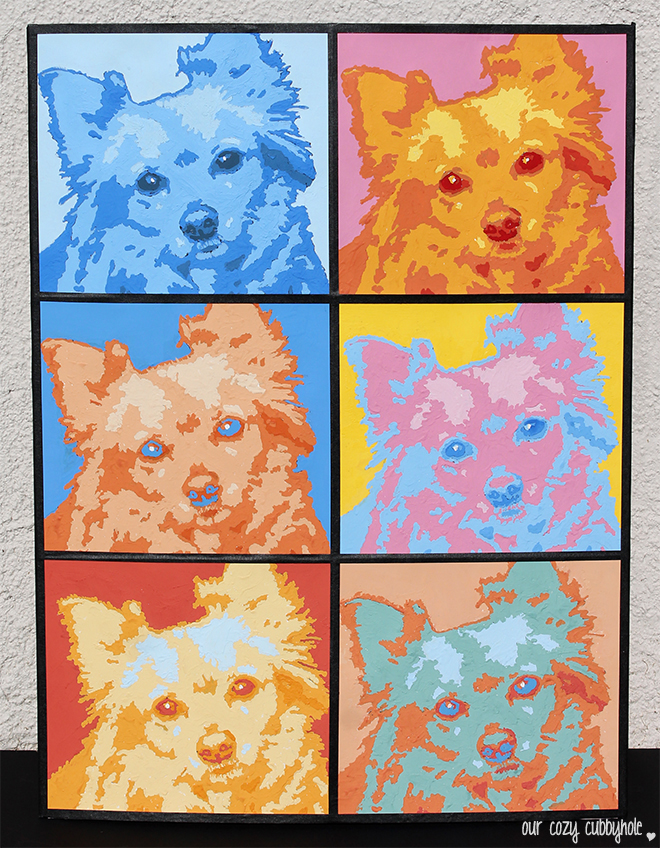
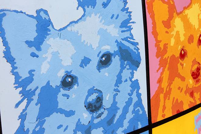
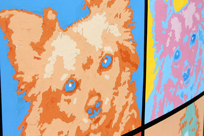
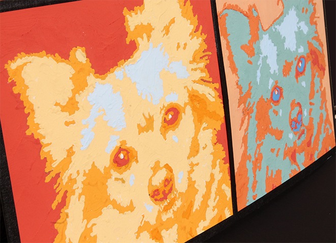
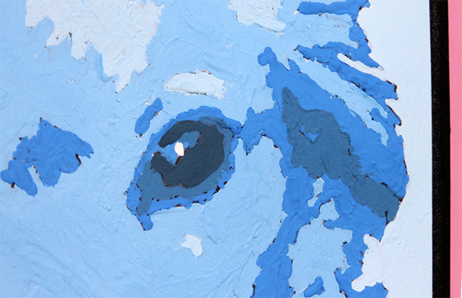 I had a lot of fun with the rough texture on this one! We spent the entire quarter trying to make our swatches perfectly smooth so I intentionally went for a rough, hand-painted look. We love it so much that I think we are going to get it framed for the house! :)
Which is your favorite Bo? Let me know in the comments below!
There you have it: round two of my schoolwork update! I’ll be back again tomorrow with more. And as always, feel free to leave any questions below!


24 Responses to "FIDM Winter 2013 Quarter Schoolwork Update: Color"
Add CommentPingback: FIDM Winter 2013 Quarter Schoolwork Update: Design Process | Our Cozy Cubbyhole
Pingback: FIDM Winter 2013 Quarter Schoolwork Update: Sketching | Our Cozy Cubbyhole