FIDM Winter 2013 Quarter Schoolwork Update: Sketching
Happy Friday! I know most of you East-Coasters are already unplugged and enjoying the weekend so perhaps a “Happy Monday!” is more appropriate for you!
For the final (tiny, I promise!) installment of Erika’s school updates (the previous ones are here, here, here, and here), I gathered a few pieces of work from my sketch book. Disclaimer: drawing is one thing I really struggle with… I have historically been a terrible drawer. I swear, a few months ago I could not have sketched my way out of a paper bag. However, I really put in a lot of effort and made some serious improvements from where I was in January. Still, you won’t be blown away by this post haha! I debated not even posting about this class but I decided to be brave and say screw it! I want a true record of my progress around here! ;)
Our sketching class was mainly made up of exercises to help us understand drawing in perspective, shading with pencils and markers, loosening up our drawing techniques, and improving our sketching speed (since the most useful way to quickly communicate your ideas to a client in a meeting is to draw them!). Therefore, most of the pages in my sketchbook are made up of various short, timed sketches, along with lots of quick doodles to warm up my drawing hand. I really didn’t do any “finished” drawings besides the final one (which was also partially timed so I wouldn’t work on it forever!) so I am just going to give you a quick overview of my experience.
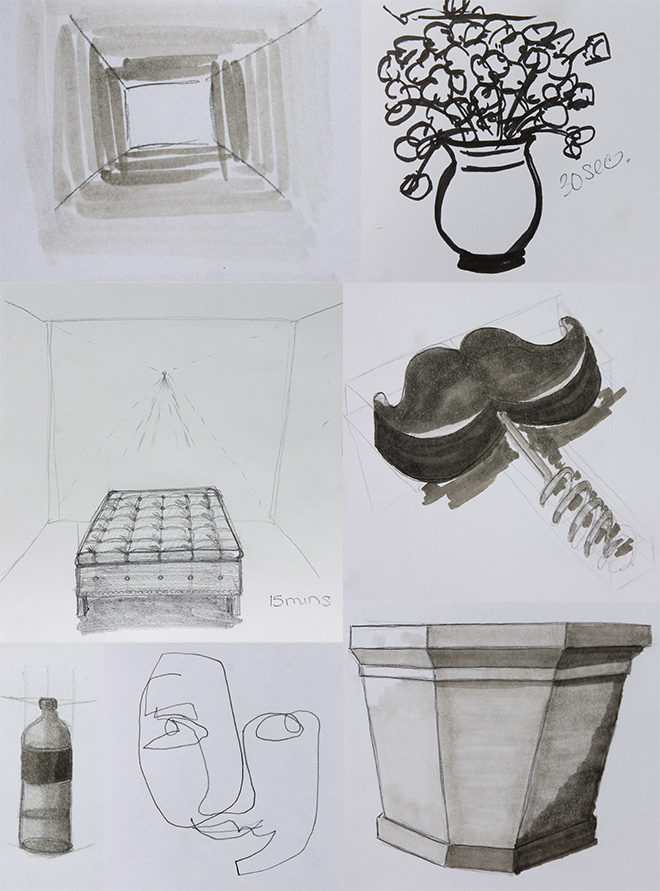
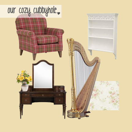
This is not, but very well could be, a page out of my sketchbook. It is composed of:
1: 15-second warm up using markers to help express 3D space
2: 30-second doodle of flowers I did while testing out a new marker I discovered in my supply kit!
3: 15 minute pencil sketch of a tufted ottoman in a space (notice the vanishing point — I need to see it… I haven’t mastered just visualizing the point yet!)
4: 10 minute pencil sketch of my awesome mustache corkscrew shaded with markers
5: 2 minute pencil sketch of a bottle shaded with markers
6: 1 minute blind (i.e. I couldn’t see the paper) contour line drawing (i.e. I wasn’t allowed to pick up my pencil) of one of my classmates. We laughed so hard! :)
7: 5 minute pencil sketch of a planter shaded with markers
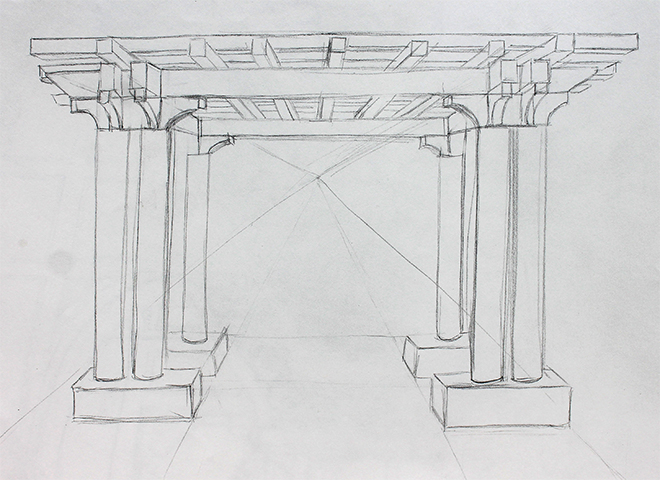
Toward the end of the class, I managed to produce a few sketches that looked a bit more finalized. My favorite was a perspective sketch of the trellis in the park outside of the school. We sat out there for an hour sketching and listening to a man play Beatles songs on a guitar. It was really therapeutic, actually! And I was happy with the drawing. Maybe I always need to be serenaded when I draw…
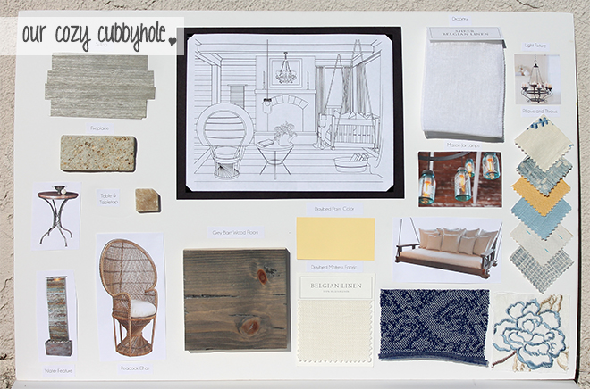
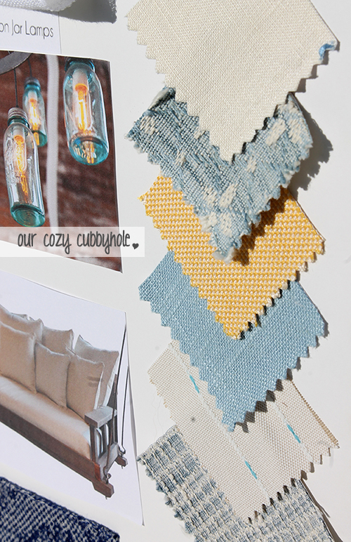
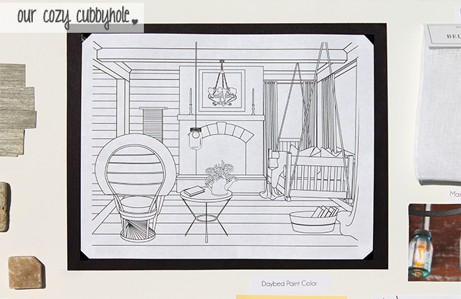
Our final project for the class was to take a picture (that had at least one, if not two, point perspective) out of a magazine and recreate it using all of our perspective drawing techniques.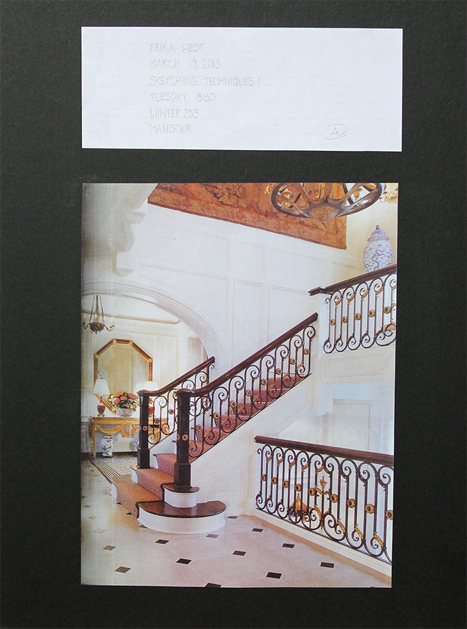 I began the assignment by creating a pencil sketch. Note: some lines are strangely darker than others because I had to make certain lines darker for the next step! This by no means looks like a finalized pencil sketch… just a tool for step 2!
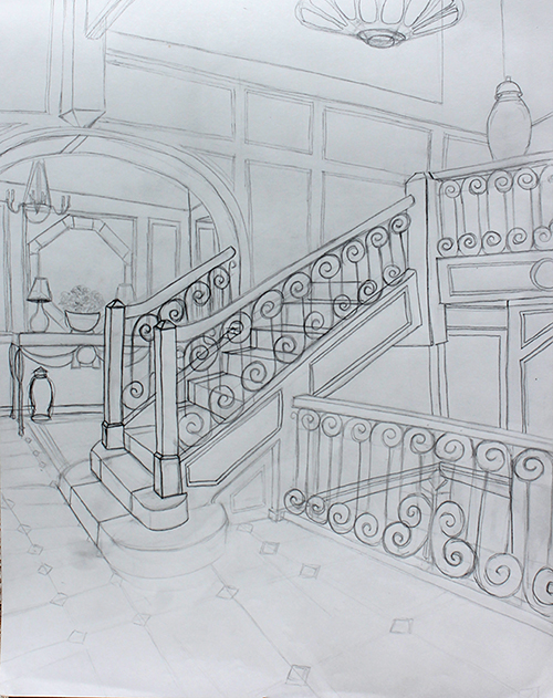
I then used a semi-transparent marker paper and traced the sketch onto it with ink. Finally, I shaded the ink sketch with markers (and stuck it to the board with double-sided tape… that you can totally see. Boo.).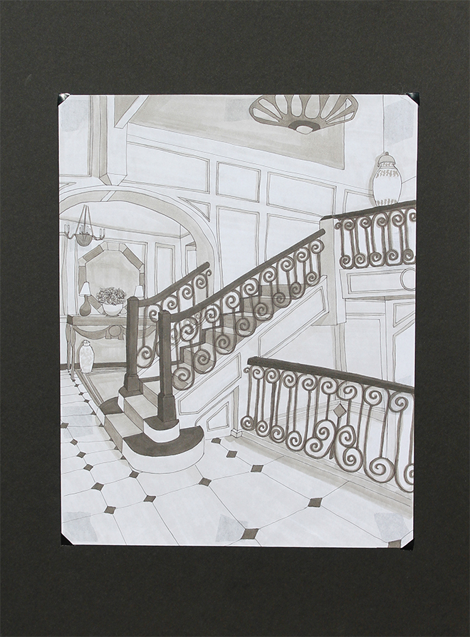 Is it perfect? Absolutely not. Does it look better than a kindergartener’s doodles? Yes! So progress is happening, my friends! I was very happy with the way it turned out, although there are things I would change if you could erase ink (you can’t. Boo.). But a huge part of my learning process has been to admit to myself that I literally cannot achieve perfection in sketching… imperfection is what makes hand drawings so beautiful. I pushed myself to NOT erase pencil lines and to loosen up! I think I made big steps towards that!
Have a great weekend everyone! :)


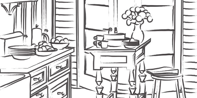
 And below is my recreated version in Illustrator. We had to do everything from finding similar fonts, creating the lines and shapes, and even adding the smallest details like drop-shadows and font textures.
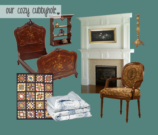
  Another fun (but time-consuming) assignment started with a photo from a magazine (thanks again,
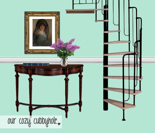
 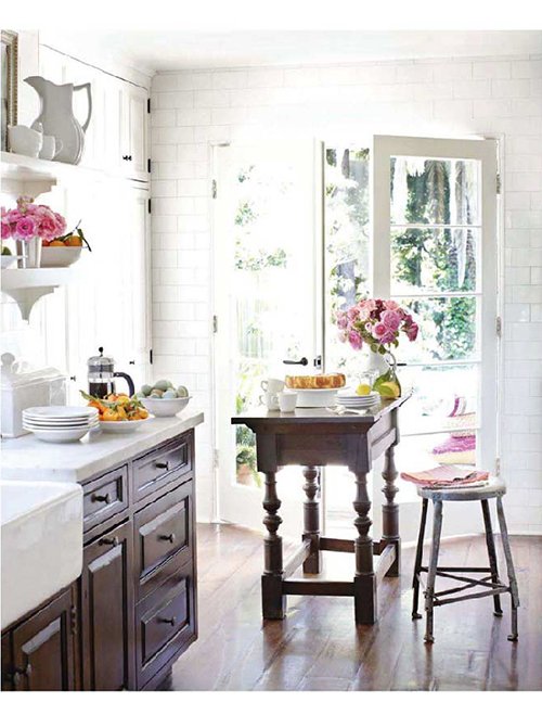 Next, we used the Illustrator pen tool to trace the room and create vector paths that formed a line drawing of the room.
 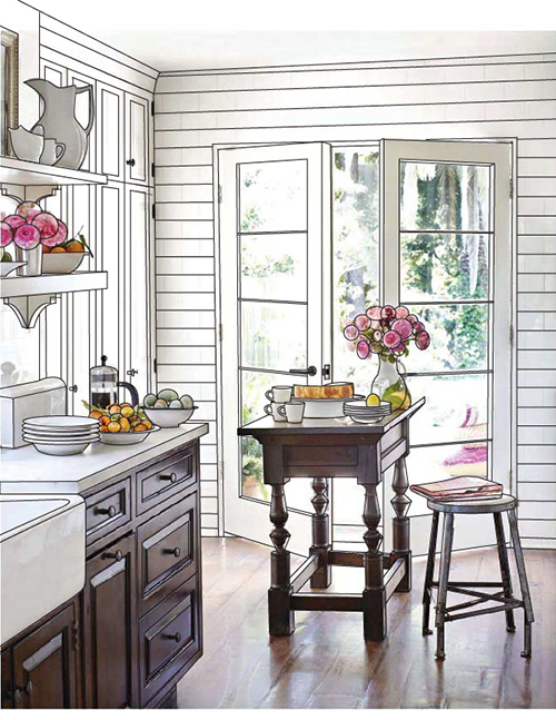 When I made the picture in the background invisible, I was left with a line drawing of the space! How cool is that!? I was able to later use this technique for another class. :)
 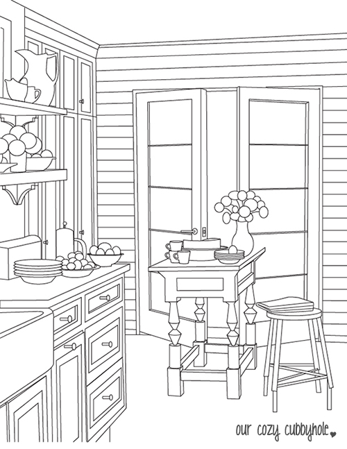 The fun part is that, since the lines are vector-based, I can play with brushes to change the look of the drawing.
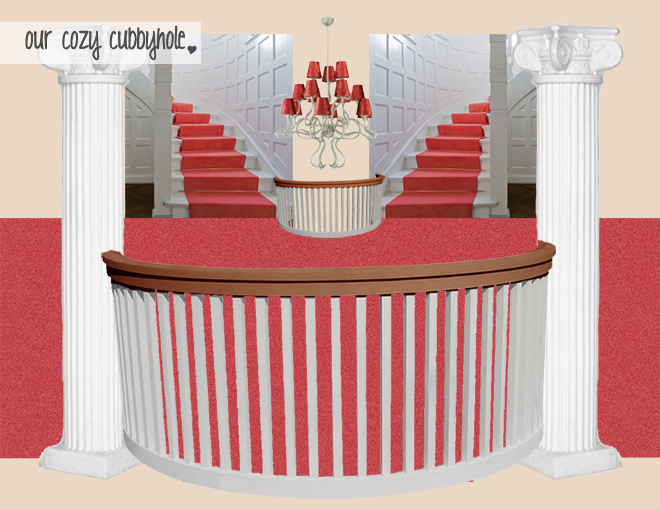
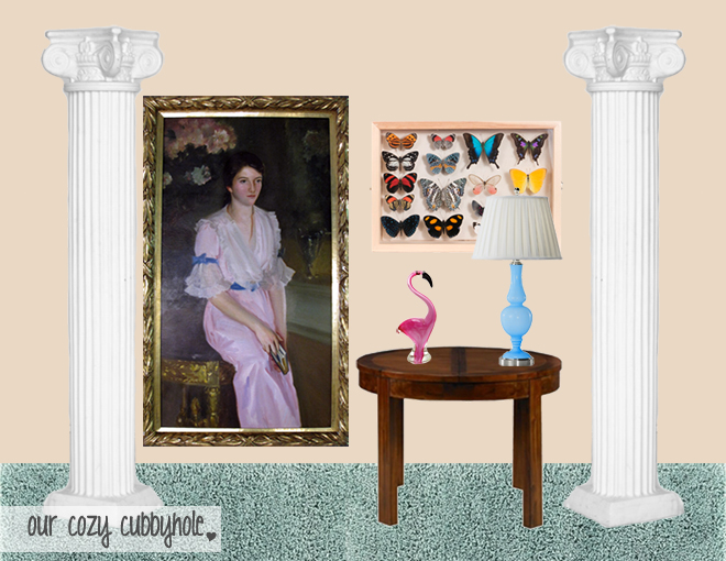
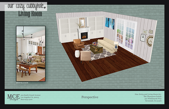
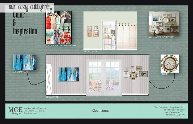
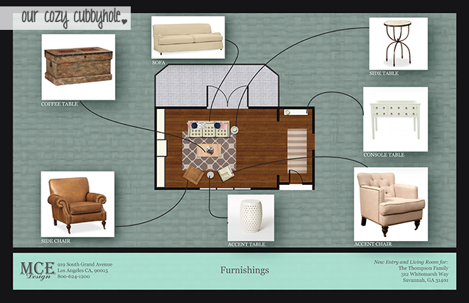
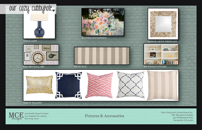
 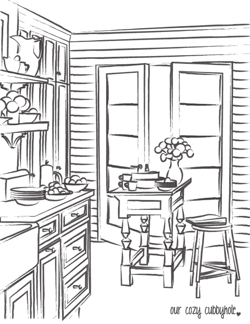 Our final project in this class was a group project (I worked with the beautiful and talented Michaela from
 The rest of the assignments in the class were exercises to learn the program and aren’t very interesting to look at out of the context of the class… so I won’t bore you with any more!