FIDM Winter 2013 Quarter Schoolwork Update: Design Process
A re you sick of my seeing my schoolwork yet? Well, only this big post (and maybe one tiny post tomorrow!) to go! If you missed the previous updates, you can find them here, here, and here. Today’s post covers some of my work from my Design Process class. Since some assignments in this class seem odd out of context (or without a verbal presentation), I will only share a few of the bigger ones with you. All of them were done with a verbal presentation and discussion with the class.
One of the first assignments was to draw four iterations of a logo for any company we wanted (real or made up). I chose to do a made up design company. The only requirements were that we could only use three colors and that the logos could either be totally different logos (still for the same company) or could work together in some way (i.e. a main logo, a stationary logo, a website header, etc.).



 Since I was enjoying myself, I did two more versions that broke the three color rule just for fun!

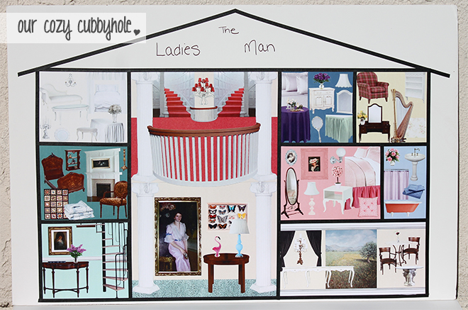
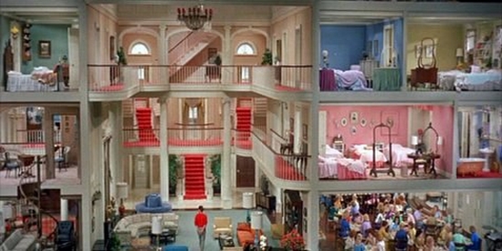
Another assignment was to watch a movie from a provided list and make a concept board about the set design of the film. I chose to watch The Ladies Man (1961), which took place in a woman’s boarding house.
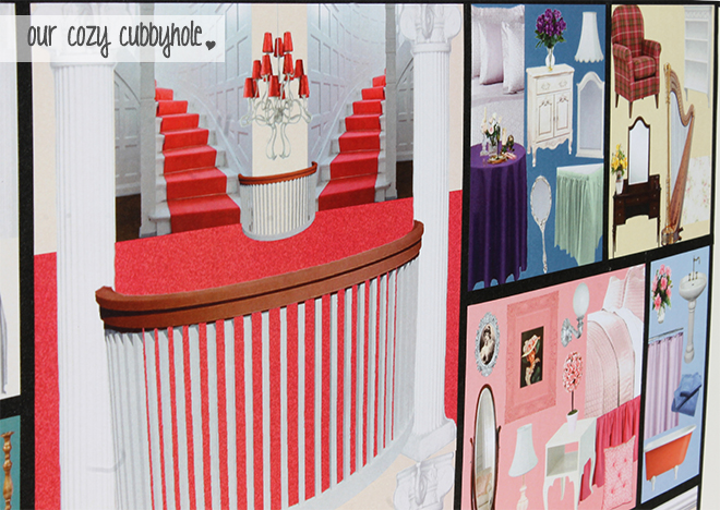
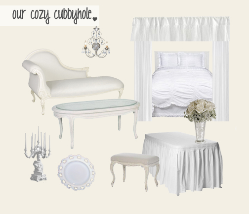
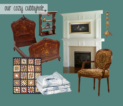
As you can see, this was obviously a comedy with its over-the-top color-themed rooms! My first impression was that it looked like a dollhouse, since they would show shots of the set from so far back that you could see multiple floors/rooms at once. So I made a dollhouse concept board with Photoshopped collages for each area of the house. Since it is hard to see on the big picture, I have included the pictures for each room below. Each room took me about an hour… 10 rooms later, I was exhausted!
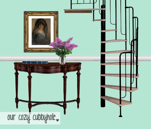
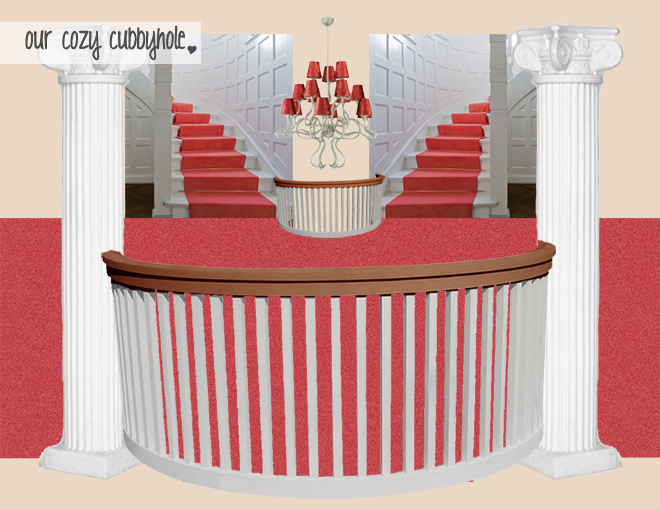
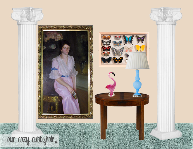
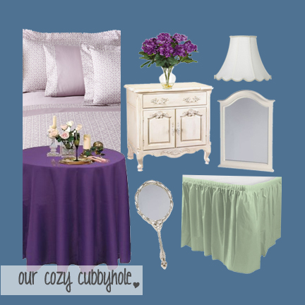
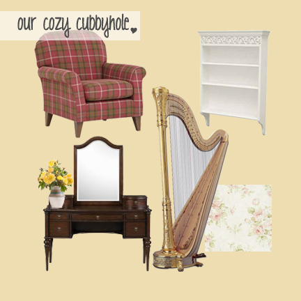
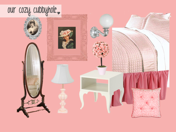
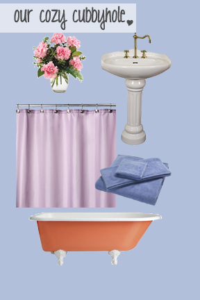
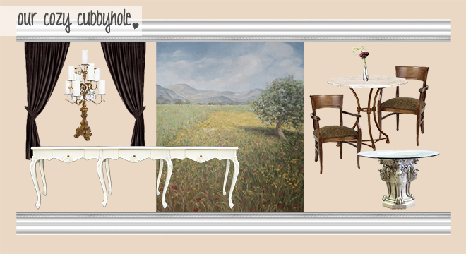
Our final assignment was to design a room inspired by a painting. Walker (I love him!) got me a gorgeous Toulouse-Lautrec (I love him!) book for Christmas, so I chose one of the paintings from there that really jumped out at me called La Rousse (La Toilette).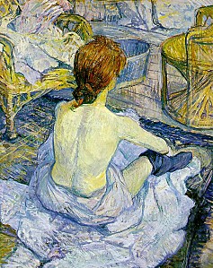
I love the gorgeous blue and yellow tones, as well as the scratchy texture. I also like the way the linens are pooled around her like water and how her hair glows like fire. This painting to me feels like I accidentally walked into a private, quiet moment in this woman’s life, and because her back is turned, it is easy to project myself into the painting. I can feel that serene moment and that deep breath one can finally take after all of the activity of the day. On a more literal level, I love the grey barnwood floors, twisted wicker furniture, and metal wash pail.
Once I picked the painting and decided what spoke to me in that painting, I needed to translate that to a pretend client and a designed space. Therefore, I chose to create a client who was a 34-year-old aspiring chef and food blogger. The client decided to buy her own home last year and immediately remodeled the kitchen for her career. However, after a year of working from home, she was feeling a little trapped in the four walls of her house. She wanted a space just out her back door that would function as a sanctuary and mini-getaway.
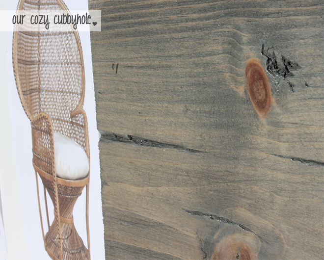
The space I designed was a back porch area that could function as a breezy reading/napping spot by day and a cozy, romantic, warm space to have a glass of wine by night. The first thing I put in the room was the rustic yellow daybed porch swing (duh) because napping outdoors is obviously the best thing in the entire world. I added some pillows in various patterns from the blue/yellow/grey color scheme inspired by the painting, all of which had amazing texture to the fabric. Next, I found textured but incredibly light drapery fabric that would be used to line the space and puddle on the floor (like the linens in the painting), creating the ability for privacy if the client wanted it. Finally, I discovered the wicker peacock chair that had a twisted bottom like the one in the painting and I had to include it! :)
In order to achieve the beautiful balance of water and fire from the painting, I added a few things that were representative of both. To achieve a sense of water, I added a slate water feature, a rustic metal watering can full of flowers, and a metal wash pail to hold books. The water vibe is the breezy, fresh, light daytime mood of this room. To achieve a sense of fire, I added a fireplace, a rustic chandelier with candles, and some glowing mason jar lights. I also pictured some additional candles and perhaps some string lights to really make the place glow. The fire aspects give it the enclosed, sensual, warm nighttime mood of the room.
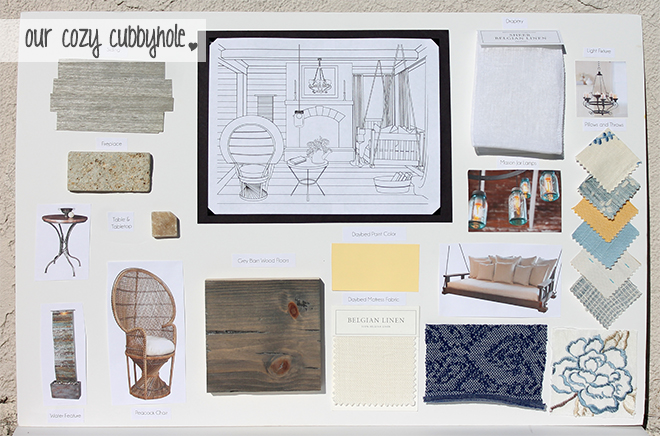
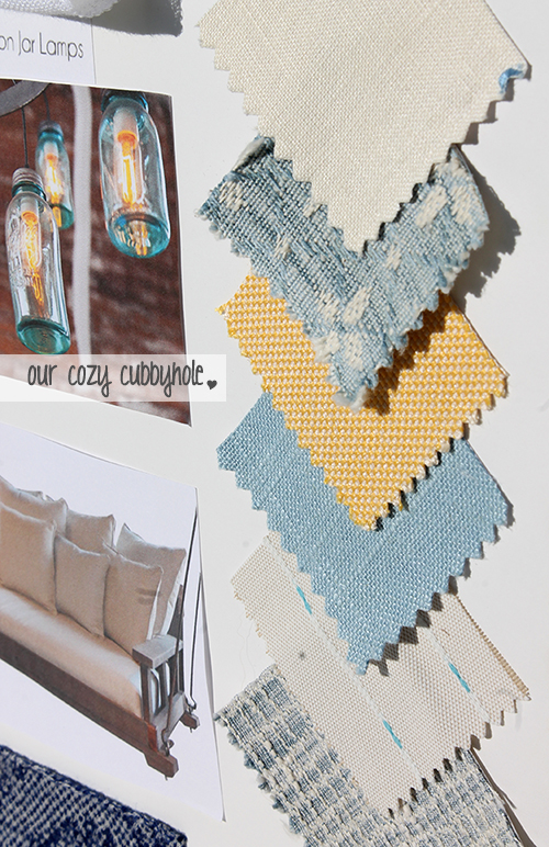
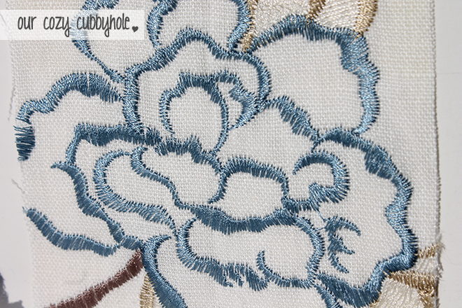
I used the Illustrator line technique I showed Tuesday to create this line drawing of the space, although I only traced a small part of it from a photo. Most of it was freehand mouse. :) Also, I intended on coloring it with colored pencils but ran out of time. Perhaps I will still do it before putting it in my portfolio to give a better color sense of the room. Thoughts?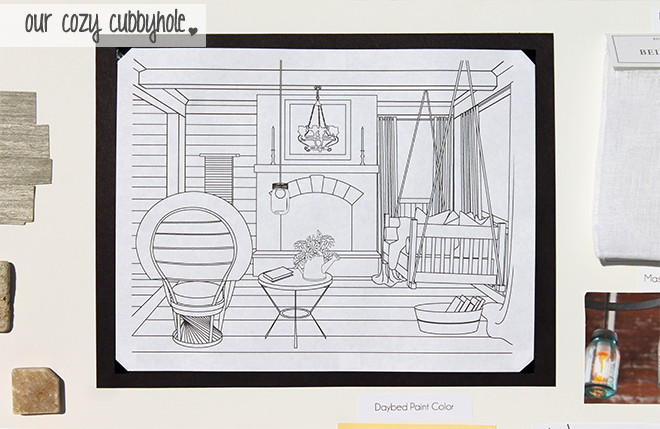
I start school again today so I am very much looking forward to getting back into my creative mindset!
As always, if you have any questions, feel free to comment below! Also, if you are ever looking for a great gift for me, I’ll take that porch up there — thanks! ;)
Which is your favorite logo? Favorite theme room in The Ladies Man? Favorite part of the porch space?




14 Responses to "FIDM Winter 2013 Quarter Schoolwork Update: Design Process"
Add Comment