Seriously Awesome News (Times Three)
**Before I start, I wanted to let you know about a little change in the comments section. There were mixed love it/don’t love it reviews on the automatic emails letting you know that I have responded to your comments. So, now there is an option! If you’d like to know when I have responded (only me — not all comments on the post, I promise!), just select the “Replies to my comments” option in the comment box and confirm subscription. If not, “Don’t subscribe” is the default so you don’t have to do a thing. Now everyone will be happy! And remember, if you change your mind, you can switch your subscription preferences at any time. :)**
I know a lot of you have been waiting in suspense for me to reveal my big news so get excited because today is the day! In fact, there are three really amazing things I want to share with you today so let’s get right to it!
1. I am super, super lucky because I was chosen by the amazingly talented and kind women, Joann and Kelly, at Kandrac & Kole to receive a ticket to Design Camp in Seattle in two weeks!! Hosted by celebrity interior designers Lori Dennis and Kelli Ellis (you may know them from HGTV or TLC), Design Camp is a two day seminar packed with workshops in all things interior design, portfolio creation, forecasts/trends, design blogging, social media, branding, and becoming a television personality! I seriously jumped up and down for like 45 minutes (great cardio, by the way) when I found out that I would be attending this incredibly valuable and fun seminar. Many of you know that my dream job would be to be on HGTV, so add in some blogging and some advice for starting an interior design career, and the result is literally my perfect dream conference. AND I GET TO GO!! Eeeeeee! I fully intend on being in sponge-mode, soaking in any and all information that I possibly can. The best part is that the conference is limited to 300 people so there will be some incredible networking opportunities and time to really get to know the other campers! Time to get my business cards printed… ;)![]()
2. I am super, super lucky because I received a message through my Etsy store just before Christmas from a woman inquiring about selling my string art to a wholesale distributor. She asked to send me an email with more information, and when she did, the first thing I saw was that she was a buyer for UncommonGoods! I LOVE THAT STORE! So once again, I jumped up and down for 45 minutes like a madwoman. For those of you who aren’t familiar with the store, here is info from their website:
![]() “UncommonGoods is an online marketplace offering creatively designed, high-quality merchandise at affordable prices. At UncommonGoods, we believe that creativity and the expression of individuality represent two great human treasures. We have set out to create a business that makes uncommon goods accessible to everyone.”
“UncommonGoods is an online marketplace offering creatively designed, high-quality merchandise at affordable prices. At UncommonGoods, we believe that creativity and the expression of individuality represent two great human treasures. We have set out to create a business that makes uncommon goods accessible to everyone.”
After several months of phone calls, emails, samples, and soul-searching on my part, the listing went live today! I am offering three versions of my string art with nails exclusively through UncommonGoods (thus the reason they have disappeared off of my Etsy store), one on the natural wood round, another with bright red paint, and another with bright turquoise paint. When the customer places an order, I will fulfill it and ship it directly to them. For those who are thinking, “Erika, you have the smallest apartment of all time. Where do you plan on making these?” The answer is: my garage space and I are going to be spending a lot of time together. Sorry, Walker’s car.
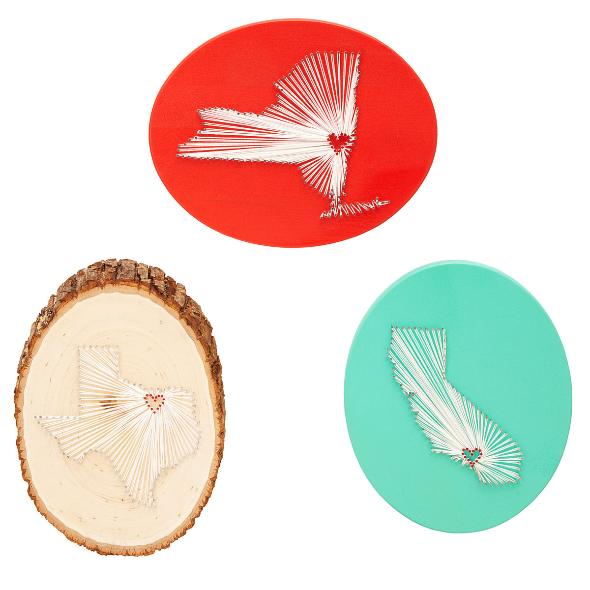
Photo source: UncommonGoods.com
So what does this all mean for me? When I got the original email, my first thoughts were, “This is amazing but with school and everything going on, I don’t have time for this.” However, after doing some number-crunching based on their sales estimates, I realized I was roughly in the range of what I am bringing home working 3 days a week at my current job. If the actual number of orders per week was lower, I would need to find other income to supplement. If the number was higher, I would be making more money and working less… from home. Since there is no way to predict the orders until they come in, I decided to err on the side of caution and make all financial decisions based on a worst-case scenario every week. Which brings me to…
3. I am super, super lucky because when I started looking into other forms of income, I decided to ignore the voice in my head saying, “You have practically no experience. They won’t even look at your work,” and applied to a few paid blogging positions. I was so wonderfully surprised when I was offered both a copy-editing position at Lifehack.org and a daily DIY blogger position for Decoist.com!! Lifehack is “widely recognized as one of the premier productivity and lifestyle blogs on the web. This site is dedicated to lifehacks, which is a phrase that describes any advice, resource, tip, or trick that will help you get things done more efficiently and effectively.” Decoist is “an interior design and architecture blog that promises to deliver fresh new inspiration everyday.”
Once I was offered both writing jobs (which are paid by post and should be enough to cover any gaps in income for weeks with fewer orders), I decided that this whole UncommonGoods/Lifehack/Decoist path was one I needed to take. While the financial risk is much higher than staying at my current job, the benefits of working from home and having more time to work/focus on school were too huge to ignore. I felt like this amazing opportunity fell onto my lap and I would be silly not to try.
So that is what I am doing: trying! I put in my notice at my current job a little while back and my last day is this Friday. The listing went live on UncommonGoods today and I start with the writing positions on Monday (I have already been editing articles, as well as did one sample post for Decoist last week). It is so exciting! I want to jump around all over the place. I want to sing and shout. I want to dance. I want to cry a little because I am terrified of the financial risk. I want to pat myself on the back for taking this leap of faith. I want to hug everyone who has supported me and told me to go for it, especially Walker (who has listened to me go on and on and on and on about every bit of this).
To my lovely blog readers, thank you all for your support as well. Check out the listing, pass it along to friends, TWEET N PIN THAT SHIZ… whatever you do, I appreciate it all! Love you guys! xoxo

Have you ever taken a big risk? Worked as an entrepreneur and/or from home? Any tips on making a rented half-garage not feel like a spider-filled cave?
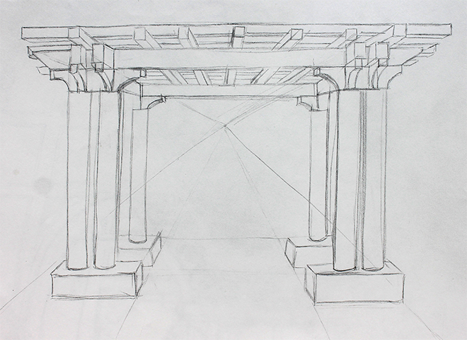

 I began the assignment by creating a pencil sketch. Note: some lines are strangely darker than others because I had to make certain lines darker for the next step! This by no means looks like a finalized pencil sketch… just a tool for step 2!
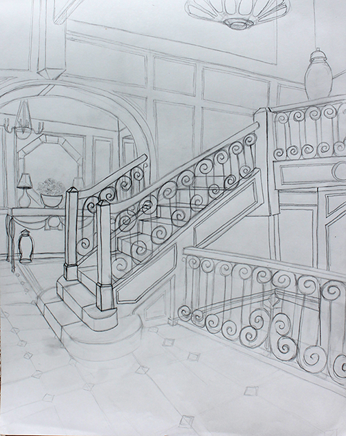
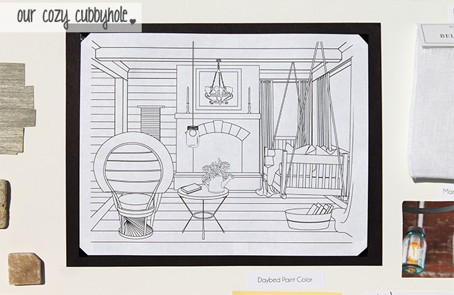
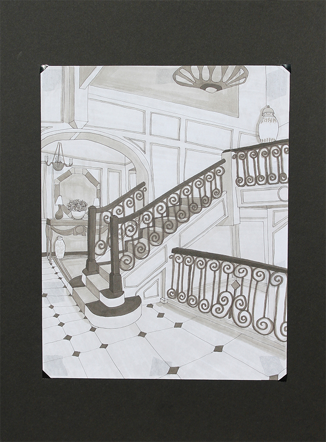 Is it perfect? Absolutely not. Does it look better than a kindergartener’s doodles? Yes! So progress is happening, my friends! I was very happy with the way it turned out, although there are things I would change if you could erase ink (you can’t. Boo.). But a huge part of my learning process has been to admit to myself that I literally cannot achieve perfection in sketching… imperfection is what makes hand drawings so beautiful. I pushed myself to NOT erase pencil lines and to loosen up! I think I made big steps towards that!