Decorist: Caroline’s Master Bedroom
Hello all! I just got back from a wonderful two week vacation visiting our families in both New York and Nebraska. Just before we left (I mean like up until 3 minutes before hopping into the car for the airport… yikes!), however, I finished up two great projects for my amazing client, Caroline, in New Orleans. I completed her nursery last month, so we then took on her master and guest bedrooms! Since I often post bits and pieces of the Decorist e-design process, I thought it would be fun to do a post with a bit more detail about how everything works from start to finish, as I get a lot of questions about the whole thing. So I decided I would do a two-part example with Caroline’s master and guest bedrooms so that you all can see two fairly different paths these projects often take.
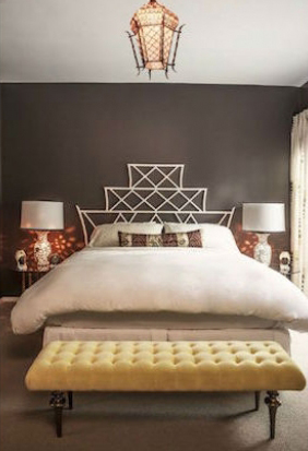
Today I will start with the master bedroom. The process begins with the client uploading photos of the room, providing the measurements of the space, and filling out a questionnaire about their wants and needs for the space. I won’t share these, since I respect my client’s privacy, but you get the idea! Generally, she wanted both rooms to have an eclectic modern feeling with a hint of bohemian flair, tons of cozy texture, and a sophisticated color palette that flowed with the other rooms. It was important for her to have the rooms feel unique but cohesive in an aesthetic for her new (GORGEOUS OLD) house. The existing items she wanted to work with were a gorgeous four poster king bed and some beautiful mirrored nightstands (though she was happy to use these in either the master or guest rooms). The plan was to add an amazing modern bohemian area rug, new media cabinet/sideboard, new curtains, bedside lamps, and an overhead light fixture, as well as some incredible decorative accents and fabulous artwork.
Step one for me is to review the information in detail, put the room into a to-scale floor plan, and send over all of my initial questions. This list is often very lengthy, but it is so necessary for me to better understand the client, assess their needs, and clarify room setup/dimensions. We usually go back and forth a couple times, and then I will send over a few mini boards to help select some of the main sample pieces (as well as to get a better understanding of the client’s style based on the things they are choosing so I can pick the remaining items with a more targeted eye). Here is an example of some of the types of boards I send:
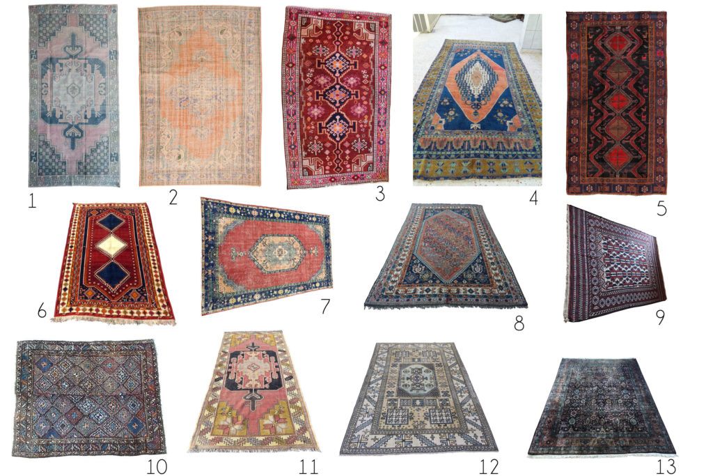
Vintage Rug Options for the Master
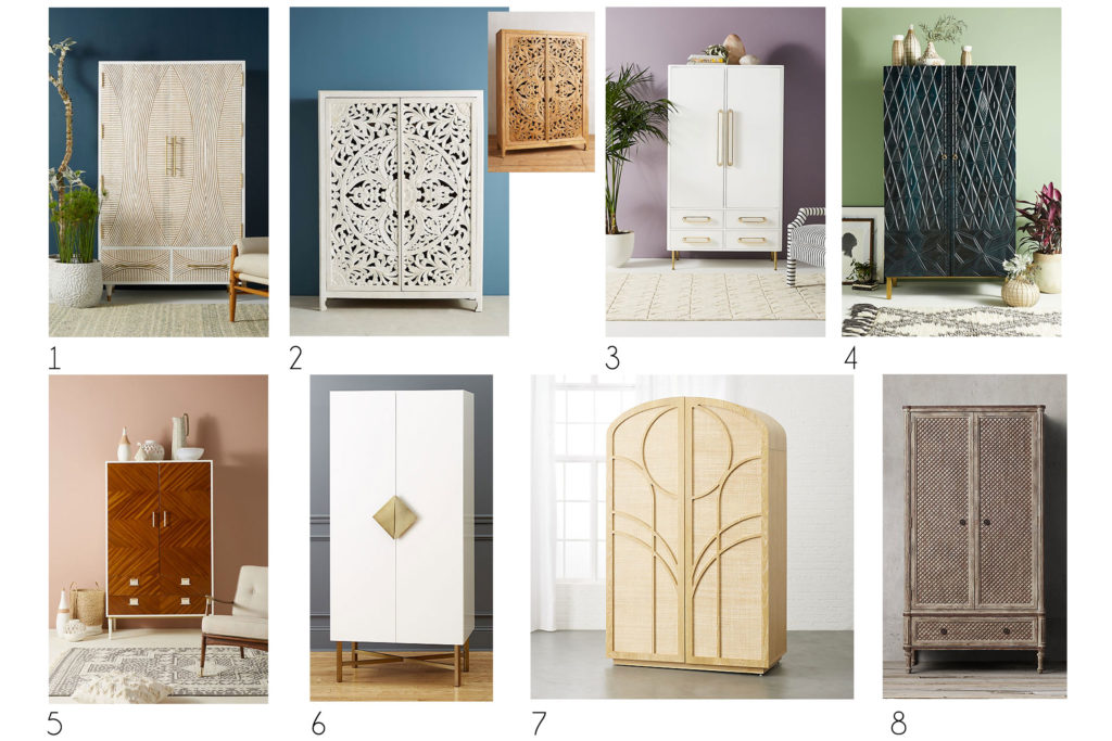
Armoire Options for the Master & Guest Bedrooms
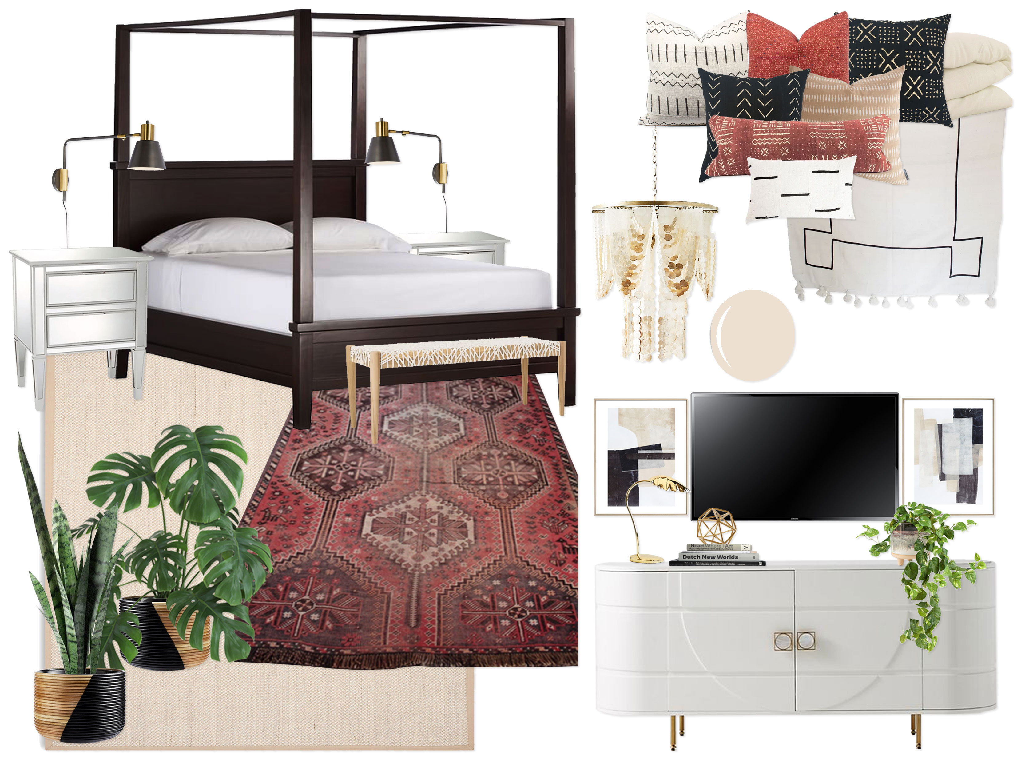
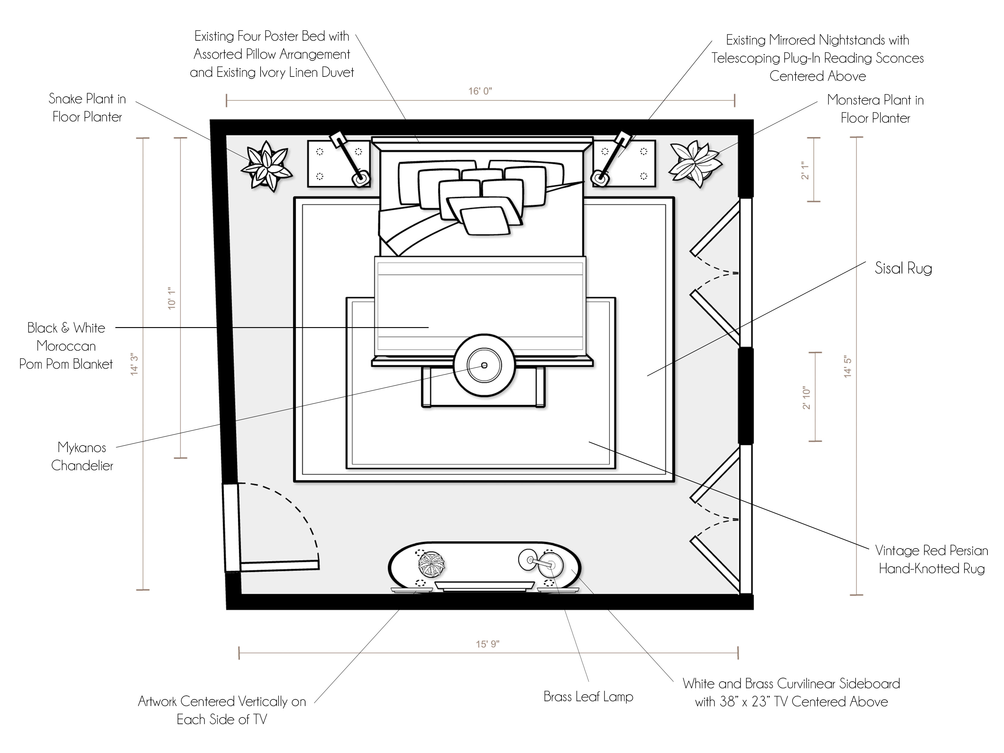
Once the client gives me feedback on a few of the main staple items, I get to work creating two unique design concepts for the space. Each of these concepts is a complete picture of the room design and includes a mood board, floor plan, and write up to help the client picture the finished space. I look at mood boards every day so it never dawned on me that they might be confusing to people when I post them on their own. However, when a client receives them in conjunction with a labeled floor plan and descriptive write up, it makes a lot more sense. Basically, the mood boards give a overall visual idea of how all of the pieces look together (trying to group little vignettes of items together when possible), while the floor plan and write up actually describe where they will concretely go in the space. If you see a console on the mood board, you can find on the floor plan where it will go in your room. I hope this clarifies things a bit! Here is what I mean:
Concept 1: Black, White, Ivory & Red
(click image to enlarge)
“Inspired by the neutral yet high contrast palettes in your inspiration photos, as well as the nursery we have already designed in your home, this design embraces the elegance of layered neutral tones (bright white, warm ivory, sand, and natural wood) with pops of high contrast black and red, as well as metallic accents in brass. With the walls painted a gorgeous warm and fairly saturated sandy beige (with the remaining trim to be painted BM White Dove like the rest of the rooms), the whole room envelops you with a sophisticated warmth. Keeping the beige and ivory tones feeling fresh, bright white accents make the room feel light and airy. The star of the show is the vintage hand-hooked blue Persian rug, which sits at the foot of the bed and is layered over a larger sisal rug. The stunning existing four poster bed is centered on the main wall, and is flanked by your beautiful existing mirrored nightstands. Above the nightstands are two black telescoping mid-century adjustable (plug-in) reading lamps that are modern and functional. Giving the room personality, coziness, and visual interest are the array of amazing mudcloth pillows in hues of white, black, red, and sand, as well as a black & white Moroccan Pom Pom Blanket draped across the bottom fo the bed (which has your existing ivory linen duvet). At the foot of the bed is a stunning woven white leather bench with natural wood legs. On the outside of the nightstands, two floor planters house mismatching plants to give the room a fresh breath of nature in a symmetrical but not too match-matchy way. Not to be outdone by the incredible bed, a jaw-dropping curvilinear white and brass sideboard is centered on the wall opposite the bed. Your TV is centered above the sideboard, with two pieces of artwork creating a “gallery wall” with the TV to blend everything together. The sideboard is accessorized with a brass leaf task lamp, geometric brass object, books, and a plant. Finishing it all off, a stunning iridescent chandelier is the perfect jewelry to give the space luxury and a hint of glamour! Calming, fresh, modern, packed with cozy texture, and complete with a punch of bold contrast, this elegant design creates a perfect relaxing sanctuary for you and your husband as you embark on this new journey of parenthood!”
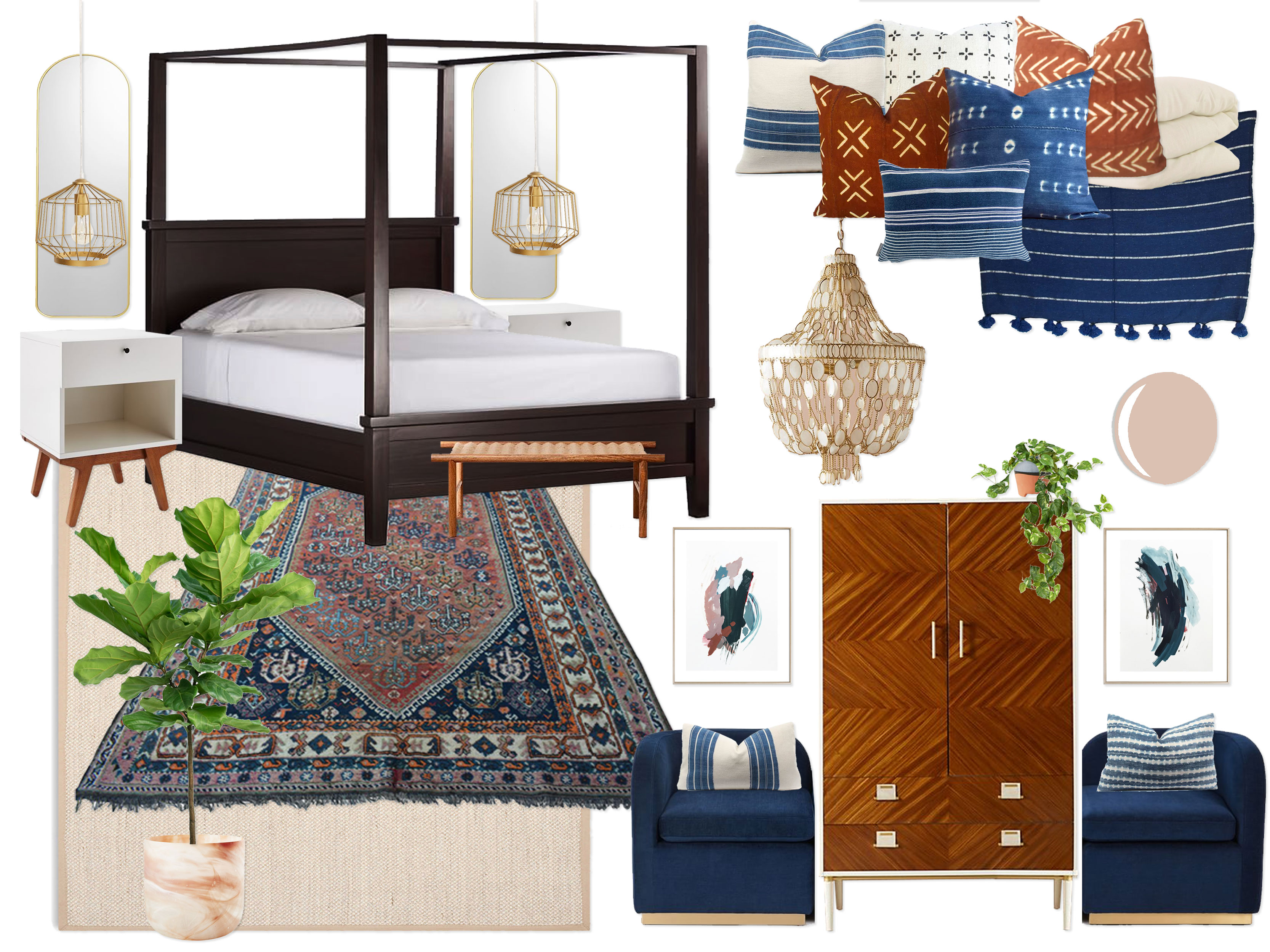
Concept 2: Indigo, Rust & Walnut
(click image to enlarge)
“Sparked by your many inspiration images with colorful yet sophisticated color palettes, this design embodies a modern vibe with a hint of a bohemian spirit, complete with a beautiful color palette of navy blue, denim blue, bright white, ivory, and rust, as well as walnut wood tones and metallic brass accents. Creating a sensual, soothing, flattering foundation, the walls are painted a gorgeous saturated rosy beige. There is a reason movie star heroines are always filmed with rosy-toned lighting… your will look utterly fantastic in this space! Setting the tone for the entire room, the incredible vintage red Persian rug takes center stage at the foot of the bed (and is again layered over a larger sisal rug). Your existing four poster bed is outfitted with the most amazing dyed indigo, denim blue striped, and rust mudcloth pillows, your existing ivory duvet, and an amazing navy blue striped Pom Pom blanket at the bottom of the bed. A natural walnut and jute woven bench sits at the foot of the bed. On either side of the bed sits two lovely modern white and walnut nightstands, both of which have tall brass mirrors and plug-in brass cage pendants centered above to create a wow moment on this bed wall. Once again, not to be rivaled by the wonderful bed, a magnificent walnut and white geo marquetry amour is centered on the wall opposite the bed and hides your TV from sight. An unbelievable navy blue velvet and brass tete-a-tete is split in half and placed on either side of the armoire to create symmetrical his and hers seating, complete with more denim striped lumbar pillows and artwork centered above. A large fiddle fig tree in a marbled glass floor planter completes the space, as does an absolutely lovely capiz shell chandelier, both of which give the room both a natural and luxurious feeling. This design walks the fine line between modern & bohemian, colorful & refined, elegant & fun, and luxurious & humble with an elegance that makes it a perfect oasis for the parents-to-be!”
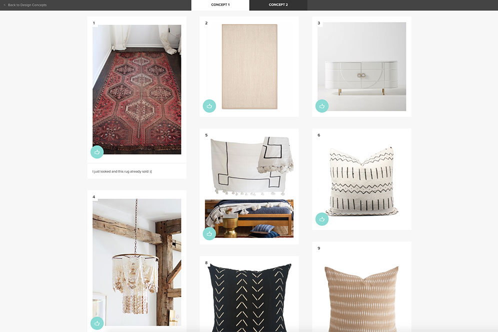
I also upload an image of each individual piece going into the room so that, in addition to rating and providing feedback on each concept as a whole, the client can actually do the same for every individual piece (with a thumbs up, okay, or thumbs down). This allows them to basically say, for example, “I like concept 1 but I don’t like this specific item/prefer the item from concept 2.” They can leave comments on each item also to give better direction if the piece isn’t quite right, or to say “LOVE THIS!!” when they can’t live without it! Here is a screenshot example of what I am taking about:
Once I get all of the feedback from the client, each project often takes a different path from here. Sometimes, one concept is dead on, with only one or two minor changes for the final design. Most often, we are about 80-90% of the way there, reselecting a few pieces or swapping them out for the corresponding items in the other concept. Sometimes, we have a bit more work to do, especially if after seeing the designs as a whole, they realize they want to make significant changes to the entire layout or function of their room because they couldn’t picture it before (i.e. “I thought I wanted this but now, seeing it, I don’t”… which by they way is TOTALLY okay! That is exactly why we go through this process and why the clients reach out for a designer’s help in the first place). So this next step in the process varies from client to client, but we do whatever we need to do to work our way to the final design, which is presented as final renderings of each relevant wall (again, varies per project depending on the space), a final labeled floor plan, detailed setup instructions, and a full shopping list of items for the client.
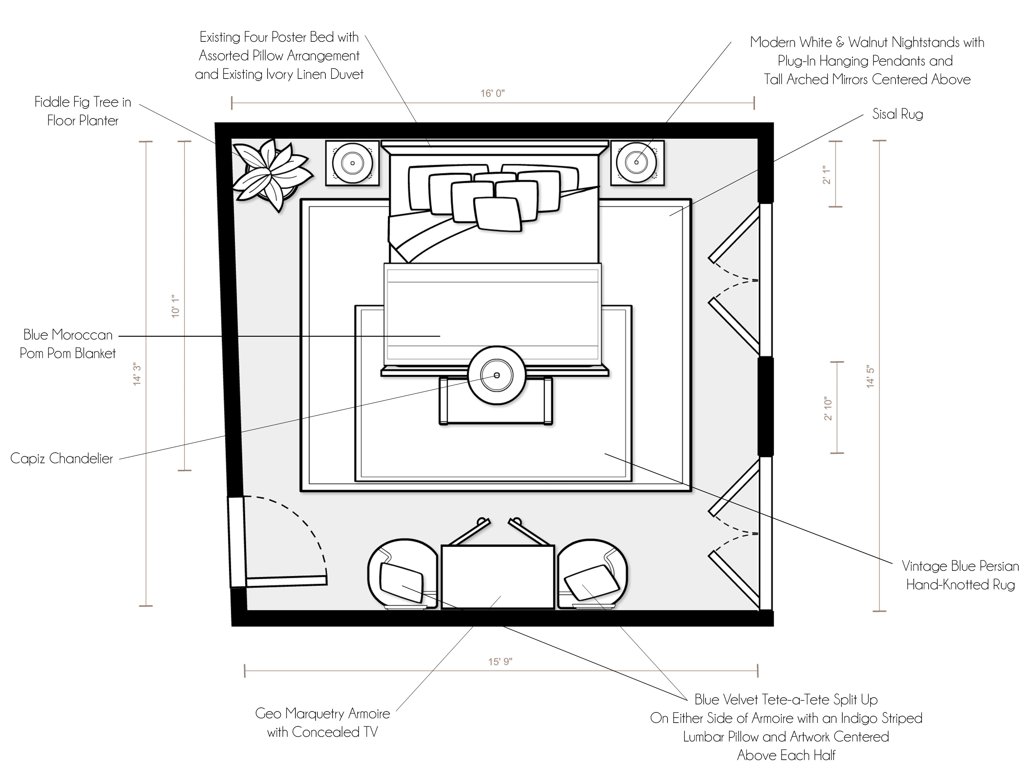
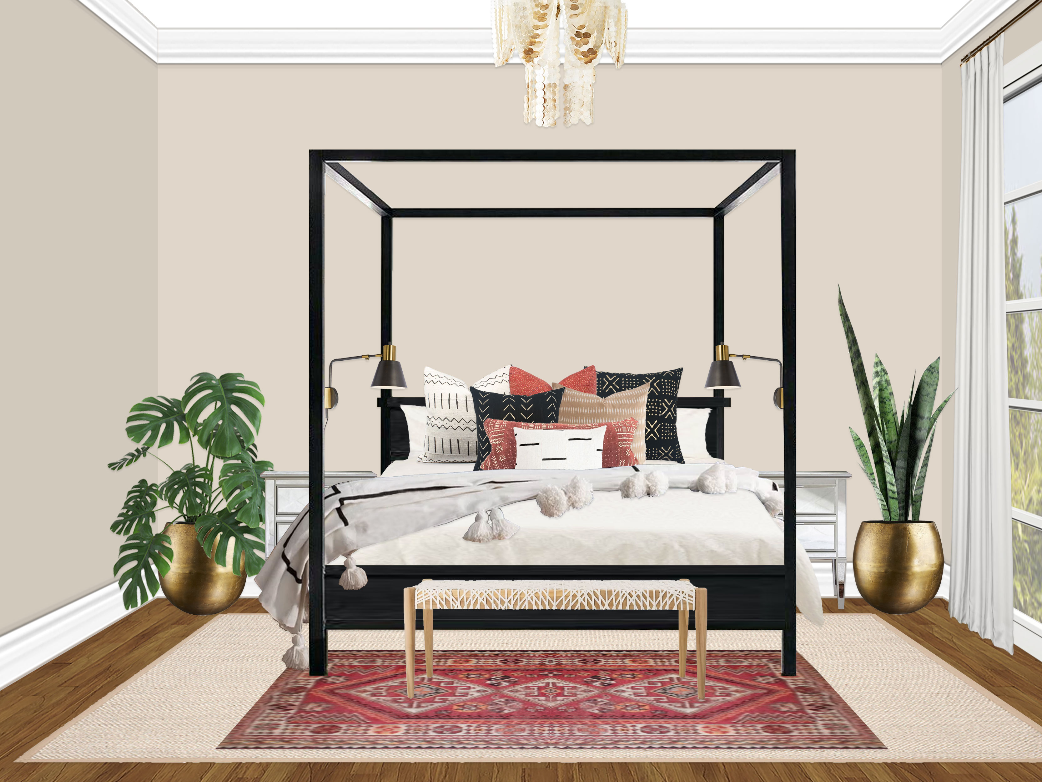
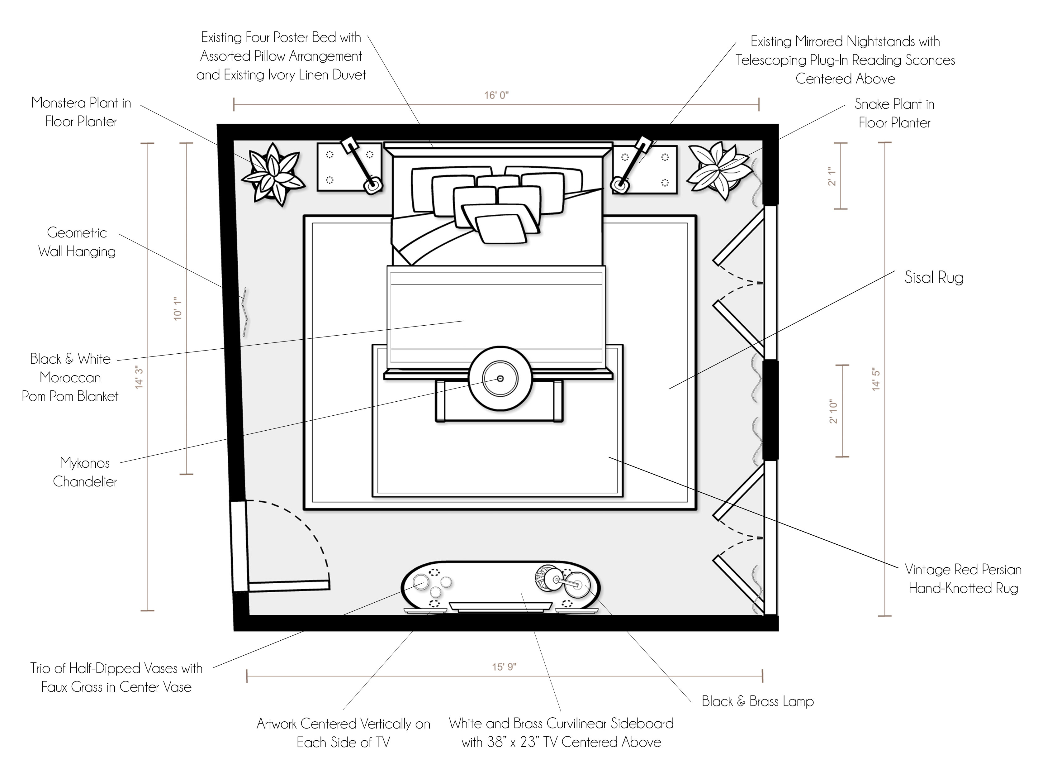
In Caroline’s master bedroom project, our final step fell into the first category: one concept was dead on! She chose concept 1 in it’s entirety, with just a little tweaking of some accessories and planters. The only hiccup was that the vintage red rug we selected had already sold. So we quickly swapped it with another one that was just as fabulous, and I got to work. Here are the final designs:
(click image to enlarge)
“Setup Instructions:
For specific product placement, please refer to your floor plan and renderings.
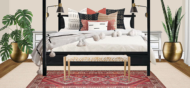
- The star of the show is the stunning red vintage rug that is placed at the foot of your existing beautiful four poster bed (centered on wall) and layered over a larger sisal rug for texture and softness. Flanking the bed on either side are your lovely existing mirrored nightstands. The sisal rug should float in front of the nightstands to allow the vintage rug on top to be mostly visible from the foot of the bed.
- Mounted centered above the nightstands are two modern black & brass telescoping adjustable reading lights, which are plug-in fixtures rather than hardwired.
- Giving the bed personality, texture, and coziness are an assortment of printed and textured pillows (please see the rendering for recommended placement), as well as a gorgeous black & white Moroccan pom pom blanket. These all sit on top of your existing ivory linen duvet.
- Finishing off the bed wall are two large rough cast brass planters (complete with a Snake plant and a Monstera plant) and an amazing woven leather bench at the foot of the bed.
- Adding an elegant and luxurious sparkle to the space, the Mykonos chandelier is hung from your existing fixture box, which is centered over the four poster bed. Since the bed is 91″ high and the fixture is 30″ high, I recommend splitting the difference between the remaining 16″ and hanging the fixture 8″ from the ceiling (and therefore 8″ from the top of the bed). However, I recommend holding it up and making adjustments higher or lower if necessary once you see it in the room.
- I recommend using a white (or very light ivory) linen with blackout lining for the window treatments you are having made. I think floor-to-ceiling white curtains keep things airy and pop against the sandy colored walls. I also recommend reinstalling the curtain rods so that they go 8-12″ over the sides of the french doors on each side (where possible) so that they can be fully opened without curtains blocking it.
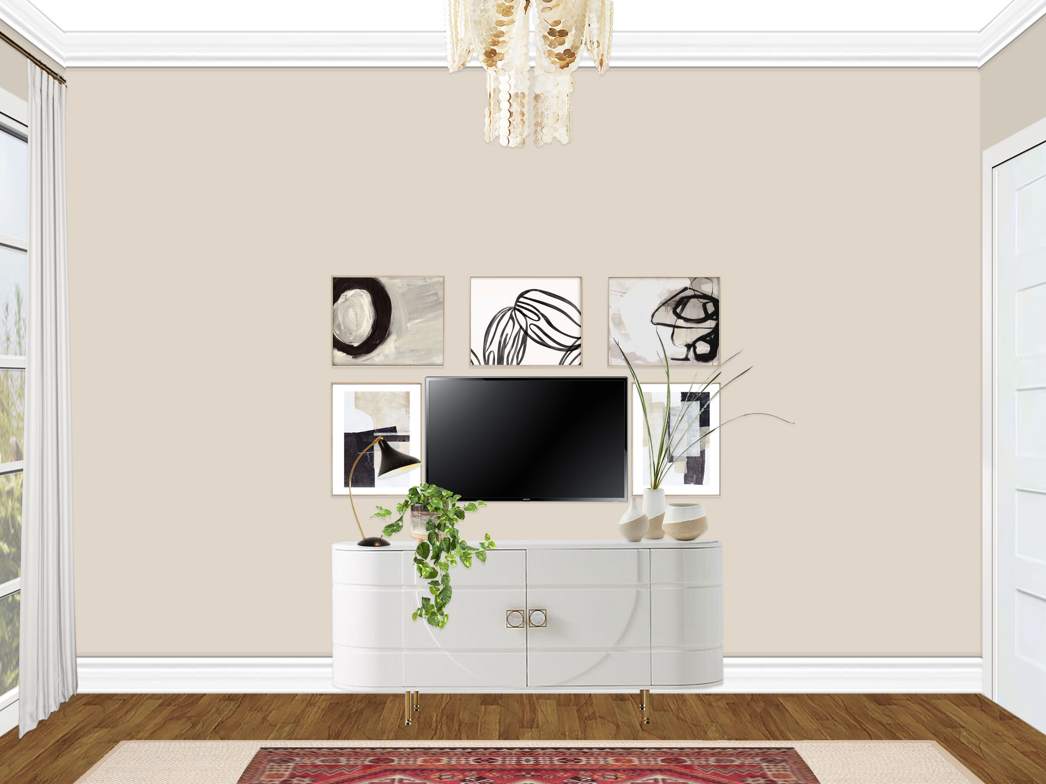
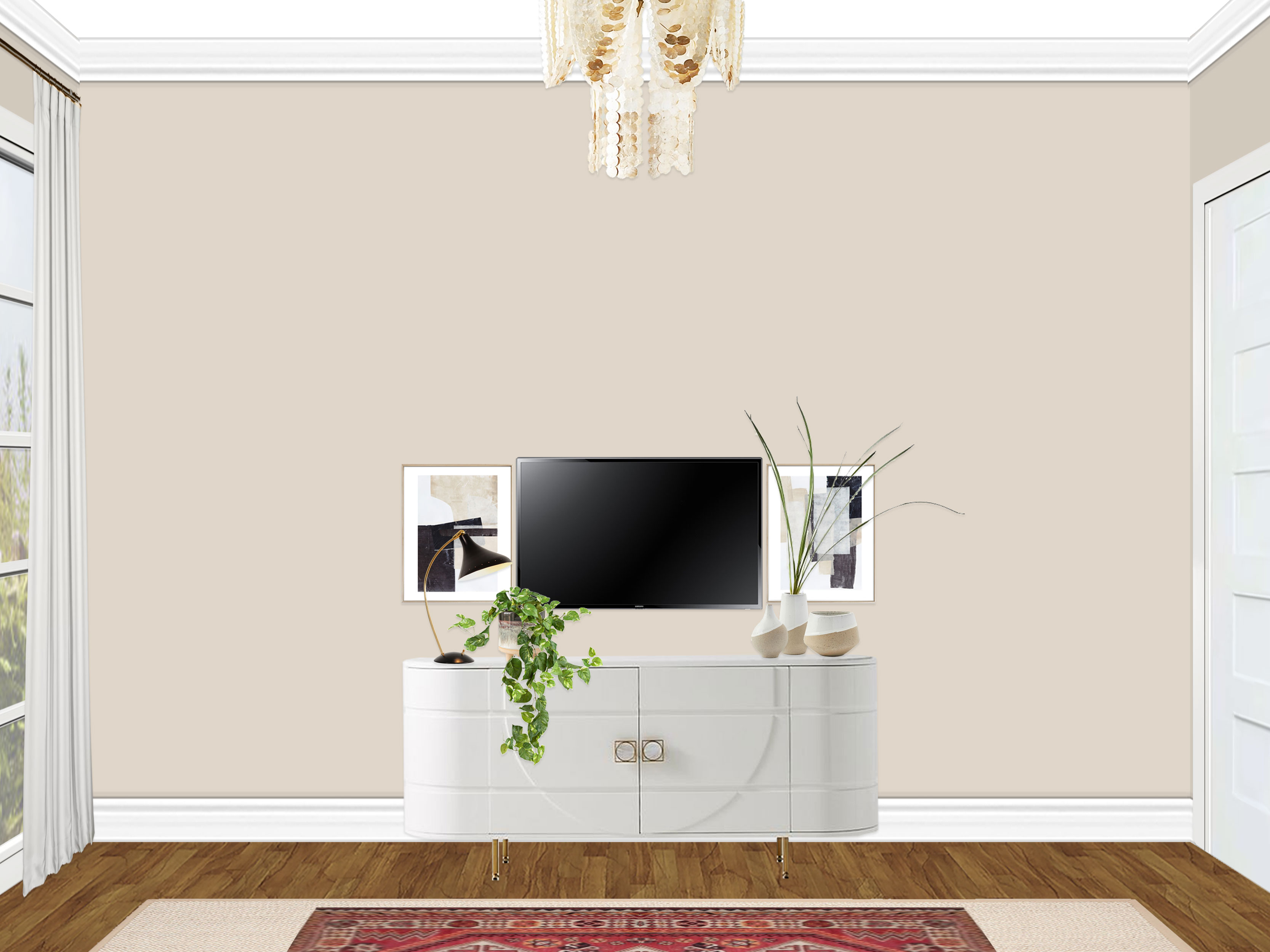
- On the wall opposite of the bed is a show-stopping white & brass curvilinear sideboard. Centered above the sideboard (and about 6″ +/- above it), your existing 38″ x 23″ TV is mounted on the wall. Blending in the TV, two pieces of coordinating artwork are hung on either side of the TV, centered vertically. I also recommend lining up the outside edge of the artwork with the outer edge of the console so everything lines up. This should give you about 1″ between the TV and each piece of art.
- If you choose to go with the larger gallery wall, the other three pieces of artwork are to be hung over the TV. Line up the two outer pieces in the same way you did with the artwork flanking the TV, by lining up the outer edges. Then center the middle piece of art, lining all three up vertically. The entire row should sit a couple inches above the top of the TV. I recommend cutting out templates of each one with pieces of paper or cardboard from old boxes so that you can put the templates on the wall first and plan everything out without putting holes in the wall. Please also note that I hung one of the pieces of artwork upside down so that the black accents in the piece worked better in the arrangement (see rendering for details).
- The sideboard is styled with a fantastic black modern task lamp (which coordinates with the bedside fixtures), hand-painted footed planter (with a pothos plant), a trio of half-dipped vases, and a sprig of faux grass (no maintenance!).
- On the large wall next to the bed (the one with the door leading to the hall), a stunning geometric iridescent wall hanging ties in the natural beauty of the chandelier with the angular modern charm of the mudcloth pillows. It catches the light from the french doors and adds a just the right amount of interest to the large wall (while still feeling minimal and clean). This is to be roughly centered on that wall but eyeball it to see where it naturally works best, keeping in mind the plant in the corner.”
As you can see, in this case, I actually provided two alternate rendering options for the TV wall, one of which had a more robust gallery wall around the TV. Usually this doesn’t happen, but since it was a little different than we had discussed, I wanted to show her both options. The labeled floor plan and setup instructions help the client understand how to execute the design and take it from the paper to reality.
Once the client sees the final design, there is one more opportunity to make final changes/tweaks to the design, which does happen occasionally. Once these minor changes are adjusted, the client can then purchase the design (in it’s entirety or whichever pieces they want) from the shopping list I create for them. They can do this through Decorist’s free purchasing service (which by the way price matches and takes coupon codes if you have them, plus provides free shipping… win/win!) or on their own if they prefer. It can also be done all at once or over time, as the shopping list will stay put for clients to use again in the future.
In general, the process is really fun and seamless for the designer and client to work together! There is a lot of back-end stuff for the designers, but it is all worth it because I think it makes the client experience positive and as clear as possible. I work to try and get more efficient with every project so that I am delivering quality designs as quickly as possible. I have gotten into a groove at this point, now that I have done about 15 projects but there is always room for improvement! Most times, we do not get to see after photos, but once in a while a client sends them our way and it is thrilling! :)
I hope this cleared up a few questions about the e-design process! I will post about Caroline’s guest room soon, as that one was a really fun, unique process as well.
In case anyone is interested in working with me on one of their rooms, you can purchase a package on my Decorist page using my friends & family promo code Designer233073 that allows you 30% off!

