Category Archives: Interior Design

Mood Board Monday: Diane’s Living Room

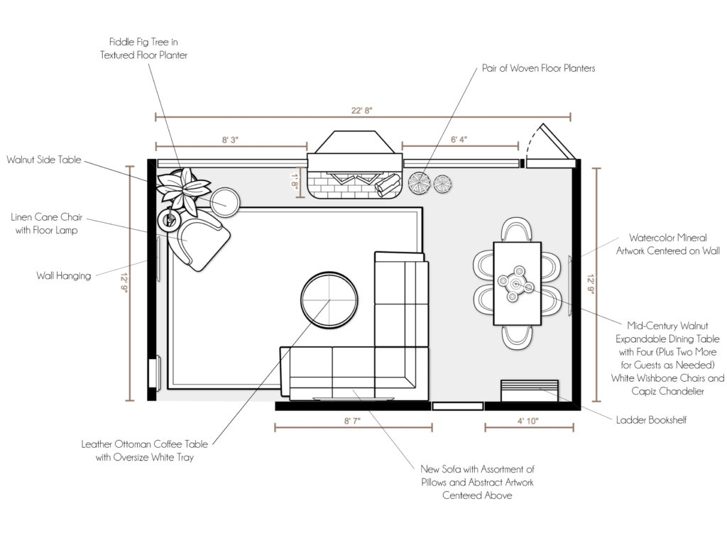
Happy Monday! Thank you all for your helpful feedback in my Instagram stories yesterday about sharing my e-designs! I am so excited that you are excited, so I’m planning a weekly feature of my e-designs called Mood Board Monday. Since I have almost a year’s worth of work to share, let’s just get started, shall we?

Rather than start from the beginning, I wanted to share my most recent project first. This is mostly because I am still excited about it, I am still working with this client on another space (yay!), and the products are the most likely to still be in stock if you see something that inspires you! I am still working on the shopability factor, as many of you said you were interested in being able to shop my e-designs. So stay tuned on that. In the meantime, please don’t hesitate to ask if you see something you love!

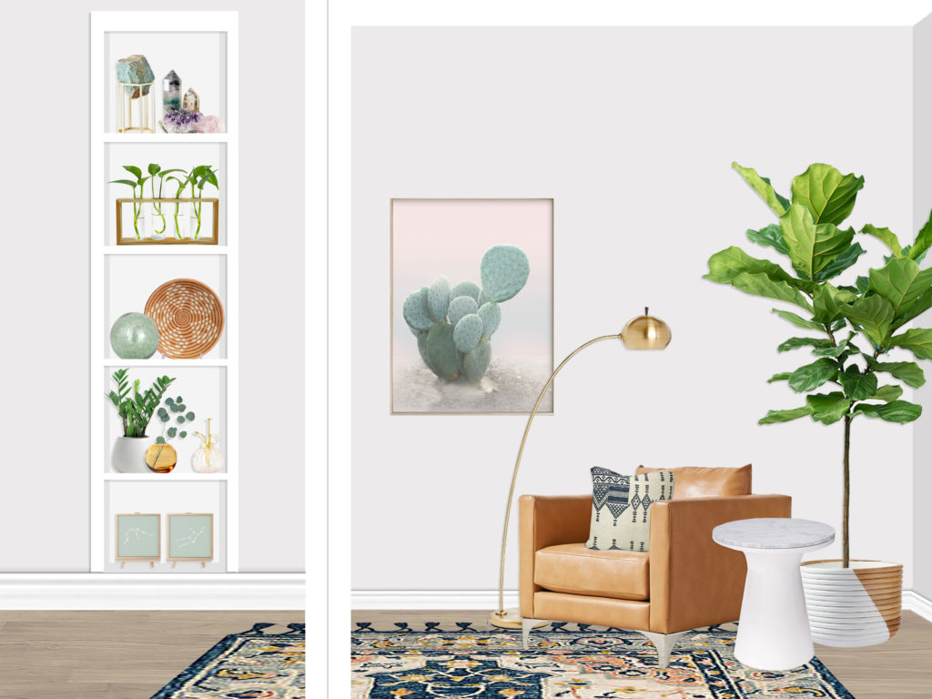
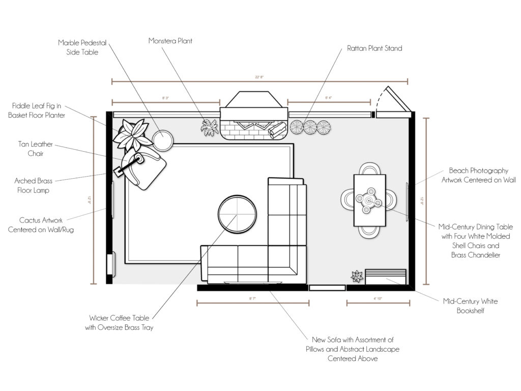
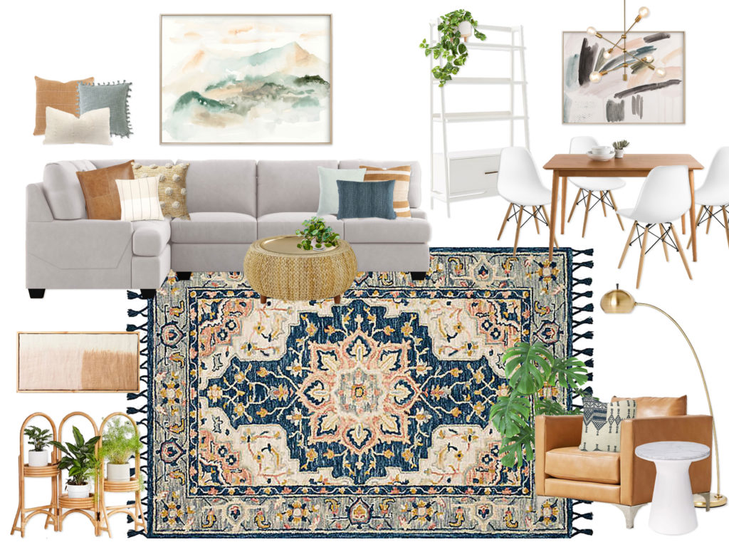
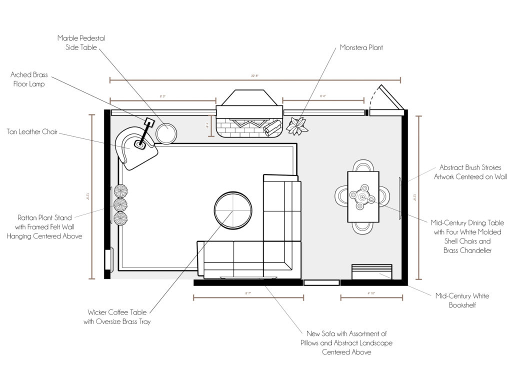
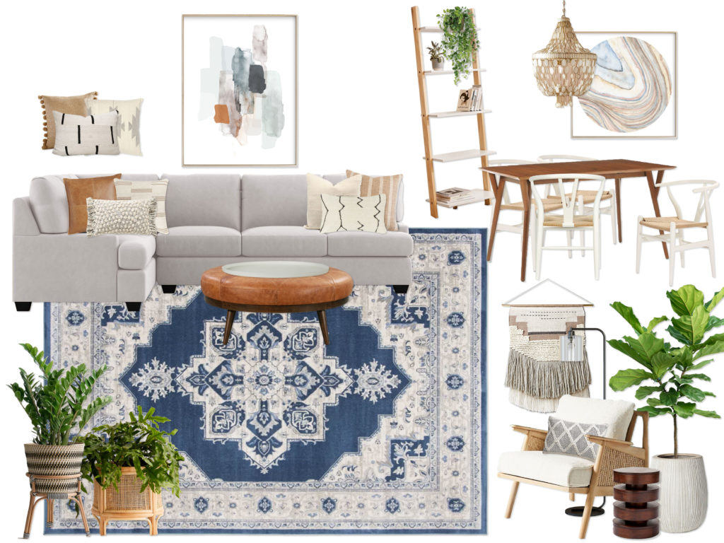
This client wanted to create a California Bohemian Mid-Century Modern inspired living area in their new home. The room had over 14 feet of window space (!!) on one wall, so the couple really wanted to focus the design around plants and greenery using mainly layered neutral tones with some pops of color (specifically in an amazing rug). They wanted the space to feel warm, cozy, and inviting, yet sophisticated and cohesive.


Concept 1: Sage & Saddle
(click image to enlarge)


Concept 2: Dynamic Neutrals with Mixed Woods & Woven Textures
(click image to enlarge)


Final Design Renderings
(click image to enlarge)


The client was so thrilled with concept 1 that we only made a couple small tweaks for the final design! It was a super fun project, and I am excited to be working on a master bedroom design with the same client.

If you are interested in working with me on a room, you can purchase a package on my Decorist page using my friends & family promo code ERIKADALE that allows you 30% off!

Have a great week ahead, friends! Stay safe & well.

Juniper’s Big Girl Room

Hello all! I hope everyone is staying safe and well out there… and STAYING HOME! We are living in strange and scary times, but I am trying to enjoy the little bubble of uninterrupted home and family life. Sure, there are days we feel a little stir crazy around here but we are generally homebodies anyway, so we like being home all together. The other silver lining is that we have been spending a lot more time and energy finally giving our house some attention for the first time since we moved in. Since we have no budget at all due to current circumstances, we are working entirely with what we already have to make our space feel more homey and happy.

One of the rooms that has been given very little attention since we moved in is Juniper’s room. While a lot of her stuff worked great in her nursery in our Pasadena apartment, for some reason a lot of it didn’t translate here as well. Or more likely we needed those things for other spots in the house because we came here with 820 square feet worth of stuff to try and fill a 2400 square foot house! We haven’t had the means to do any furniture shopping yet, so a lot of things are filling temporary roles in other rooms.
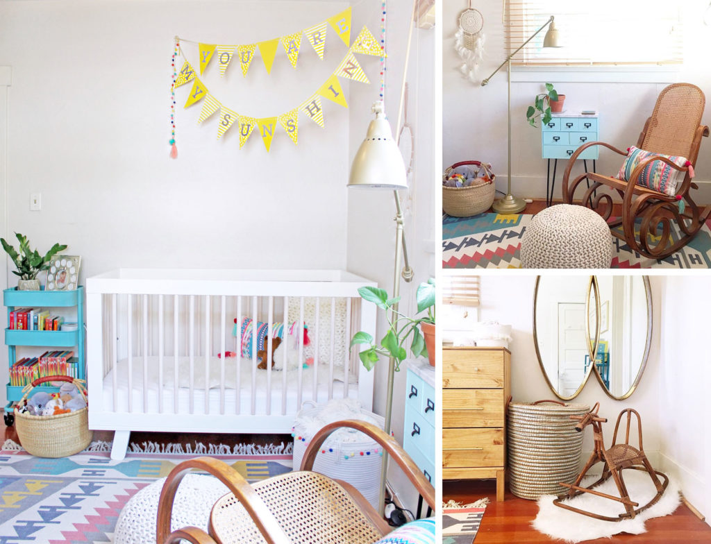
Remember Juniper’s cute little nursery in Pasadena? Loved that space!

Anyway, I digress. Back to Juniper. She has been going through some major “big girl” milestones lately, the newest of which was potty training (wooo! She did such a great job! If there is one thing quarantine is perfect for it’s potty training!). So when Photowall reached out to me a few weeks back, kindly offering to gift us an accent wall of wallpaper, I knew immediately that I wanted to give Juniper a big girl room makeover to celebrate all of her hard work and big milestones. I have always dreamed of doing a wall mural behind her crib, so I got incredibly excited to start designing! It took me a long time to pick out the mural (designer paralysis is a real thing, guys. When interior designers work on their own spaces, we CANNOT make up our minds. I am so decisive when it comes to clients but not when it comes to our house. Ask my poor husband… he finally made me start hanging a picture on the wall each day just to give me a deadline hahahaha!). I knew I wanted something nature-inspired, illustrated (rather than a photo), and not too childish (so it can grow with her). As soon as I saw the little bunnies at the bottom of this Forest wall mural, I knew it was perfect since Juniper is obsessed with bunnies.

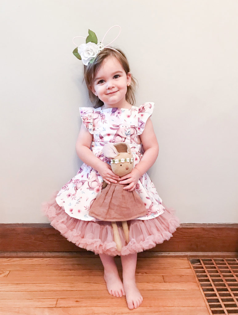
Case & point… her birthday bunny party from last year:
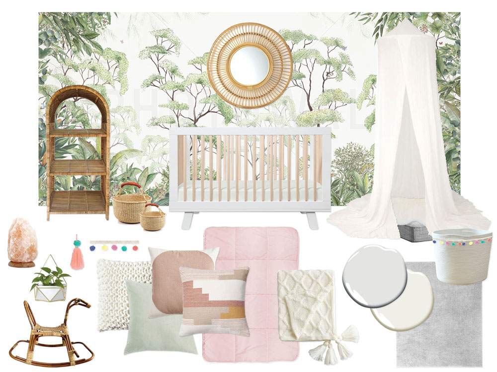
Once I had decided on the wall mural, the rest of the design was easy, mainly because we had no budget and planned to work almost entirely with what we already have! Here was my original idea mood board for the space:
And here is where we started when we moved in:
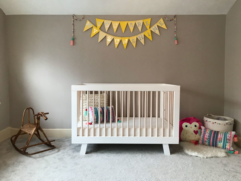
The “Before”… just super empty!

The wallpaper arrived, and I will admit that I was a bit intimidated at the prospect of installing it, especially as it was not pre-pasted paper. However, it came with really clear instructions and a wallpaper installation kit with all of the tools I needed… plus I watched this super helpful installation video like 100 times! I planned to share a little time lapse video with you of the installation but about 5 minutes before I planned to start (i.e. the paste was already setting up and there was no turning back), I managed to drop my phone in the toilet (uggghhhh!), so it spent the next two days in rice (it lived though!).

So my words will have to suffice haha! It wasn’t too difficult but it also wasn’t a walk in the park. Some things were really easy and straightforward, like the actual pasting, smoothing, etc. What was really tricky was getting the first panel hung level in our 110 year old very un-level house. I had to remove and readjust panels 1-3 three times just to get things going correctly. Ugh! But once that was done, the others were quite easy to line up and install. The only really big issue I had with installation were a couple of the seams at the very top. Since we have an angled ceiling, we had to tape the excess wallpaper to the ceiling because it kept trying to curl and fall down. So it was pulling away from the wall at the top 2 inches or so as I installed the rest of the panels. Once I trimmed the excess, I had to go back and re-paste the top few inches of all panels to get them to stick correctly. Oddly enough, this caused some annoying gaps at the top of some of the seams (how?! The rest of the seam is perfect so this makes no sense to me!). Only one is really visible but it is the one right in the center and on a pure white background so I can’t stop looking at it haha! Pro tip: murals and wallpaper with a lot of pattern hide seams WAY better than areas of solid color. Anyway, it’s not perfect but I am SO proud of the way it turned out!
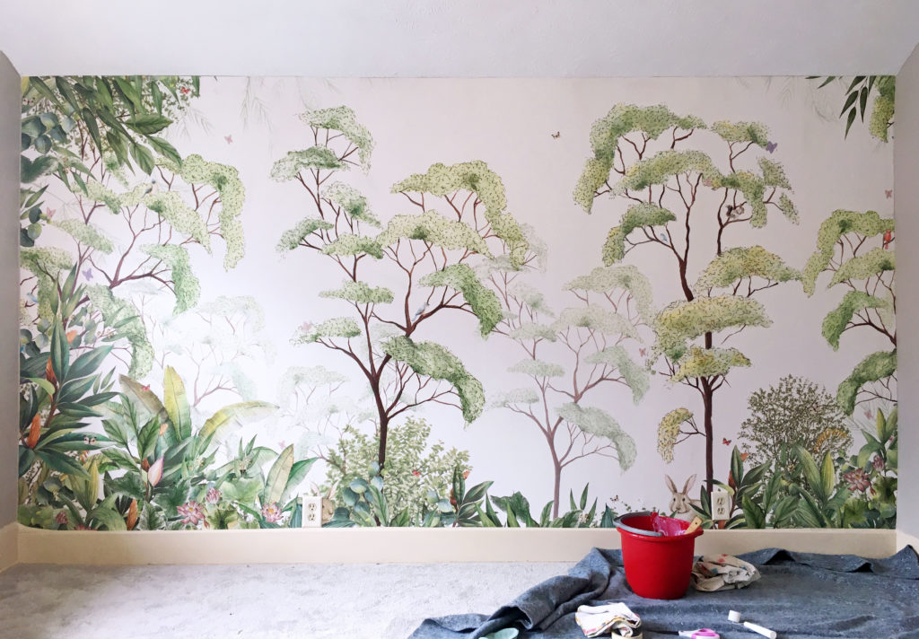
Once the wallpaper was up (phew!), the rest of the design was simply pulling from things we already had in the house! And so, the moment you’ve all been waiting for…
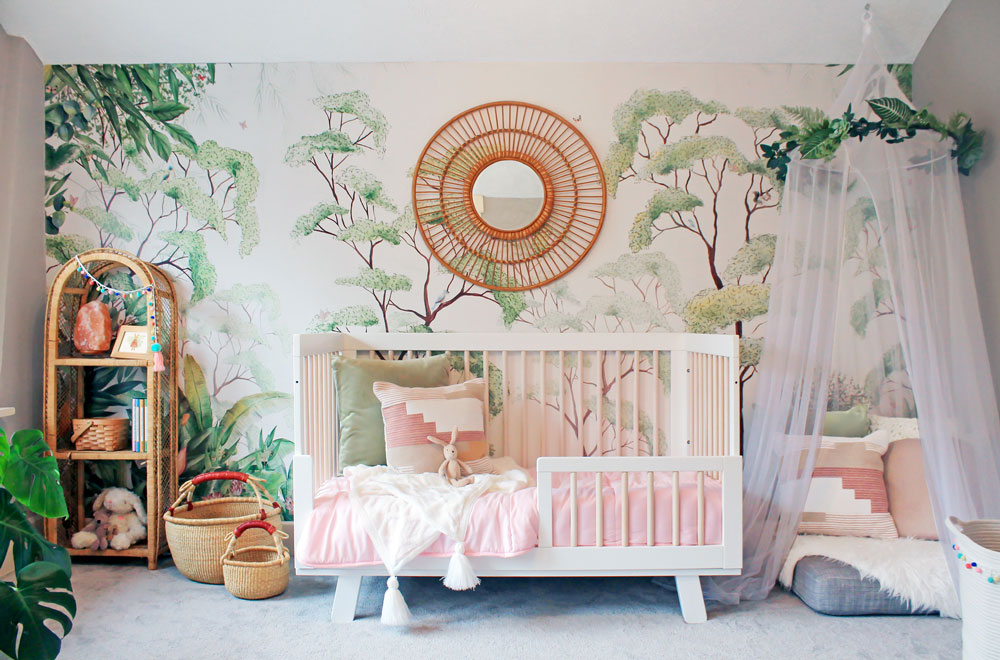
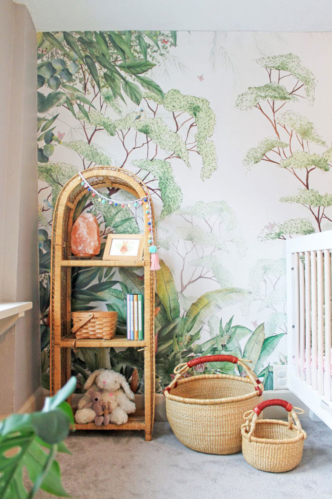
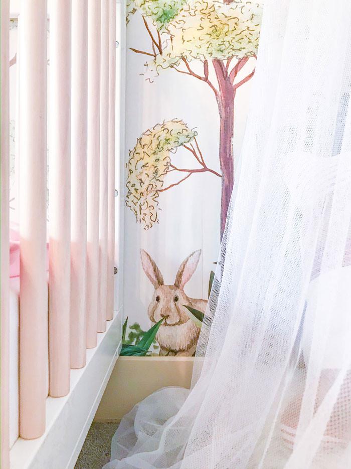
In case anyone was wondering where the bunny ended up! June loves that it is peeking out from between the crib and canopy tent! Not an accident, mind you. Math for the win.

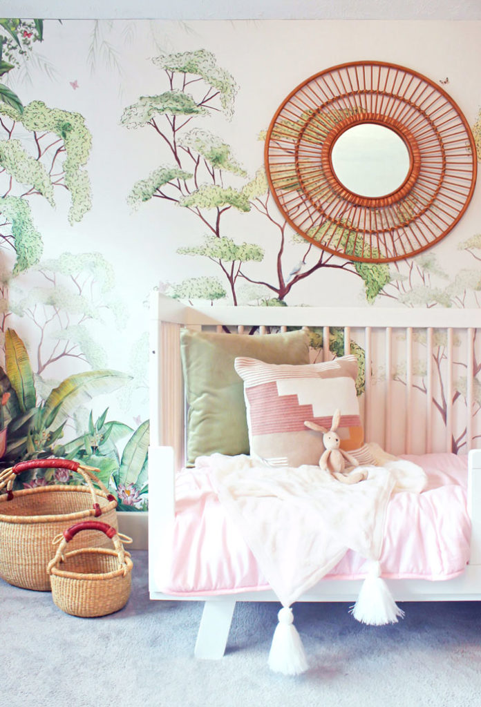
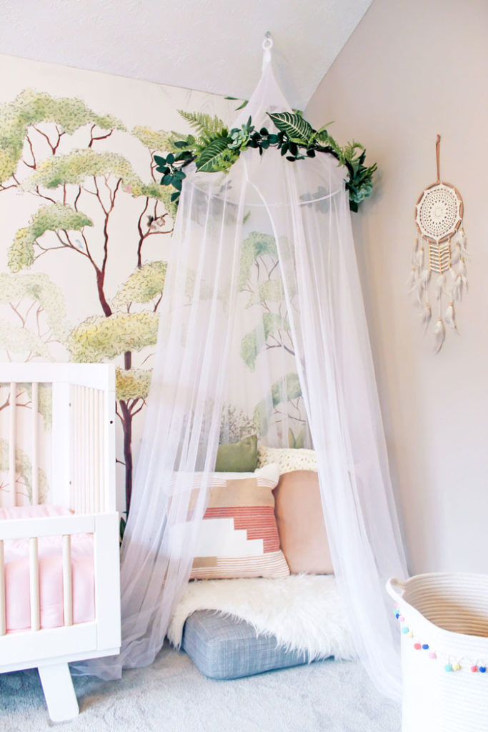
TA-DA! Juniper’s new big girl room! We are all so thrilled with her new magical forest space. As far as the details in the space, I bought the awesome vintage rattan shelf from my neighbor for $2 (!!) in the fall and a couple months later bought the secondhand canopy tent from another neighbor for $5! The canopy had a bunch of hot pink ribbons hanging off of it, and while it was cute, it wasn’t exactly what I was going for. So I removed them and repurposed the greenery garland from Juniper’s first birthday party to hang around the hoop. The mirror was thrifted for $4 but was originally from Target and, in my opinion, really completes the space! I really debated whether to put it up there because I didn’t want to put a hole in the beautiful wallpaper, but I couldn’t resist… and I am so happy I did it! The pillows and throw were all swapped out for ones we already had, most of which were originally from Target, Pier 1 (store closing sale – got a pillow and throw at 95% off or about $4 TOTAL for BOTH!!), or HomeGoods. Finally, we used an extra sofa cushion (since our whole sectional doesn’t fit in our new living room) for the floor cushion under the tent.

The only thing we bought new for this project was the new pink comforter for the bed. Until recently, Junie has been using a baby blanket but she had majorly outgrown it, feet sticking out and all! So we had plans to get her a real comforter anyway and when I found this one for only $20, I knew it was a perfect fit. So even if I include the secondhand/older purchases from the past few months into this budget, we made over this whole space for only $35!!! Insane.

That being said, the real star of the show here is the incredible wall mural, which was generously gifted by Photowall. They are such a cool company, focused on environmental and social responsibility issues related to the production of their products, which includes using natural biodegradable (or recycled) materials where possible, recycling all waste material, and printing to order (rather than stocking) to reduce waste in the first place. Plus, every purchase supports their work to plant 5000 trees every year in the area surrounding Lake Victoria in East Africa. As an environmentalist, this all makes me so happy and proud to support a company making efforts to take care of our Earth and take accountability for their environmental impacts. Plus, their vast catalog of options is GORGEOUS. It’s not my fault that it took me forever to choose haha! On top of their generous gift of our mural, Photowall has also kindly offered a discount code for my readers in case you also want to tackle a quarantine house project! Use code erikadale2020 to get 25% off of your purchase now through May 25, 2020. And definitely get the wallpaper hanging kit… lifesaver. Thank you times a million, Photowall!

I will leave you with a few photos of our big girl enjoying her new room in her Easter dress (also repurposed haha!) on Sunday! She’s so fun and free… right at home in her new wild forest. Have a great week!
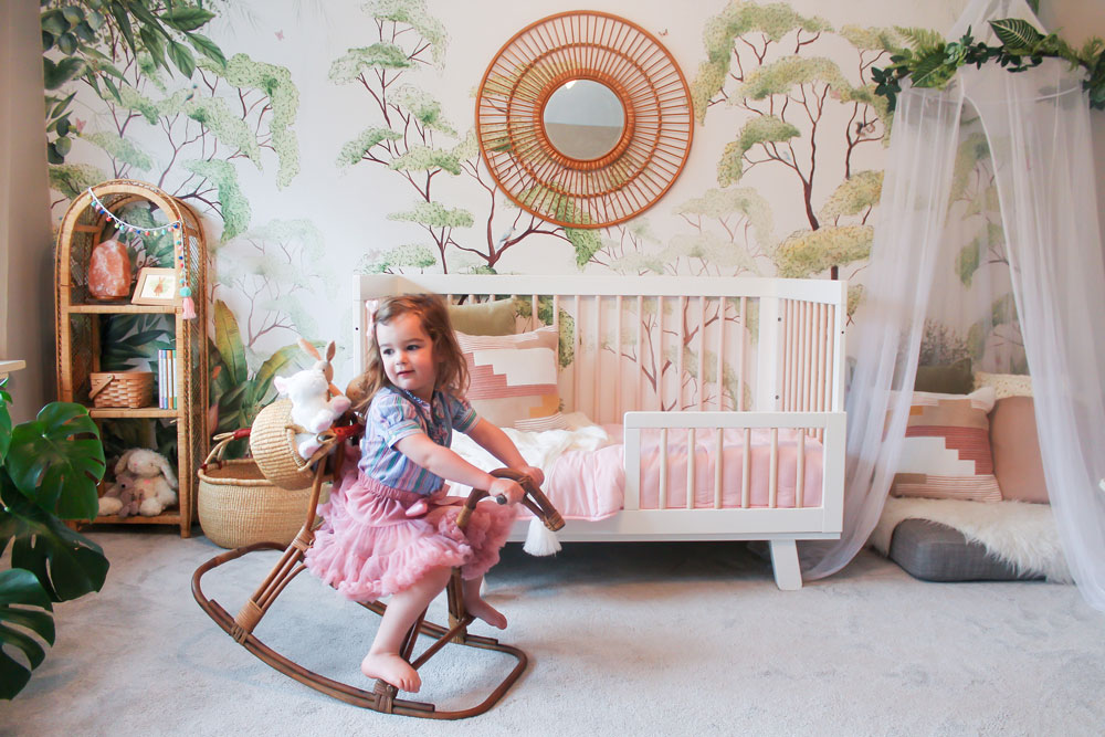
Riding her horse with a basket full of bunnies on the back. Typical.
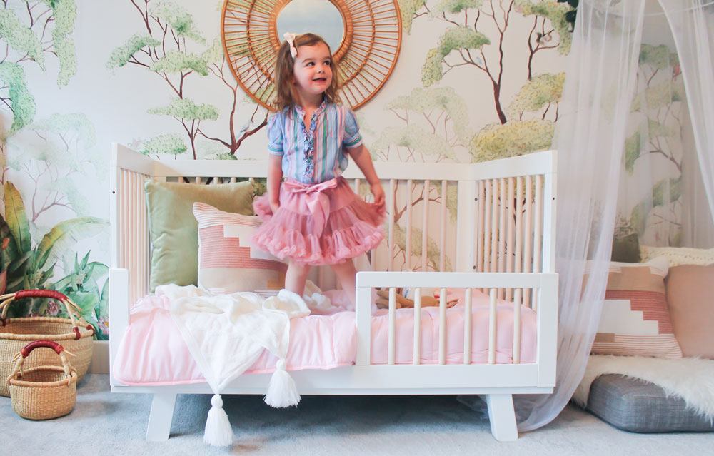
She looks SO big here!
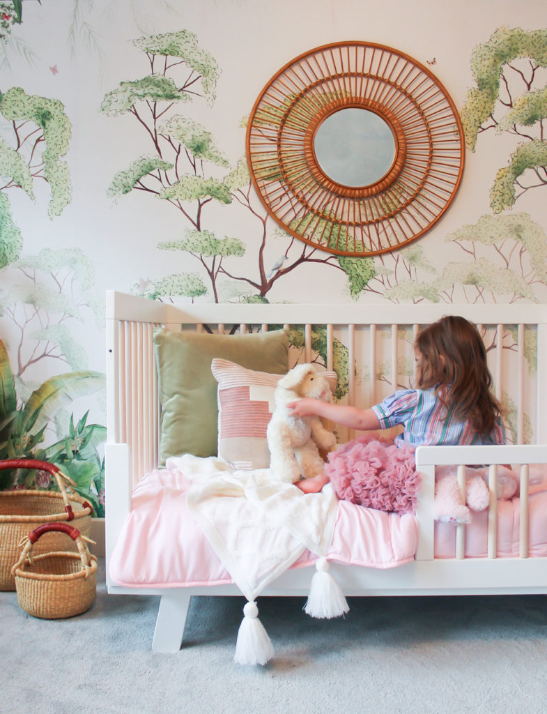
Such a sweetie.
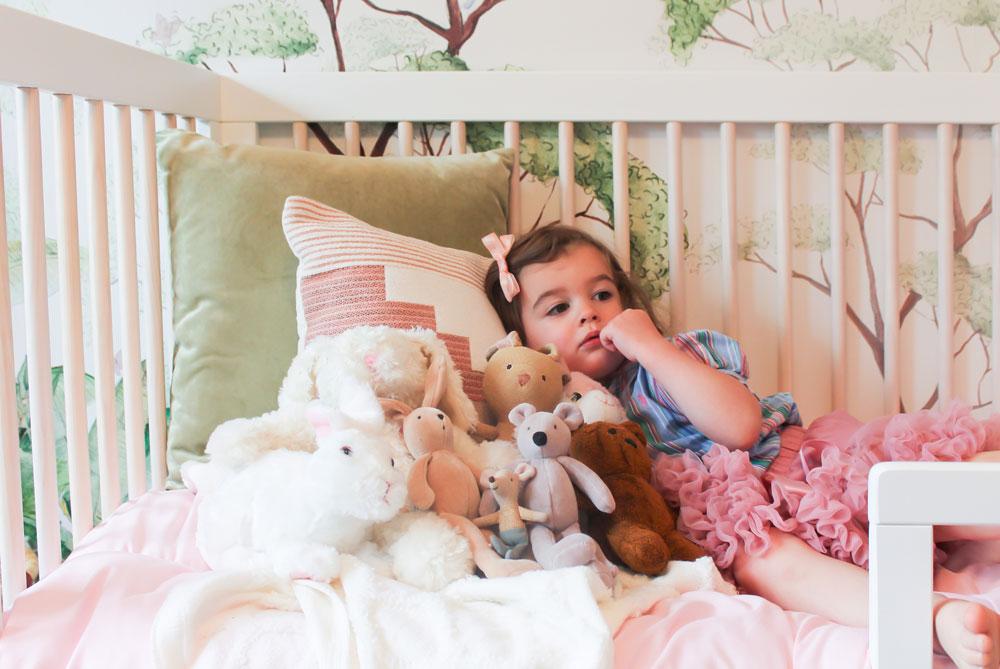
A more accurate number of bunnies and friends in reality!
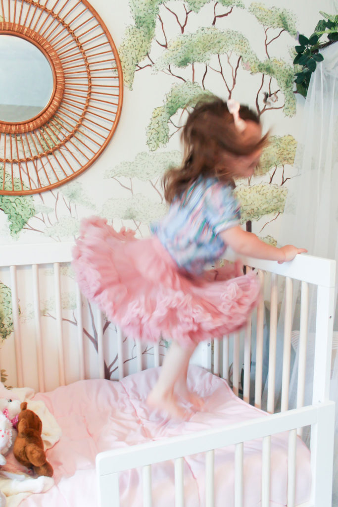
Love this little blur of a human!
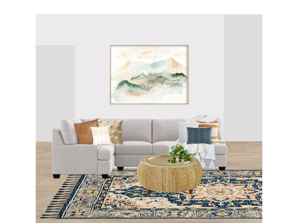
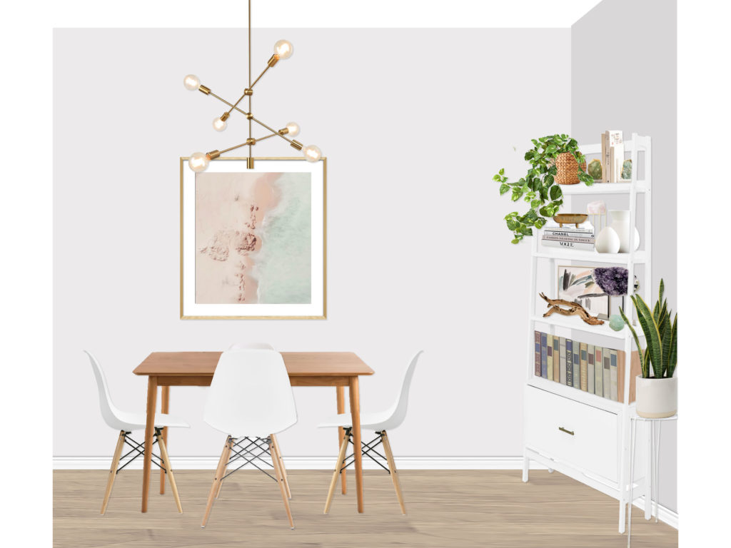
 

Decorist: DJ’s Den

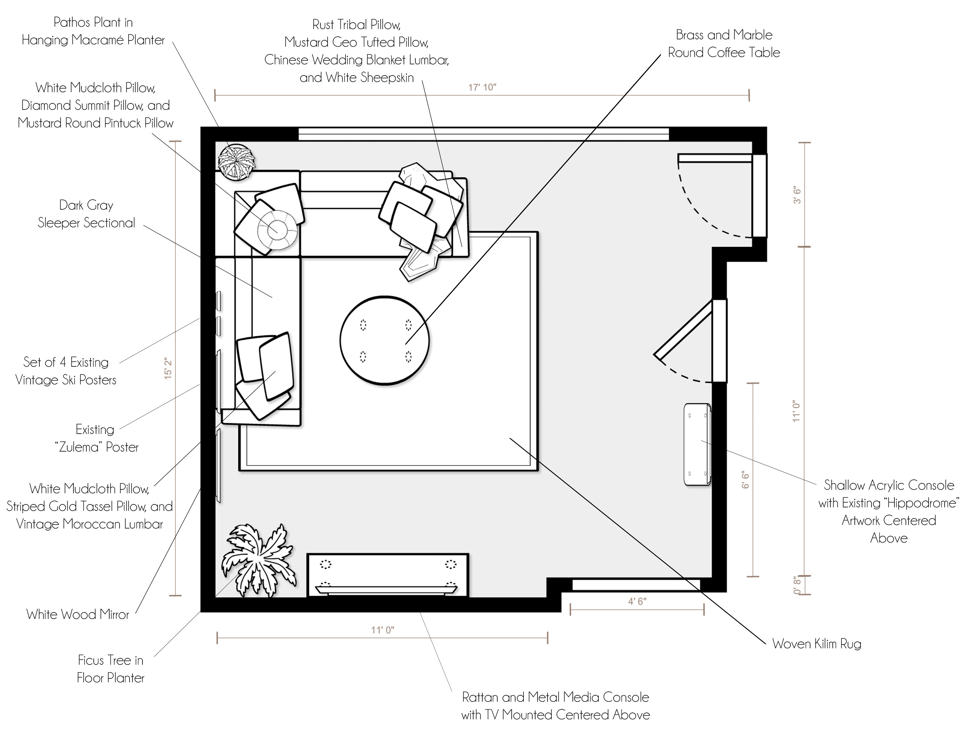
Happy Super Bowl Sunday! Our family has been crazy busy these past few weeks relocating to Lincoln, NE. Now that things are settling in a bit, I wanted to share a couple really fun projects I have been working on. The first is a den/tv room for my fantastic San Francisco client (we just finished designing her master suite!). She wanted to create a cozy, inviting TV room inspired by their existing fantastic vintage posters, complete with a fantastic sleeper sofa for when Grandma and Grandpa come to visit! Pulling the color palette from their artwork, I put together two fun, vibrant concepts for the space.

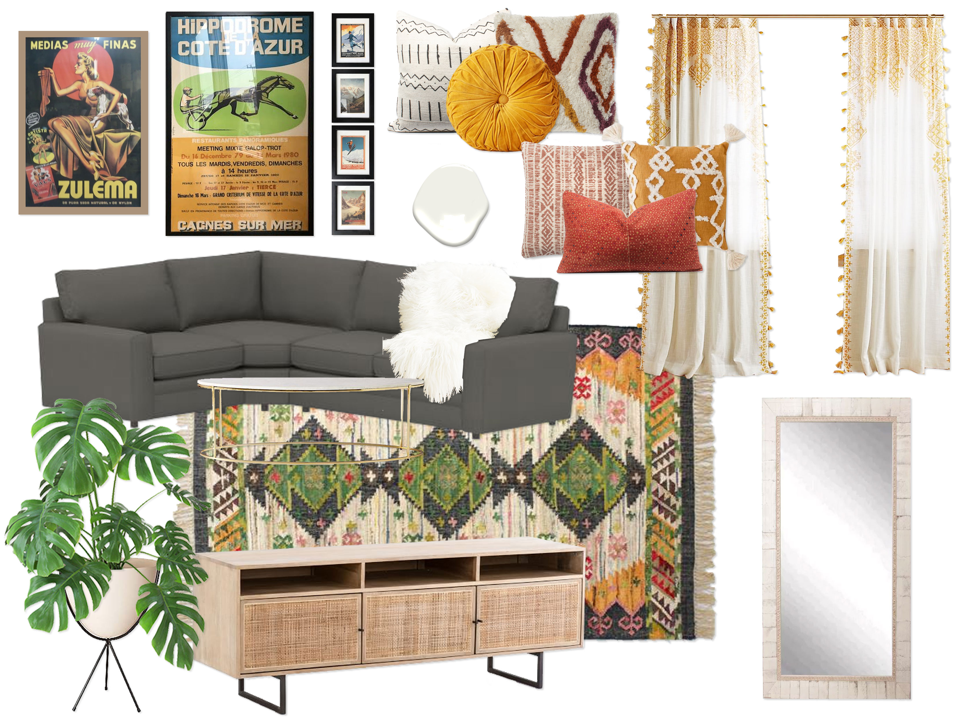
Concept 1: Mustard, Rust, Green, & Charcoal
(click image to enlarge)

“Inspired by your inspiration images with colorful yet sophisticated color palettes, this design embodies a fun, modern vibe with a hint of the bohemian spirit, complete with a beautiful color palette of mustard, rust, charcoal gray, green, and bright white, as well as natural wood tones and pops of black and brass. You’re existing Benjamin Moore White Dove walls are the perfect clean, fresh foundation to let the color palette really pop. In addition, bright white accents throughout make the room feel light and airy. The star of the show is the stunning green, charcoal, mustard, and rust kilim rug, which grounds and defined the space, giving it personality and defining the color palette. The perfect blend of cozy and sophisticated, a gorgeous charcoal boss tweed (a pet and kid friendly fabric) sleeper sectional is the ideal way to cozy up for a family movie night. Not only that, but the sectional provides a full-sized sleeper for when Grandma and Grandpa come to visit. Giving the room personality, coziness, and visual interest are the array amazing textured and mudcloth pillows in hues of white, rust, and mustard, as well as a white faux sheepskin throw draped over the sofa for an extra dose of hygge. A beautiful oval brass and marble coffee table floats in front of the sofa, and a gallery wall of your fantastic vintage posters is arranged centered on the sofa wall. Across from the sofa is a gorgeous rattan and black metal media console, perfect for storing all of your entertainment needs. Your existing TV is mounted centered above the console. To add a bit of lushness to the space, a monstera plant in a mid-century bullet planter with a black metal base dresses up the corner of the room next to the media console. Finishing off the space are luxurious floor-to-ceiling boho tassel drapes with a blackout liner and a lovely floor length white wood mirror for the convenience of your guests. This design walks the fine line between modern & eclectic, colorful & refined, sophisticated & fun, and luxurious & humble with an elegance that makes it a perfect oasis in your new home!”

Concept 2:Indigo, Denim, Mustard & Gray
(click image to enlarge)

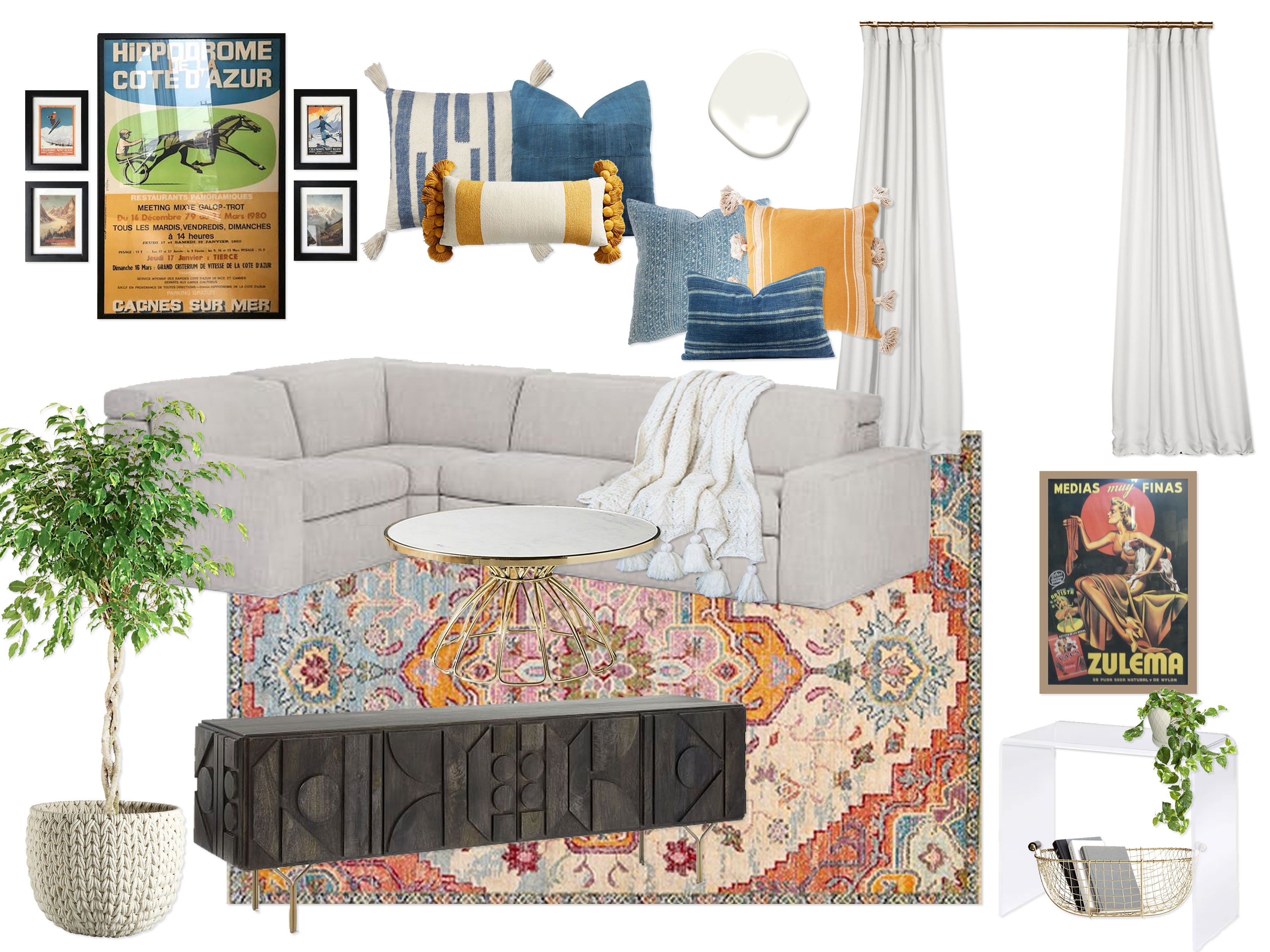
“Sparked by the gorgeous color palettes found in your existing artwork, this design embraces the elegance of indigo, washed denim blue, mustard, gray, and bright white, with pops of high contrast black, as well as metallic accents in brass. Once again, your existing wall color creates a serene and crisp backdrop for the dynamic color palette. Setting the groundwork for the layers of color, a fantastic medallion rug makes the room feel instantly alive. A clean, modern yet amazingly cozy gray sleeper sectional is inviting from the very start. It also functions as a full-sized sleeper for Grandma and Grandpa. The sofa is outfitted with the most amazing dyed indigo, washed denim, and mustard throw pillows, in addition to a soft white tassel throw blanket for layers of texture. Floating in front of the sofa is an elegant round brass and marble coffee table that gives the room a hint of glam and luxury. Centered above the sofa is a gallery wall of several of your vintage posters. On the wall opposite the sofa, a show-stopping carbon colored carved wood media console is drop dead gorgeous! It’s long, low silhouette is high-end and allows for a ton of storage. Your existing TV is centered above the console, and a ficus tree in a woven basket planter floats to the right. On the closet wall, right by the entry, there is a shallow clear acrylic console with waterfall edges. Centered above is one of your fantastic vintage posters, and floating below is a brass basket to hold extra pillows, books, etc. Finishing off the space are thick, elegant floor to ceiling white drapes to keep the room feeling spacious and airy. Cozy, fun, and complete with a punch of contrast and color, this elegant design creates a perfect area for your family and guests to relax.”

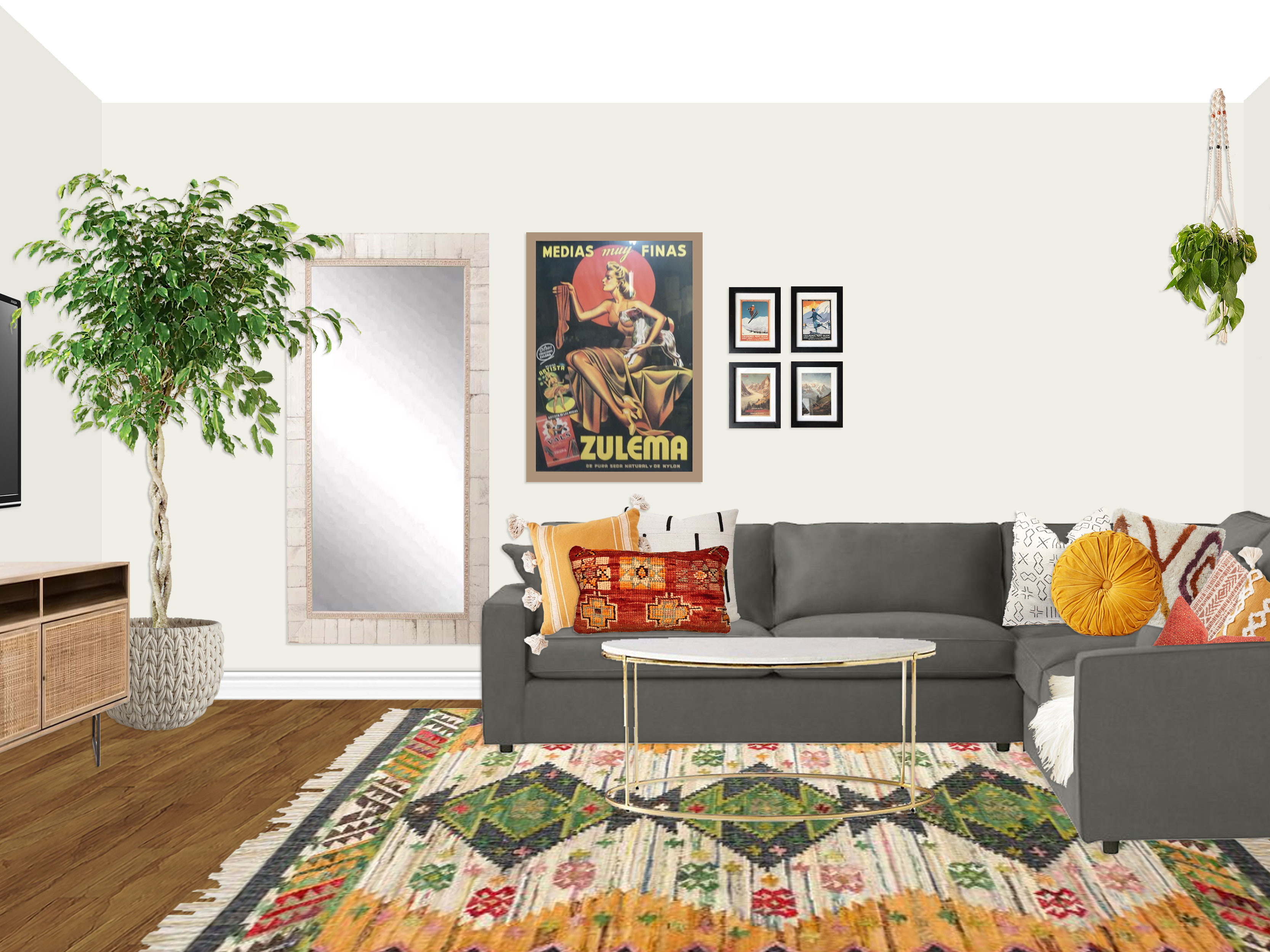
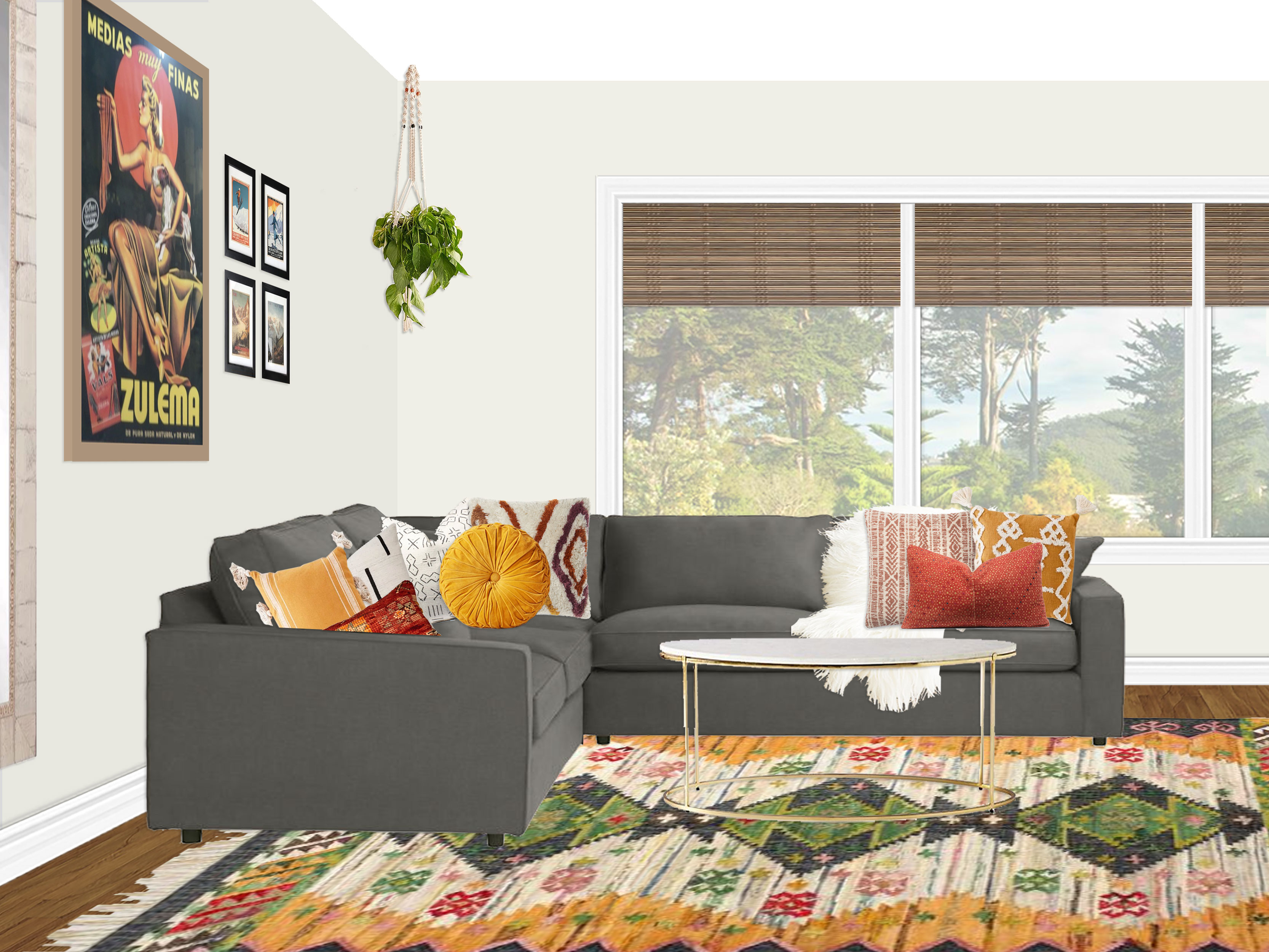
The client fell head-over-heels for concept 1! However, she loved the idea of the acrylic console from concept 2 right as you enter the room, so we relocated the full length mirror from concept 1 and worked in the console as well. Other than loving the concept 2 planter and opting for custom blinds instead of drapes, everything else from concept 1 was a go!

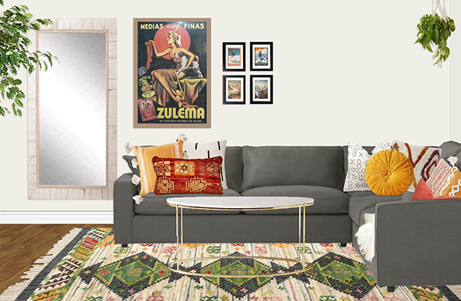
FINAL DESIGN
(click to enlarge image)

Setup Instructions:
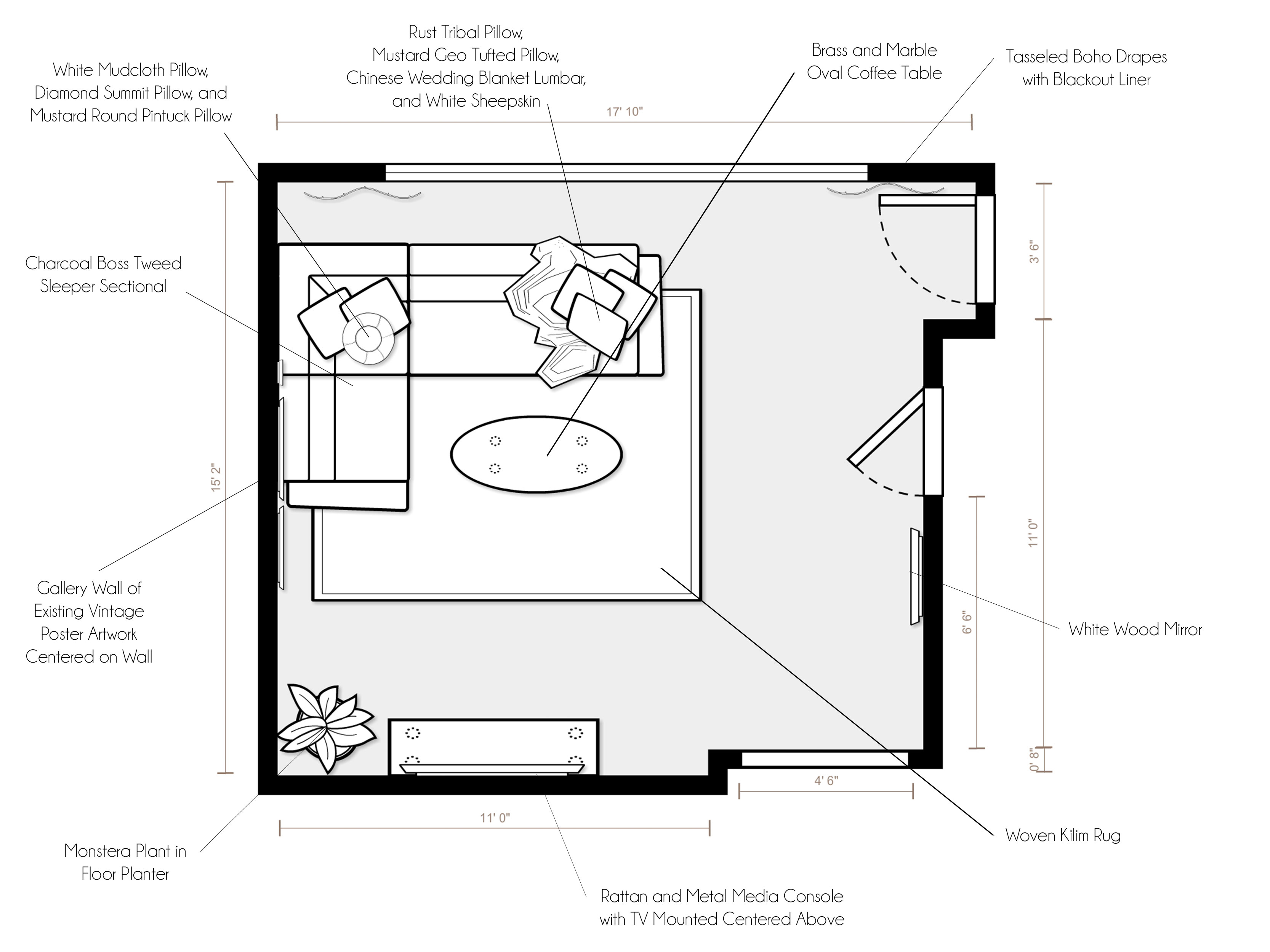
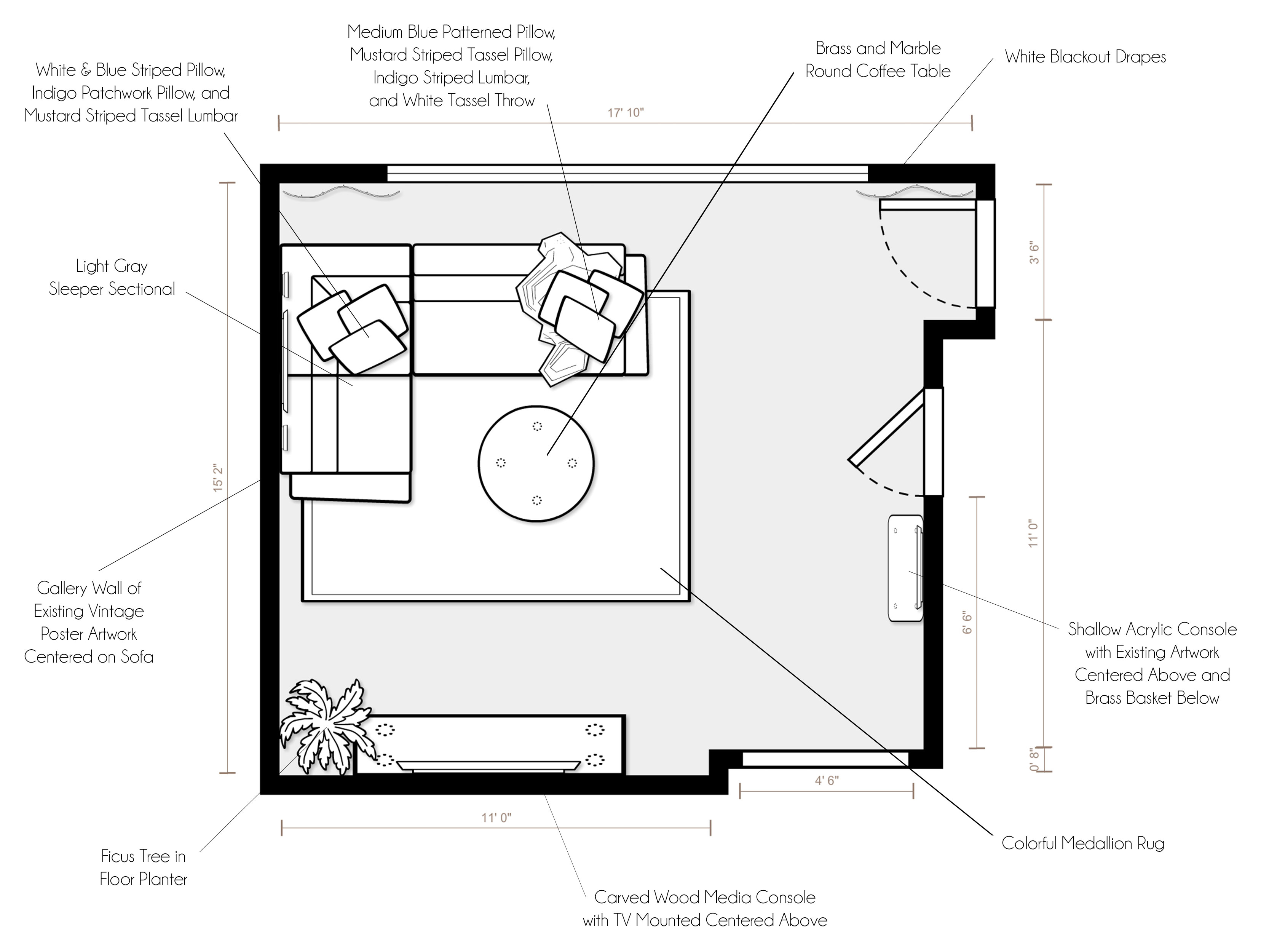
For specific product placement, please refer to your floor plan and renderings.

  • As you enter the den, a stunning acrylic console with waterfall edges floats (centered between the two switches on the closet wall) as a display area and drop zone. Your amazing “Hippodrome” vintage poster is centered above it, with the center of the artwork at about 57″ from the floor.
  • As you make your way into the main part of the space, the main piece of furniture is the incredible dark gray sleeper sectional in an L configuration (with the full-size sleeper extending towards the TV wall). The sofa should be placed about a foot or so from the window wall and an inch or so from the side wall, though use your judgement to adjust as needed in the space. This allows the sofa to be as far from the TV as possible so all seats have a good viewing angle, while allowing some breathing room in front of the window.
  • The show-stopper is the gorgeous Boho Woven Kilim rug in tones of rust, green, mustard, and charcoal. The rug grounds the space and floats under the sofa. In order to place it properly, I would line up the right edge with the bump out between the TV and entry door (so that it defines the space and does not intrude into the entry passage way. This will put the rug 12″ from the left side wall. From top to bottom, I would arrange the rug so that it sticks out beyond the sectional about 18″ towards the bottom/TV (see rendering for a visual).
  • Floating centered on both sides of the sectional is a lovely brass and marble round coffee table.
  • Giving the sofa personality, life and coziness, three pillows have been placed on each corner of the sectional (see renderings for placement) and a soft sheepskin has been draped over the back.
  • Inspiring the whole room, your existing “Zulema” and ski posters are placed over the sofa on the side wall. The artwork should be hung at 57″ on center, just like the “Hippodrome” piece so that they are properly floating above the sofa.
  • Next to the sofa is a convenient and beautiful white wood mirror to reflect light around the space, as well as so that your guests can check their outfits in the morning. The mirror should be lined up so that the top is at the same height as the top of the “Zulema” poster. It should have roughly the same amount of space between it and the “Zulema” poster as the “Zulema” poster has with the ski posters. Hold these up and use your judgement (and the renderings for reference) to get the exact side-to-side gap measurement.
  • On the wall opposite the window is a breathtaking rattan wood and metal media console, which is centered on the 68″ sleeper section of your sectional. It will not be perfectly centered on the 11′ TV wall, but rather cheated a bit toward the entry to allow for the best TV viewing angle for all seats (it will be about 70″ from the left side wall and 62″ from the bump out wall near the entry, depending on how far away from the side wall you float your sectional). You should be able to draw a line from the center of the sleeper sectional through the center of the coffee table to the center of the media console. This will make everything feel balanced.
  • In order to make sure the TV wall adjustment feels intentional and balanced, a ficus tree in a wonderful woven basket planter floats in the corner between the TV stand and mirror. Also bringing lushness and greenery to the space, a pathos plant is hung in the corner above the sectional in a macrame hanging planter.”

The client was thrilled with the final design and got her room all put together just in time for the new year! And as always, if anyone is interested in working with me on a room, you can purchase a package on my Decorist page using my friends & family promo code Designer233073 that allows you 30% off!
Have a wonderful Super Bowl Sunday, and I promise to post an update about our family soon! :)