Category Archives: E-Design

Decorist: DJ’s Den

Happy Super Bowl Sunday! Our family has been crazy busy these past few weeks relocating to Lincoln, NE. Now that things are settling in a bit, I wanted to share a couple really fun projects I have been working on. The first is a den/tv room for my fantastic San Francisco client (we just finished designing her master suite!). She wanted to create a cozy, inviting TV room inspired by their existing fantastic vintage posters, complete with a fantastic sleeper sofa for when Grandma and Grandpa come to visit! Pulling the color palette from their artwork, I put together two fun, vibrant concepts for the space.

Concept 1: Mustard, Rust, Green, & Charcoal
(click image to enlarge)
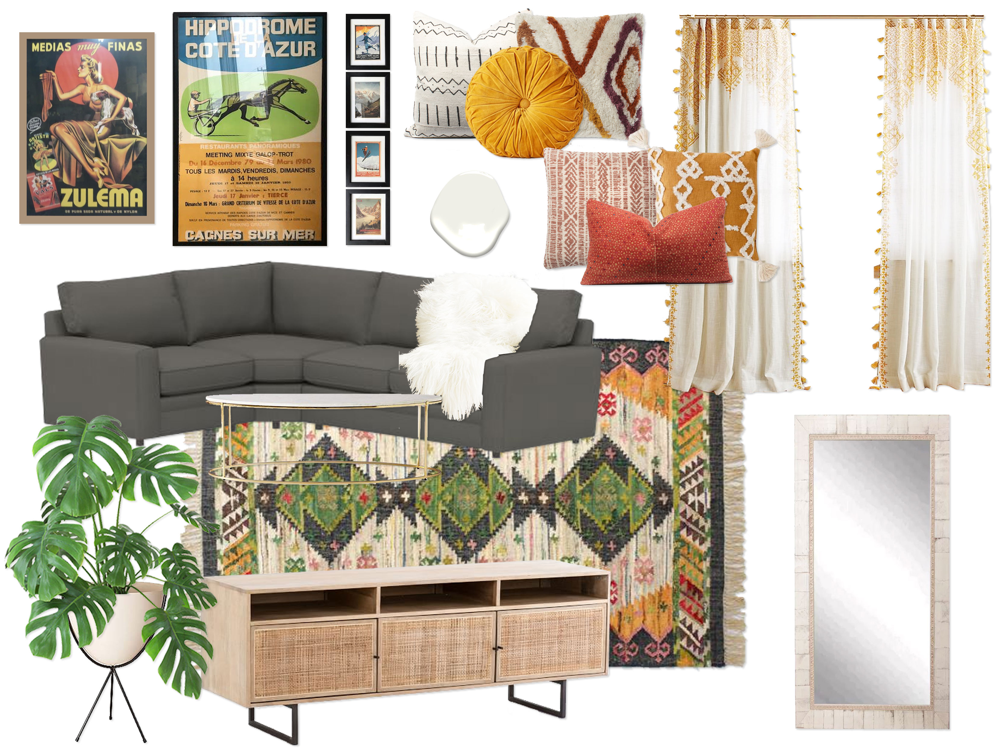
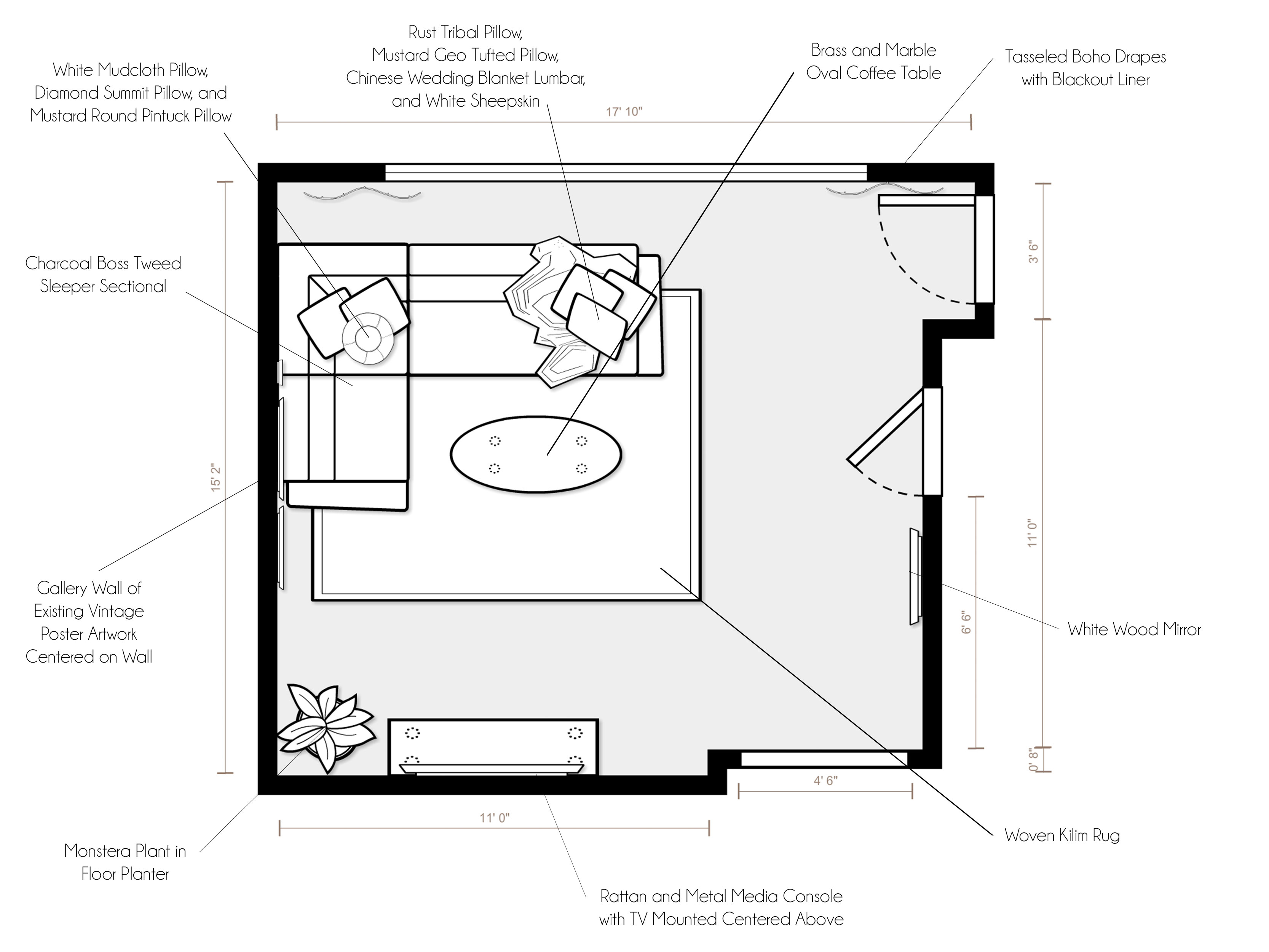
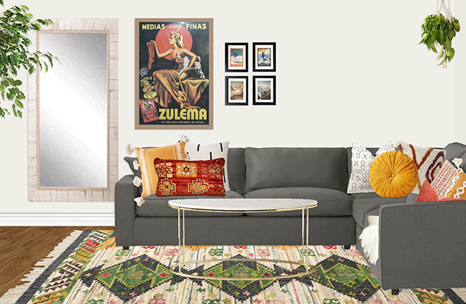
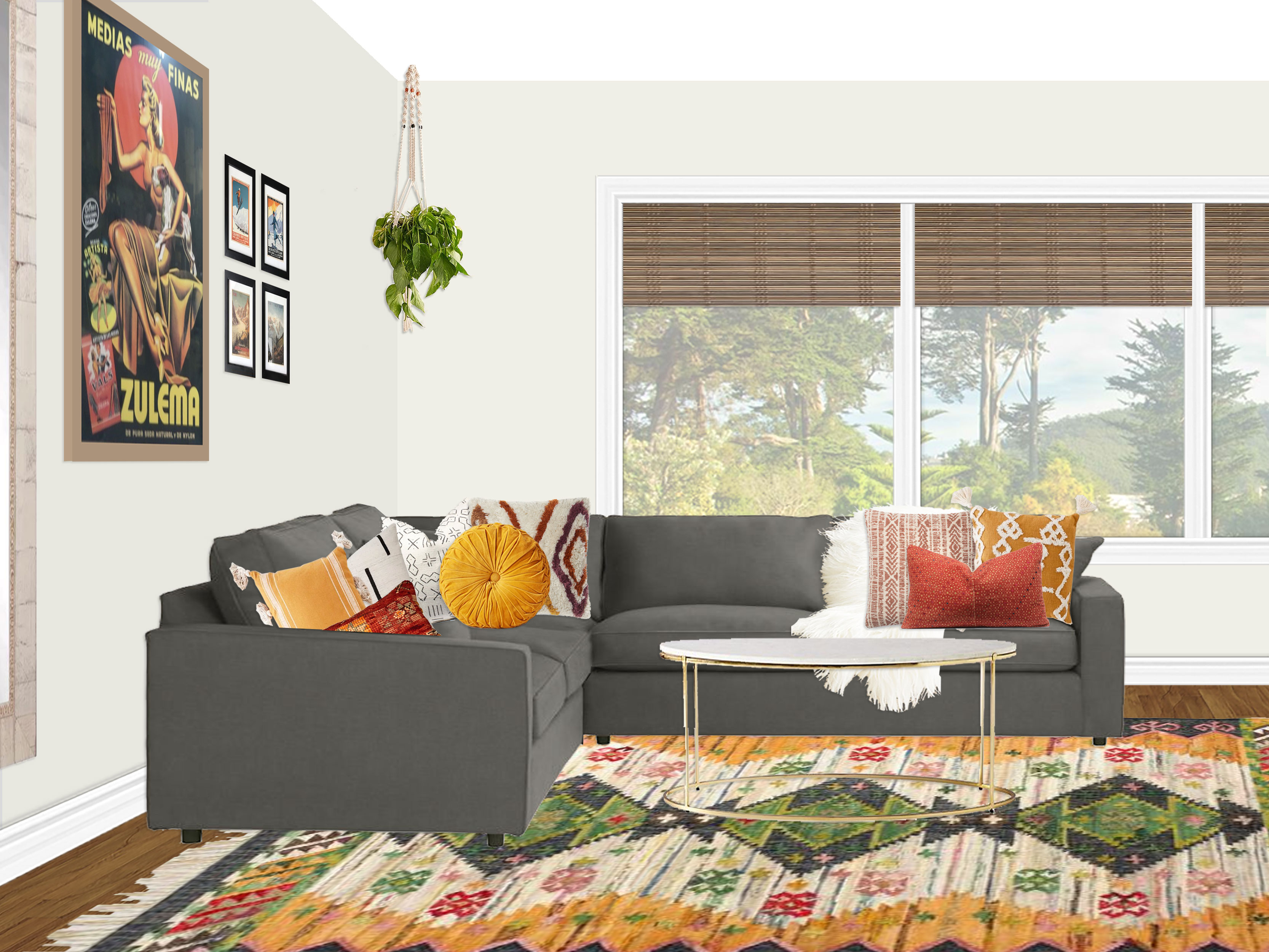
“Inspired by your inspiration images with colorful yet sophisticated color palettes, this design embodies a fun, modern vibe with a hint of the bohemian spirit, complete with a beautiful color palette of mustard, rust, charcoal gray, green, and bright white, as well as natural wood tones and pops of black and brass. You’re existing Benjamin Moore White Dove walls are the perfect clean, fresh foundation to let the color palette really pop. In addition, bright white accents throughout make the room feel light and airy. The star of the show is the stunning green, charcoal, mustard, and rust kilim rug, which grounds and defined the space, giving it personality and defining the color palette. The perfect blend of cozy and sophisticated, a gorgeous charcoal boss tweed (a pet and kid friendly fabric) sleeper sectional is the ideal way to cozy up for a family movie night. Not only that, but the sectional provides a full-sized sleeper for when Grandma and Grandpa come to visit. Giving the room personality, coziness, and visual interest are the array amazing textured and mudcloth pillows in hues of white, rust, and mustard, as well as a white faux sheepskin throw draped over the sofa for an extra dose of hygge. A beautiful oval brass and marble coffee table floats in front of the sofa, and a gallery wall of your fantastic vintage posters is arranged centered on the sofa wall. Across from the sofa is a gorgeous rattan and black metal media console, perfect for storing all of your entertainment needs. Your existing TV is mounted centered above the console. To add a bit of lushness to the space, a monstera plant in a mid-century bullet planter with a black metal base dresses up the corner of the room next to the media console. Finishing off the space are luxurious floor-to-ceiling boho tassel drapes with a blackout liner and a lovely floor length white wood mirror for the convenience of your guests. This design walks the fine line between modern & eclectic, colorful & refined, sophisticated & fun, and luxurious & humble with an elegance that makes it a perfect oasis in your new home!”

Concept 2:Indigo, Denim, Mustard & Gray
(click image to enlarge)
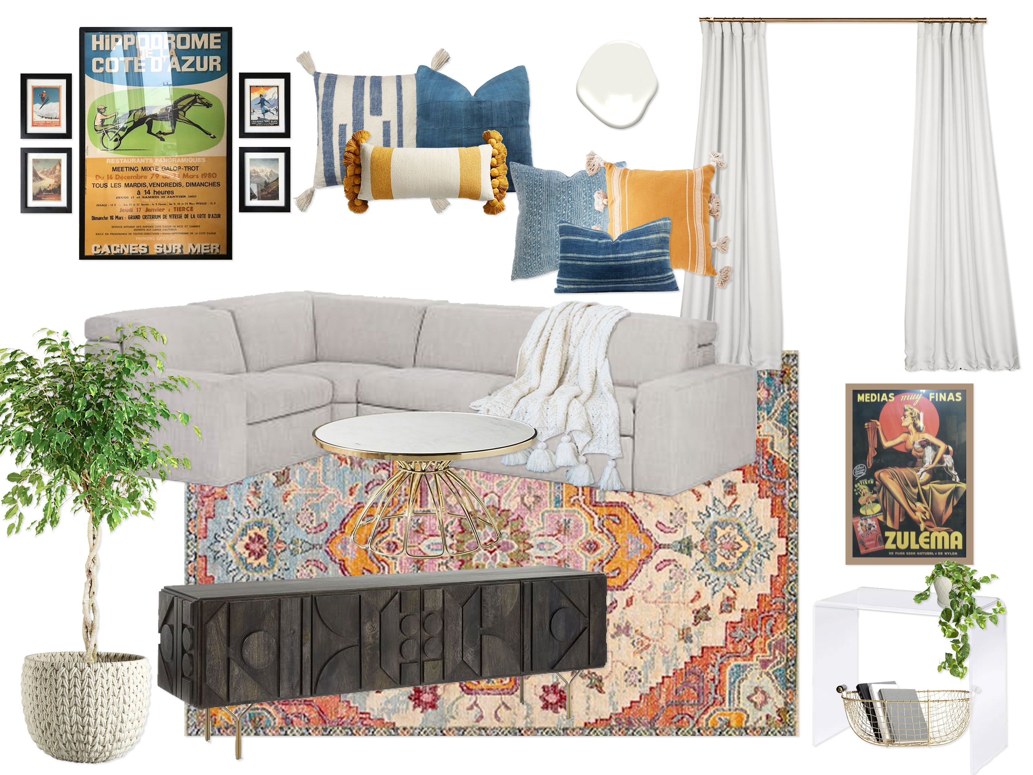
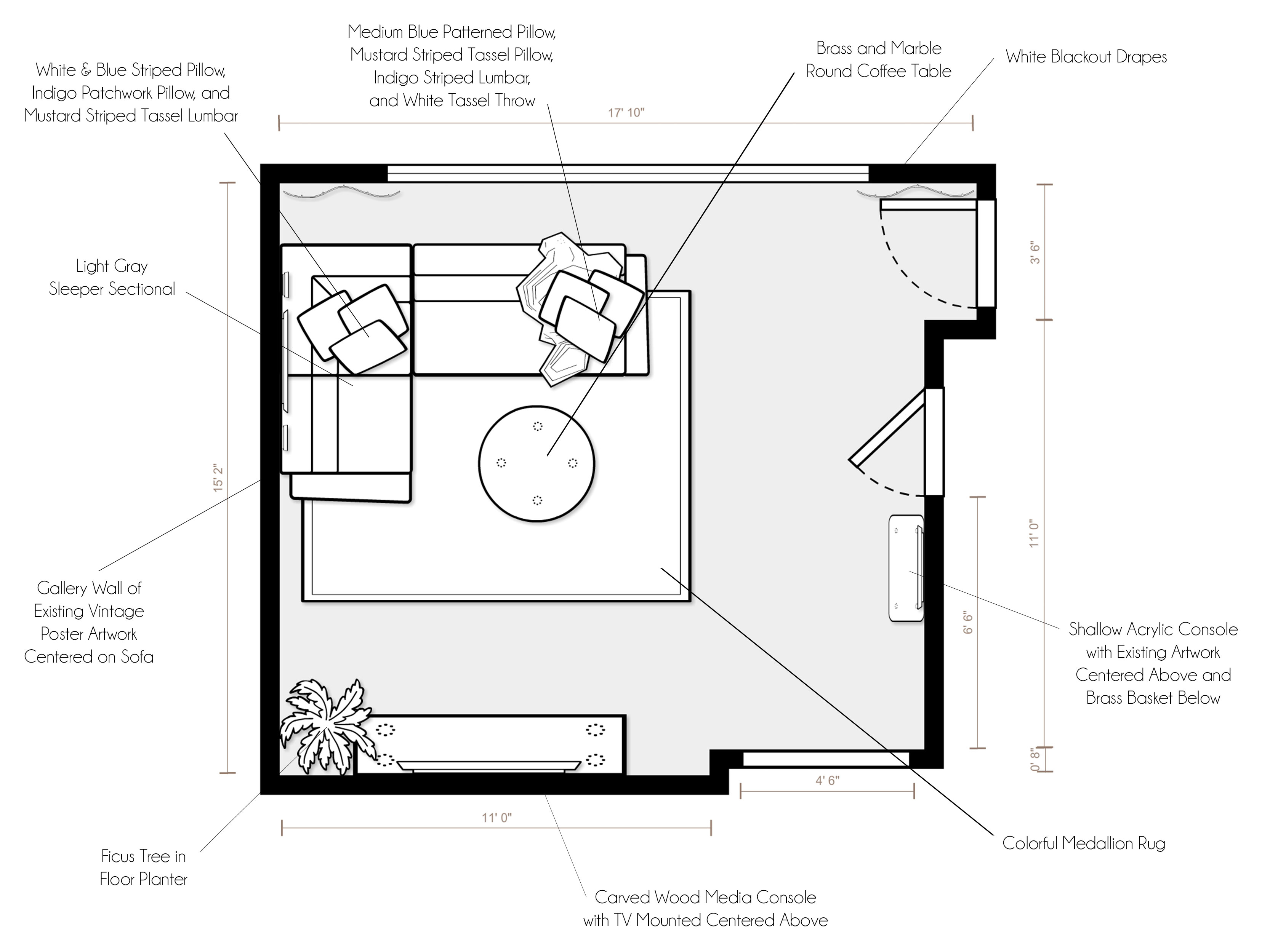
“Sparked by the gorgeous color palettes found in your existing artwork, this design embraces the elegance of indigo, washed denim blue, mustard, gray, and bright white, with pops of high contrast black, as well as metallic accents in brass. Once again, your existing wall color creates a serene and crisp backdrop for the dynamic color palette. Setting the groundwork for the layers of color, a fantastic medallion rug makes the room feel instantly alive. A clean, modern yet amazingly cozy gray sleeper sectional is inviting from the very start. It also functions as a full-sized sleeper for Grandma and Grandpa. The sofa is outfitted with the most amazing dyed indigo, washed denim, and mustard throw pillows, in addition to a soft white tassel throw blanket for layers of texture. Floating in front of the sofa is an elegant round brass and marble coffee table that gives the room a hint of glam and luxury. Centered above the sofa is a gallery wall of several of your vintage posters. On the wall opposite the sofa, a show-stopping carbon colored carved wood media console is drop dead gorgeous! It’s long, low silhouette is high-end and allows for a ton of storage. Your existing TV is centered above the console, and a ficus tree in a woven basket planter floats to the right. On the closet wall, right by the entry, there is a shallow clear acrylic console with waterfall edges. Centered above is one of your fantastic vintage posters, and floating below is a brass basket to hold extra pillows, books, etc. Finishing off the space are thick, elegant floor to ceiling white drapes to keep the room feeling spacious and airy. Cozy, fun, and complete with a punch of contrast and color, this elegant design creates a perfect area for your family and guests to relax.”

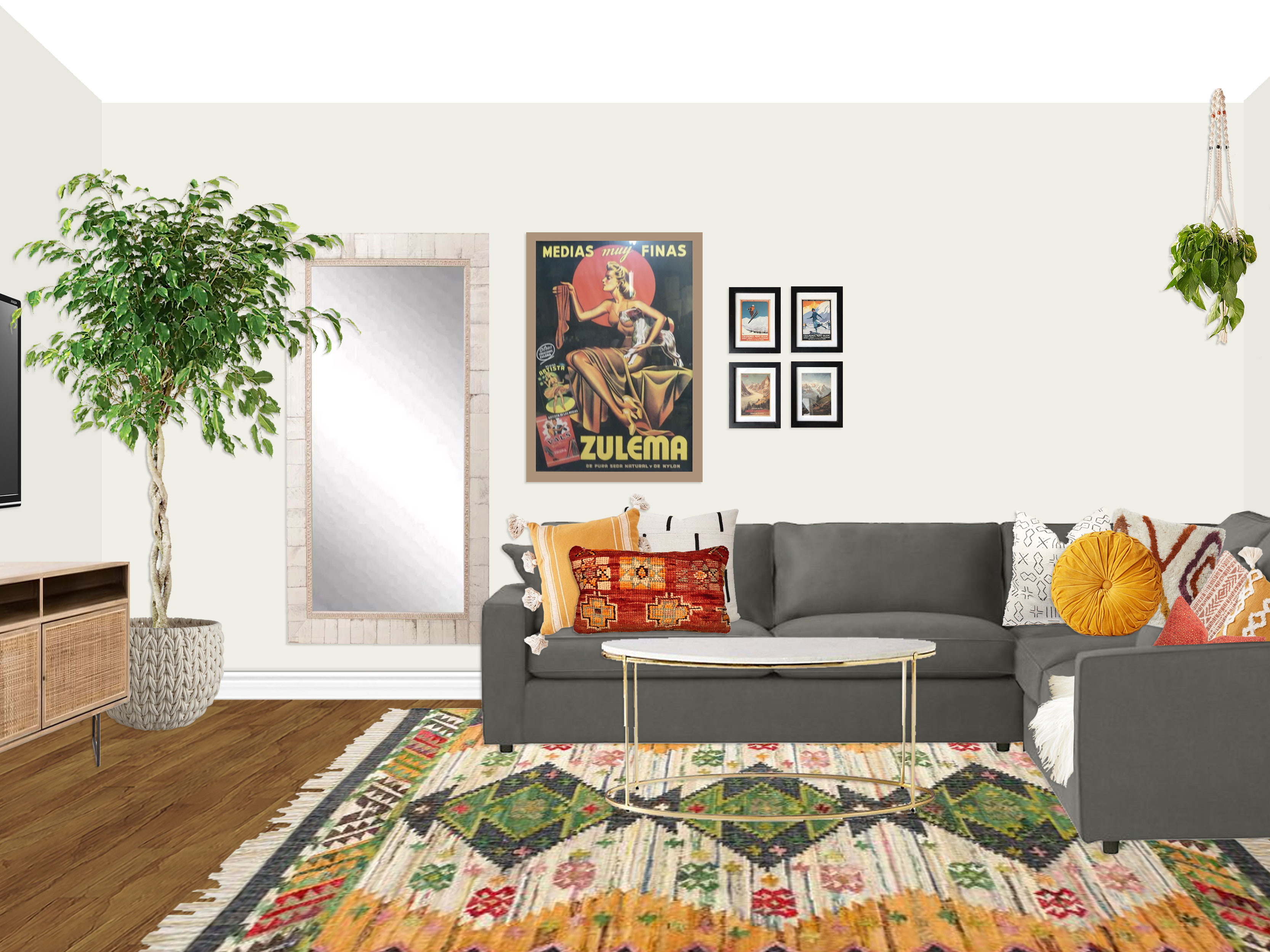
The client fell head-over-heels for concept 1! However, she loved the idea of the acrylic console from concept 2 right as you enter the room, so we relocated the full length mirror from concept 1 and worked in the console as well. Other than loving the concept 2 planter and opting for custom blinds instead of drapes, everything else from concept 1 was a go!

FINAL DESIGN
(click to enlarge image)
Setup Instructions:
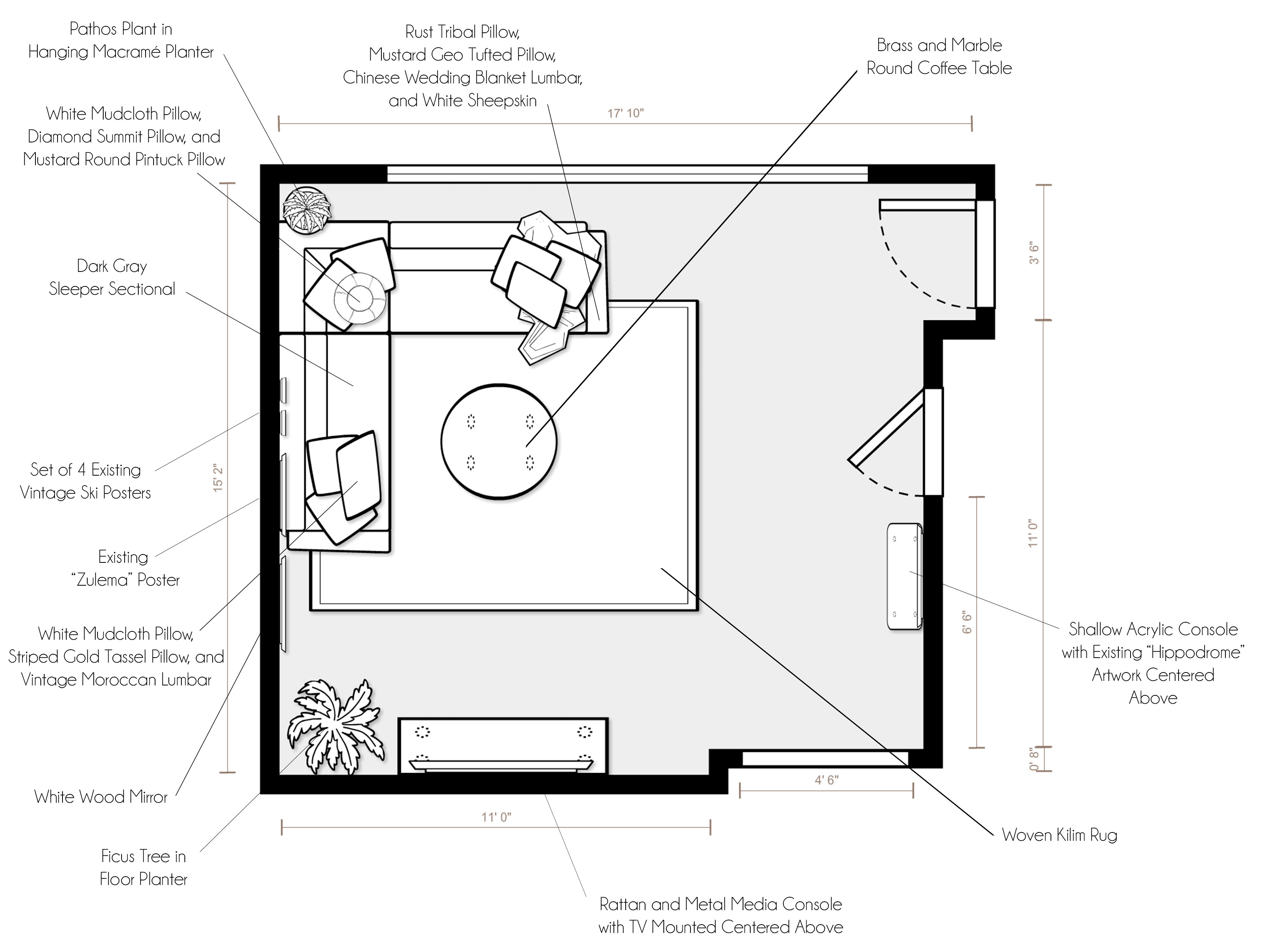
For specific product placement, please refer to your floor plan and renderings.

  • As you enter the den, a stunning acrylic console with waterfall edges floats (centered between the two switches on the closet wall) as a display area and drop zone. Your amazing “Hippodrome” vintage poster is centered above it, with the center of the artwork at about 57″ from the floor.
  • As you make your way into the main part of the space, the main piece of furniture is the incredible dark gray sleeper sectional in an L configuration (with the full-size sleeper extending towards the TV wall). The sofa should be placed about a foot or so from the window wall and an inch or so from the side wall, though use your judgement to adjust as needed in the space. This allows the sofa to be as far from the TV as possible so all seats have a good viewing angle, while allowing some breathing room in front of the window.
  • The show-stopper is the gorgeous Boho Woven Kilim rug in tones of rust, green, mustard, and charcoal. The rug grounds the space and floats under the sofa. In order to place it properly, I would line up the right edge with the bump out between the TV and entry door (so that it defines the space and does not intrude into the entry passage way. This will put the rug 12″ from the left side wall. From top to bottom, I would arrange the rug so that it sticks out beyond the sectional about 18″ towards the bottom/TV (see rendering for a visual).
  • Floating centered on both sides of the sectional is a lovely brass and marble round coffee table.
  • Giving the sofa personality, life and coziness, three pillows have been placed on each corner of the sectional (see renderings for placement) and a soft sheepskin has been draped over the back.
  • Inspiring the whole room, your existing “Zulema” and ski posters are placed over the sofa on the side wall. The artwork should be hung at 57″ on center, just like the “Hippodrome” piece so that they are properly floating above the sofa.
  • Next to the sofa is a convenient and beautiful white wood mirror to reflect light around the space, as well as so that your guests can check their outfits in the morning. The mirror should be lined up so that the top is at the same height as the top of the “Zulema” poster. It should have roughly the same amount of space between it and the “Zulema” poster as the “Zulema” poster has with the ski posters. Hold these up and use your judgement (and the renderings for reference) to get the exact side-to-side gap measurement.
  • On the wall opposite the window is a breathtaking rattan wood and metal media console, which is centered on the 68″ sleeper section of your sectional. It will not be perfectly centered on the 11′ TV wall, but rather cheated a bit toward the entry to allow for the best TV viewing angle for all seats (it will be about 70″ from the left side wall and 62″ from the bump out wall near the entry, depending on how far away from the side wall you float your sectional). You should be able to draw a line from the center of the sleeper sectional through the center of the coffee table to the center of the media console. This will make everything feel balanced.
  • In order to make sure the TV wall adjustment feels intentional and balanced, a ficus tree in a wonderful woven basket planter floats in the corner between the TV stand and mirror. Also bringing lushness and greenery to the space, a pathos plant is hung in the corner above the sectional in a macrame hanging planter.”

The client was thrilled with the final design and got her room all put together just in time for the new year! And as always, if anyone is interested in working with me on a room, you can purchase a package on my Decorist page using my friends & family promo code Designer233073 that allows you 30% off!
Have a wonderful Super Bowl Sunday, and I promise to post an update about our family soon! :)


Decorist: Michael’s Office & Guest Room

Happy Friday! I hope everyone is excited and gearing up for the holidays! As I mentioned on Instagram, we are in the process of moving so we plan to have a quiet Christmas here in LA before hitting the road to Lincoln, NE. Once things settle down, I promise to post all about this transition for our family. But in the meantime, I wanted to share some work I have been doing in the meantime!

I had a great client, Michael, last month that wanted a clean, bright, uncluttered home office space (for occasional work-from-home use) and comfortable guest room. He and his wife wanted a base of bright whites to make the space feel clean and fresh, while also acting as a great backdrop for some pops of color. They were open to many color palettes and ideas, so I chose to do two fairly different concept ideas to see what struck a chord with them. With only a queen mattress, the room was a blank slate waiting for us to bring it to life!

Concept 1: White with Natural Wood and Layered Soft Colors

(click image to enlarge)


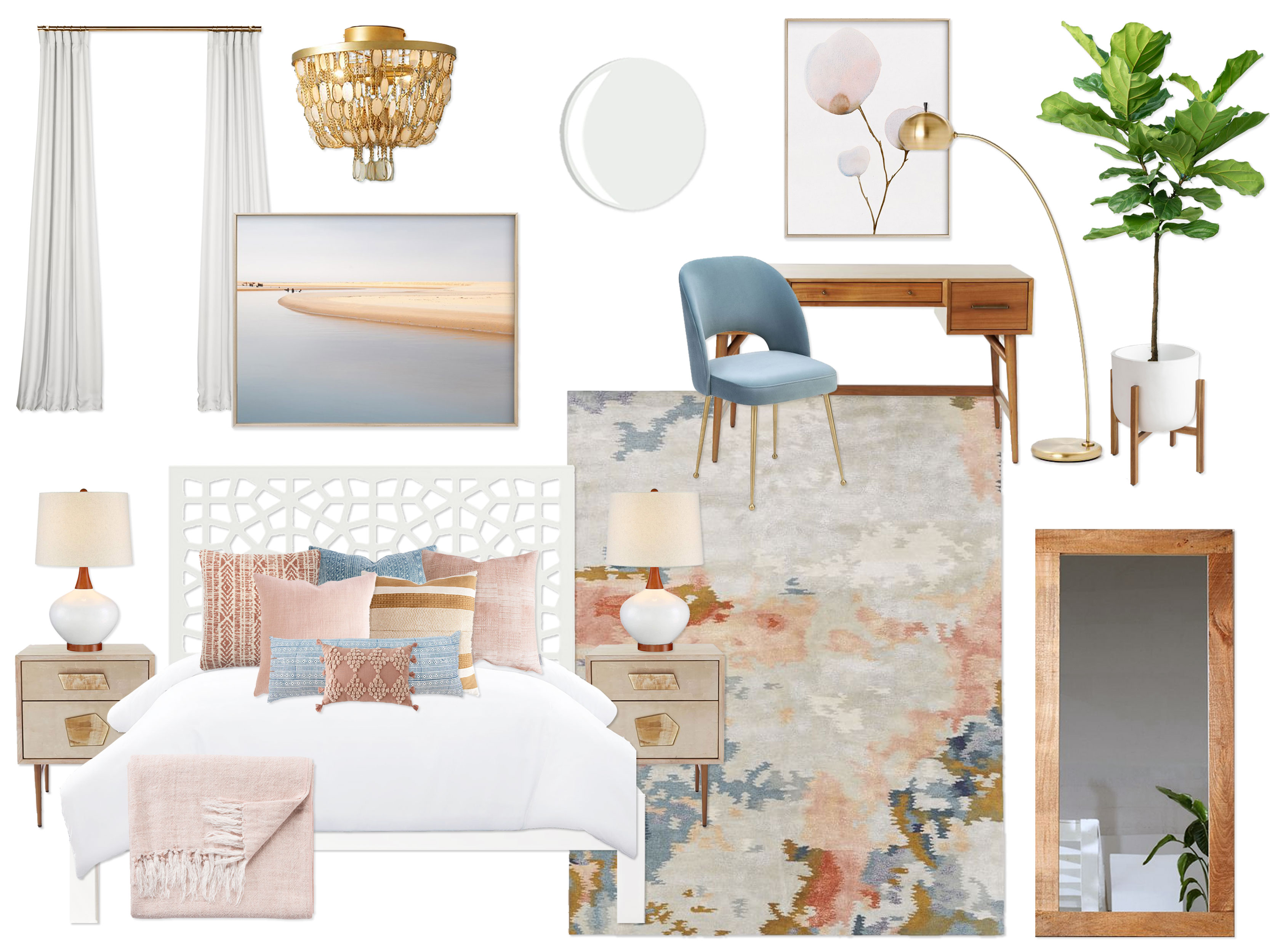
“Inspired by your inspiration images with colorful yet sophisticated color palettes, this design embodies a refined modern vibe with a hint of a bohemian spirit, complete with a beautiful color palette of soft blue, rust, mustard, blush, ivory, beige, and bright white, as well as natural wood tones and metallic brass accents. The walls are painted in a crisp, bright white (BM Decorator’s White), creating the perfect clean, fresh foundation to let the color palette really pop. In addition, bright white accents (like floor-to-ceiling white drapes and a fresh white duvet) throughout make the room feel light and airy like your inspiration photos. The star of the show is the stunning modern abstract rug, which grounds the space, giving it personality and defining the color palette. The office side of the room is outfitted with a lovely natural wood desk with a mid-century silhouette, sky blue velvet desk chair, gorgeous piece of artwork, and a petite brass arc lamp. The perfect spot for working from home, the bright, airy space is functional yet minimal to reduce visual clutter. On the opposite wall, the fantastic white Moroccan bed is the perfect spot for visiting guests (or, let’s be honest, an adorable two-year-old who want to come hang with dad while he works!). It is flanked by breathtaking geometric jeweled nightstands in a washed wood and brass finish, as well as two beautiful ceramic and wood table lamps. Giving the room personality, coziness, and visual interest are the array of amazing printed and mudcloth pillows in hues of soft blue, rust, blush, and mustard, as well as a blush tassel blanket draped across the bottom of the bed and a crisp white duvet to let the colorful textiles really take center stage. Above the bed is a stunning landscape that helps tie in all of the colors in the palette. Finishing off the space is a magnificent oversized wood floor mirror (which is perfect for reflecting the light from the large window and for guests to check their outfits), luxurious floor-to-ceiling white blackout drapes, elegant brass capris shell semi-flushmount light fixture, and a mid-century planter with a fiddle fig tree to bring the outdoors in. This design walks the fine line between modern & eclectic, colorful & refined, sophisticated & fun, and luxurious & humble with an elegance that makes it a perfect oasis for working and hosting visitors!”

Concept 2: White-On-White with Pops of Bold Color

(click image to enlarge)

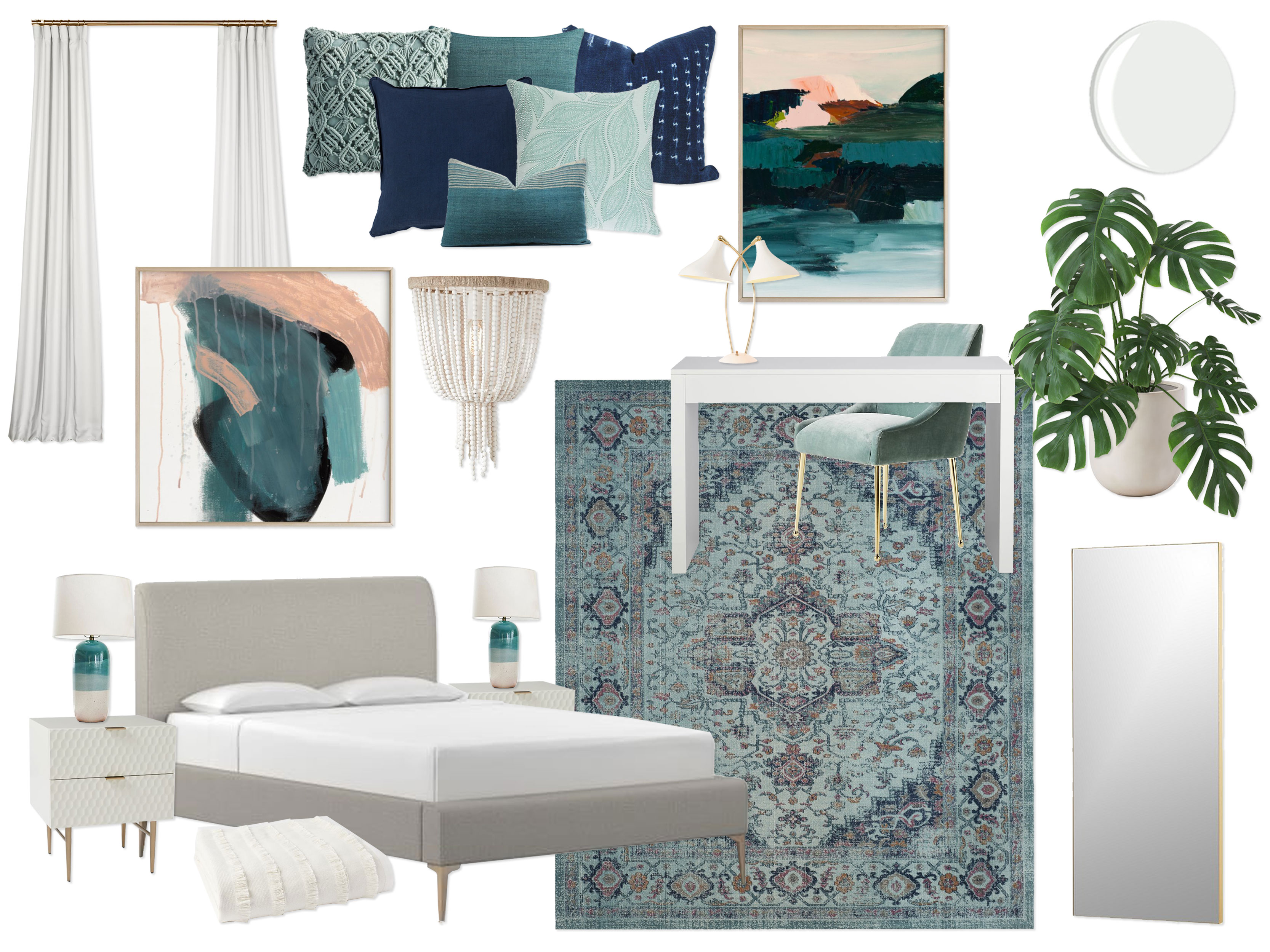
“Sparked by the gorgeous palettes of bright white-on-white with pops of bright color and contrast in your inspiration photos, this design embraces the elegance of layered neutral tones (bright white, ivory, and warm gray) with pops of high contrast navy, vibrant turquoise, and soft jade, as well as metallic accents in brass. Once again, the walls are painted in a bright white (BM Decorator’s White) to create a serene and crisp backdrop for the white-on-white effect and this dynamic color palette. The floating desk in the office space sets the tone for the whole room, with its sleek silhouette and upscale lacquer finish. Facing in towards the center of the space, the desk is complimented with a stunning duck egg blue velvet desk chair, sculptural dual head brass & white mid-century task lamp, and gorgeous piece of abstract artwork with a dynamic color palette. Once again grounding the space and setting the tone for the entire room, the incredible vintage-inspired turquoise Persian medallion rug runs the full length of the room, tying together the office space and the guest space. On the opposite wall, the lovely gray upholstered guest bed with brass legs is outfitted with the most amazing turquoise, navy, and jade (mudcloth, macrame, and textured) pillows, in addition to a new bright white duvet and an amazing white tiered fringe blanket at the bottom of the bed for layers and layers of white-on-white texture. On either side of the bed sit two lovely geometric patterned white & brass nightstands that feel regal and refined. Bringing a bit more of a free-spirited vibe to the space, a pair of dipped turquoise lamps grace the tops of the nightstands and a complimentary piece of large-scale abstract art hangs over the bed and captures the color palette of the room perfectly! Completing the space is a radiused bullet floor planter with a monstera plant for some greenery, floor-to-ceiling white blackout drapes to add to the luxurious white-on-white texture, a sculptural but humble white beaded semi-flushmount light fixture, and high-end brass infinity mirror for your guests’ convenience. Calming, fresh, modern, packed with cozy texture, and complete with a punch of contrast and color, this elegant design creates a perfect relaxing sanctuary for you and your guests to enjoy!”

The client and his wife very much preferred concept 1 almost as-is, but since it was going to function primarily as his office, he wanted to tweak it a bit to feel less feminine, primarily by swapping out most of the blush (he thought it looked great in the rug as an accent color but wanted to emphasize other colors).  Super fun, easy changes were made to emphasize the mustard and blues in the rug. Plus, they loved the bed from concept 2, so I made a couple substitutions to make the alternate bed work in the space! Here is the final we came up with!

FINAL DESIGN

(click to enlarge image)
Setup Instructions:

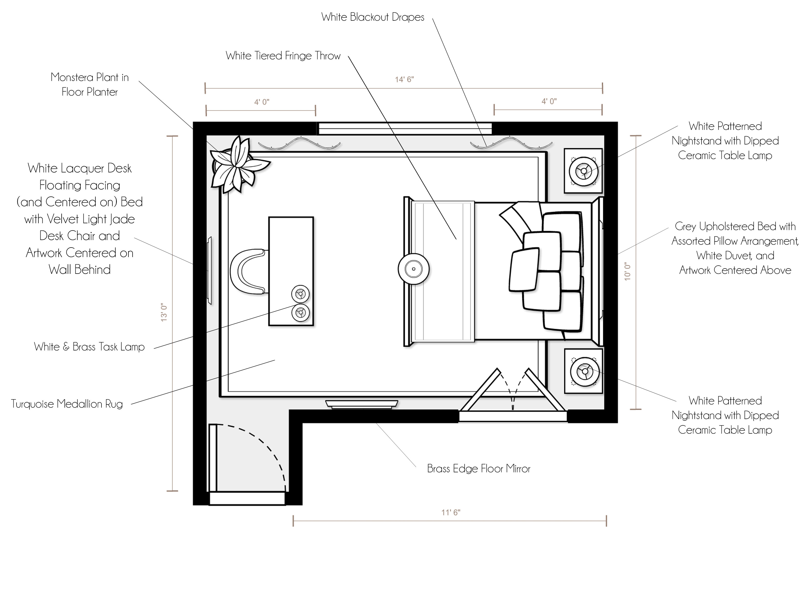
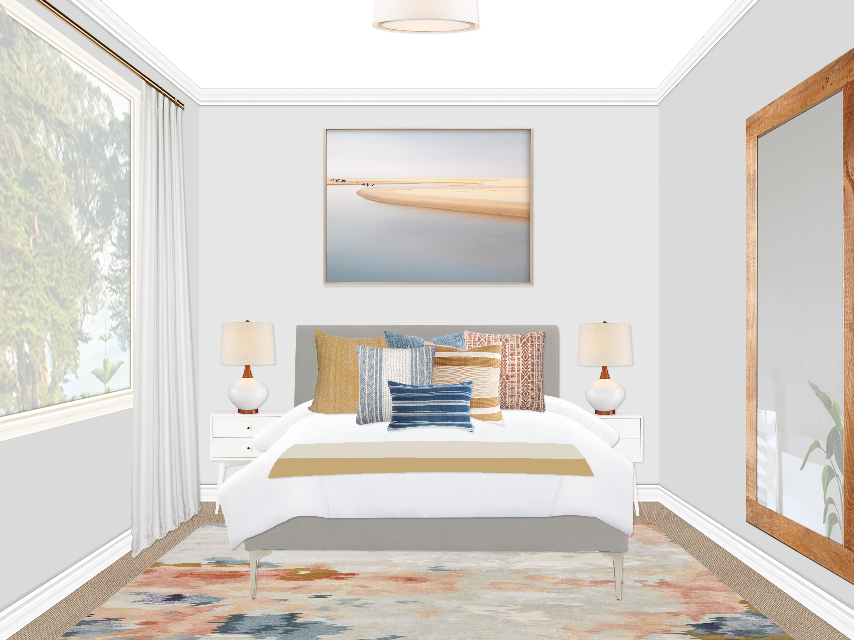
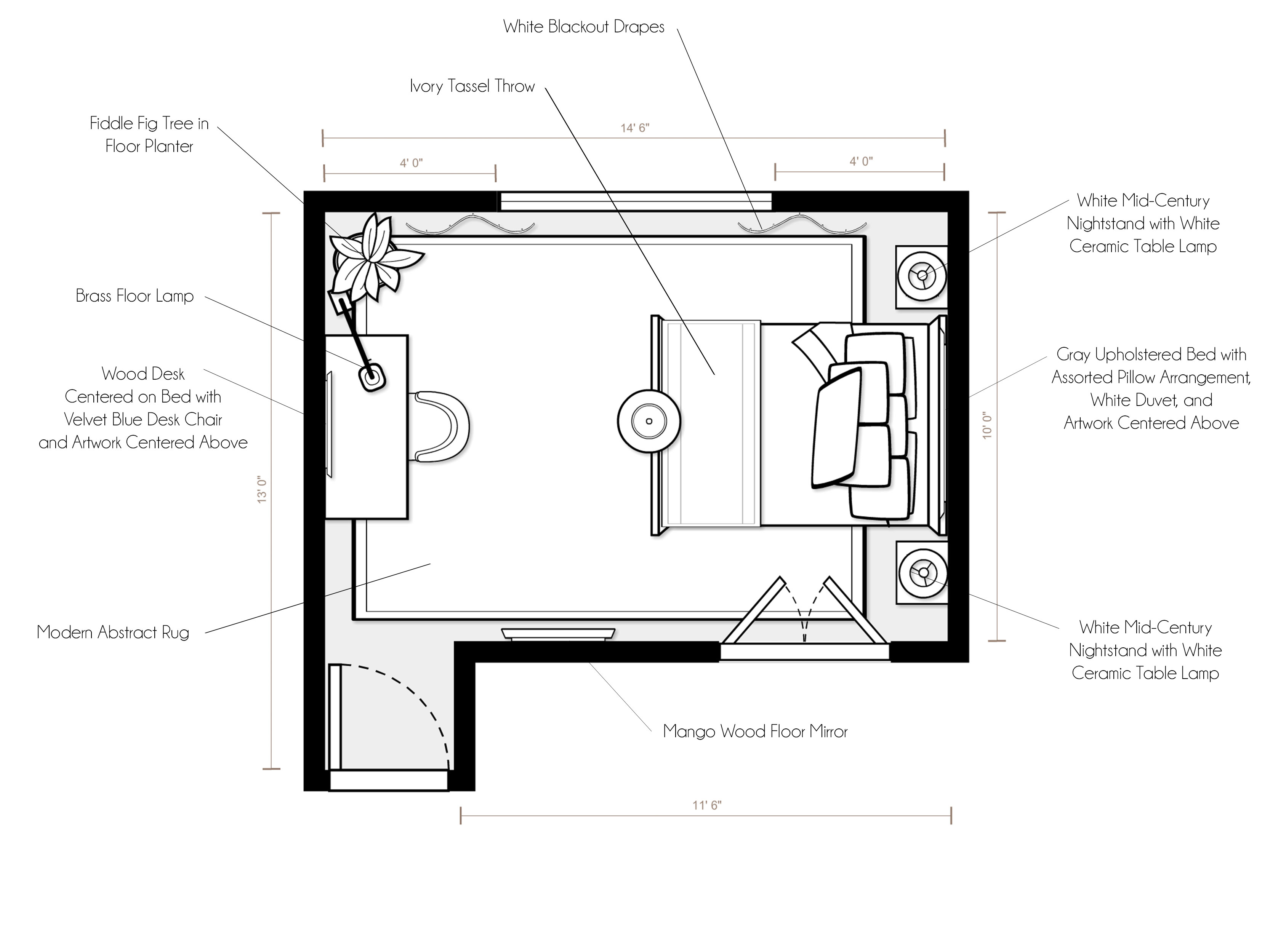
For specific product placement, please refer to your floor plan and renderings.

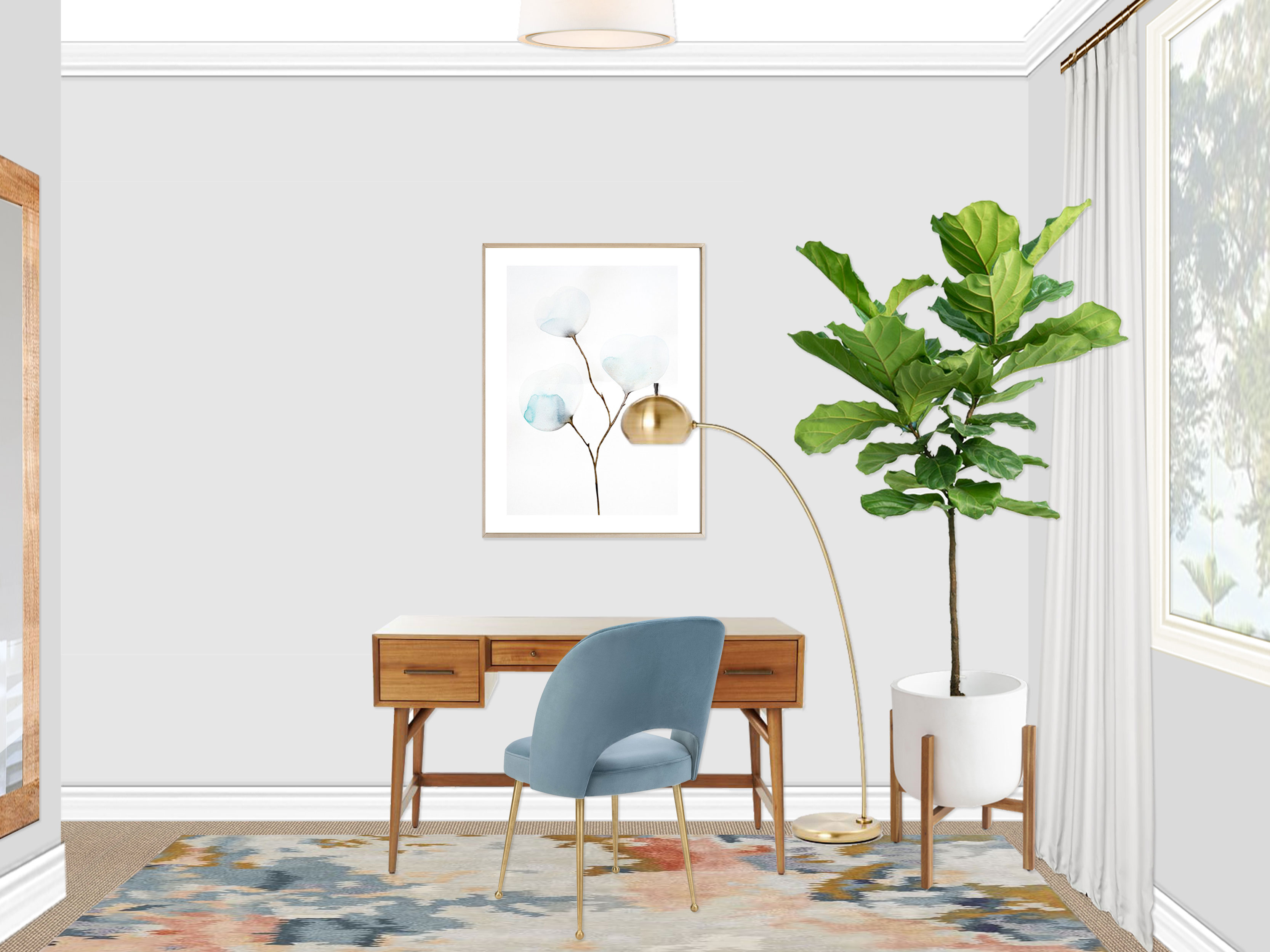
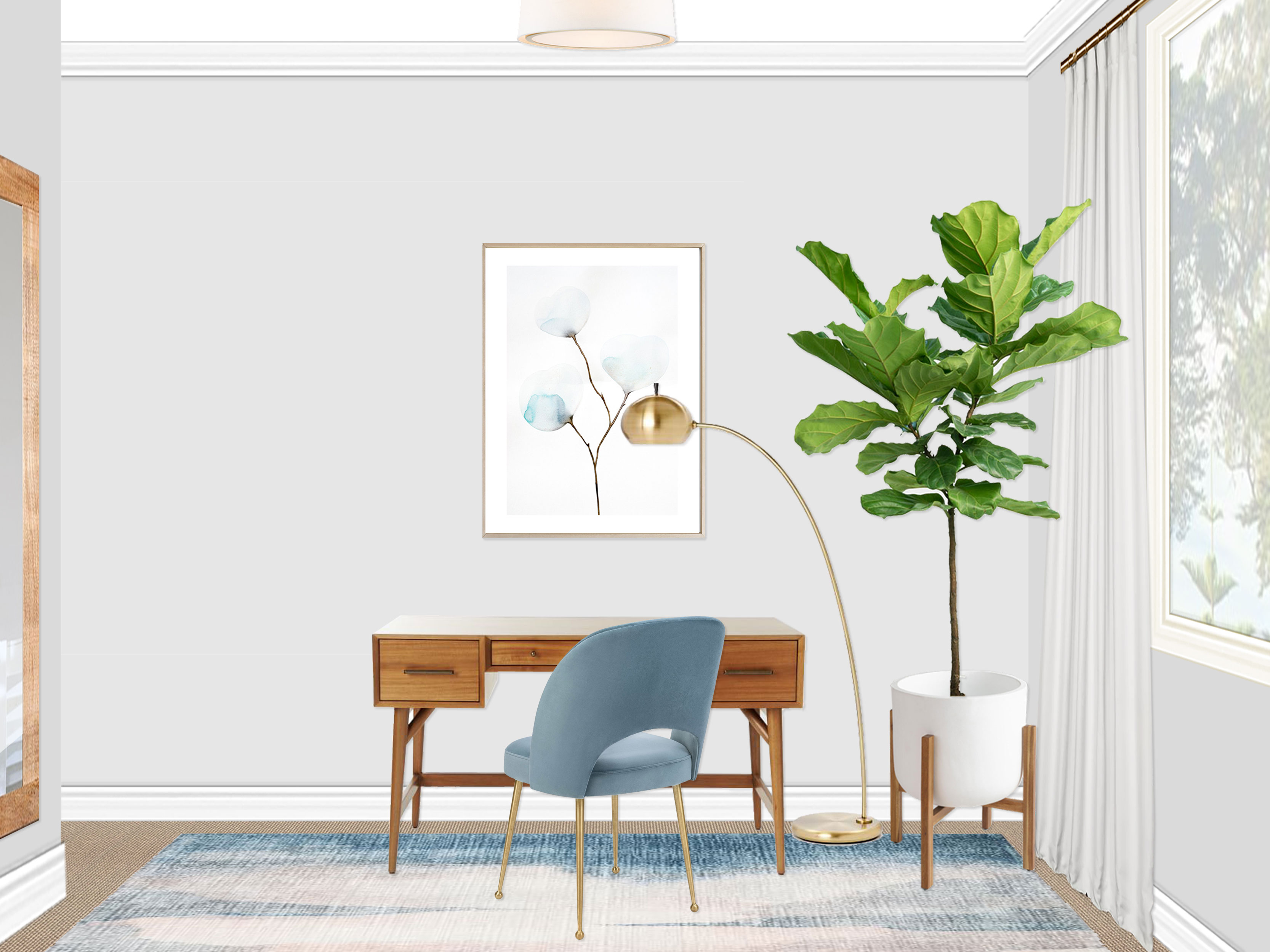
  • As soon as you enter the room, you will see your wonderful new office space. A stunning mid-century inspired desk with several drawers for storage takes center stage. A lovely velvet blue upholstered desk chair with brass legs, elegant brass overarching lamp, and large-scale watercolor artwork complete the workspace (which is all centered on the bed on the opposite wall).
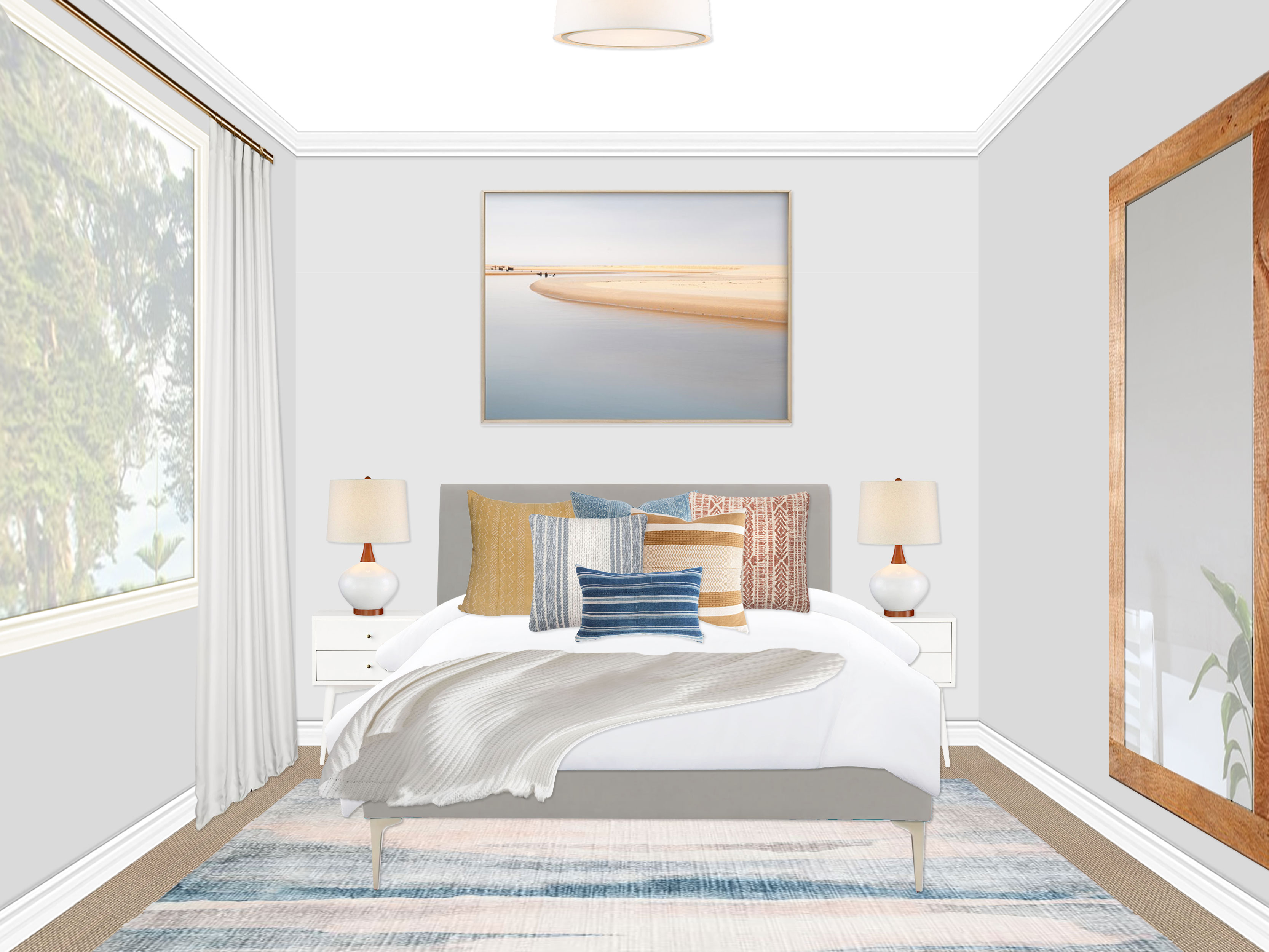
  • Centered on the opposite wall, a marvelous gray upholstered bed creates a perfect space to host guests.
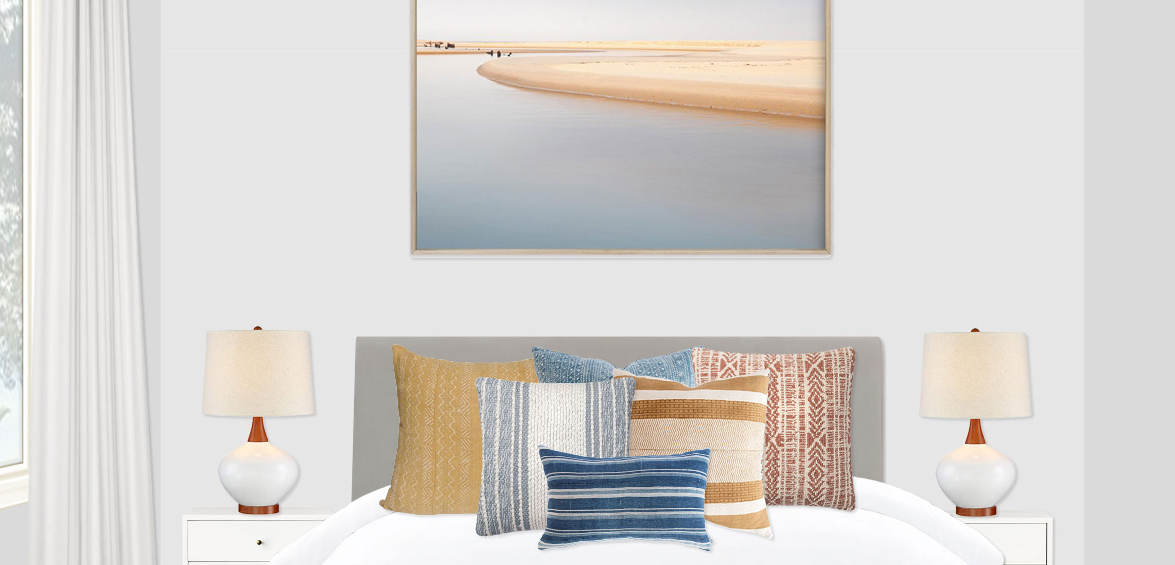
  • Giving the bed personality, texture, and coziness are an assortment of printed and textured pillows (please see the rendering for recommended placement), as well as a gorgeous ivory Moroccan pom pom blanket. These all sit on top of a crisp white duvet (since the weight and feel of bedding is a very personal thing, I have not included it on your shopping list).
  • Flanking the bed on either side are two eye-catching white nightstands with white and wood ceramic bedside lamps.
  • Centered above the bed and pulling the whole color palette together is the stunning large-scale landscape photo.
  • For the convenience of guests, a full length mango wood mirror has been added to the wall opposite the window in the open space between the desk and bed areas.
  • Giving the room life and lushness, a white ceramic bullet planter with wood stand houses a fiddle fig tree (consult your local nursery to make sure you are choosing plants that are suited for the light in the space. I based my recommendation on getting a good amount of natural light in the space) in the corner by the desk.
  • A modern white and brass overhead fixture is hung in the existing electrical box centered in the space, finishing off the clean, sleek look.
  • Finally, floor to ceiling drapes are hung around the large window to highlight it and also to provide blackout coverage when needed for guests. The curtains are to be hung with the rod centered between the window trim and the crown molding. The panels are the full 108″ so they will puddle on the floor by a couple inches. Also, the rod should be installed 8-12 inches wider than the window frame on each side so the panels can hang beyond the outside edges of the window frame. Once installed, if the curtains puddle too much on the ground for your taste, you may want to hem or hem tape the bottoms to size once the rod is installed (or install them directly onto the rod without the ring clips which will move things up a couple inches).”

After the final design was done, the centerpiece of the rug went on backorder (ughhhhhh! I hate when that happens), so we actually came up with an alternate final design with a similar rug. Thankfully it was an easy swap (and we swapped the throw too because it suddenly felt out of place with the new rug).

In the end, the client was very happy about both rug options and I think even decided they liked the alternate rug better! So all’s well that ends well! They were such a fun family to work with and hope they are already settling in to their new space, ready to (ignore work I hope haha and) host visitors for the holiday.

As for what’s next for me work-wise, once we have completed the move, I will be increasing the number of projects I take on so I am designing full-time while we get our feet on the ground! So if anyone is interested in working with me on one of their rooms, you can purchase a package on my Decorist page using my friends & family promo code Designer233073 that allows you 30% off!

Have a great weekend everyone and happy holidays if I don’t make it back here to share another project before then! :)

Decorist: DJ’s Master Bedroom

Happy November! I hope everyone had a happy and candy-filled Halloween! My baby dressed as my other baby, so my heart was basically a melted puddle all day!

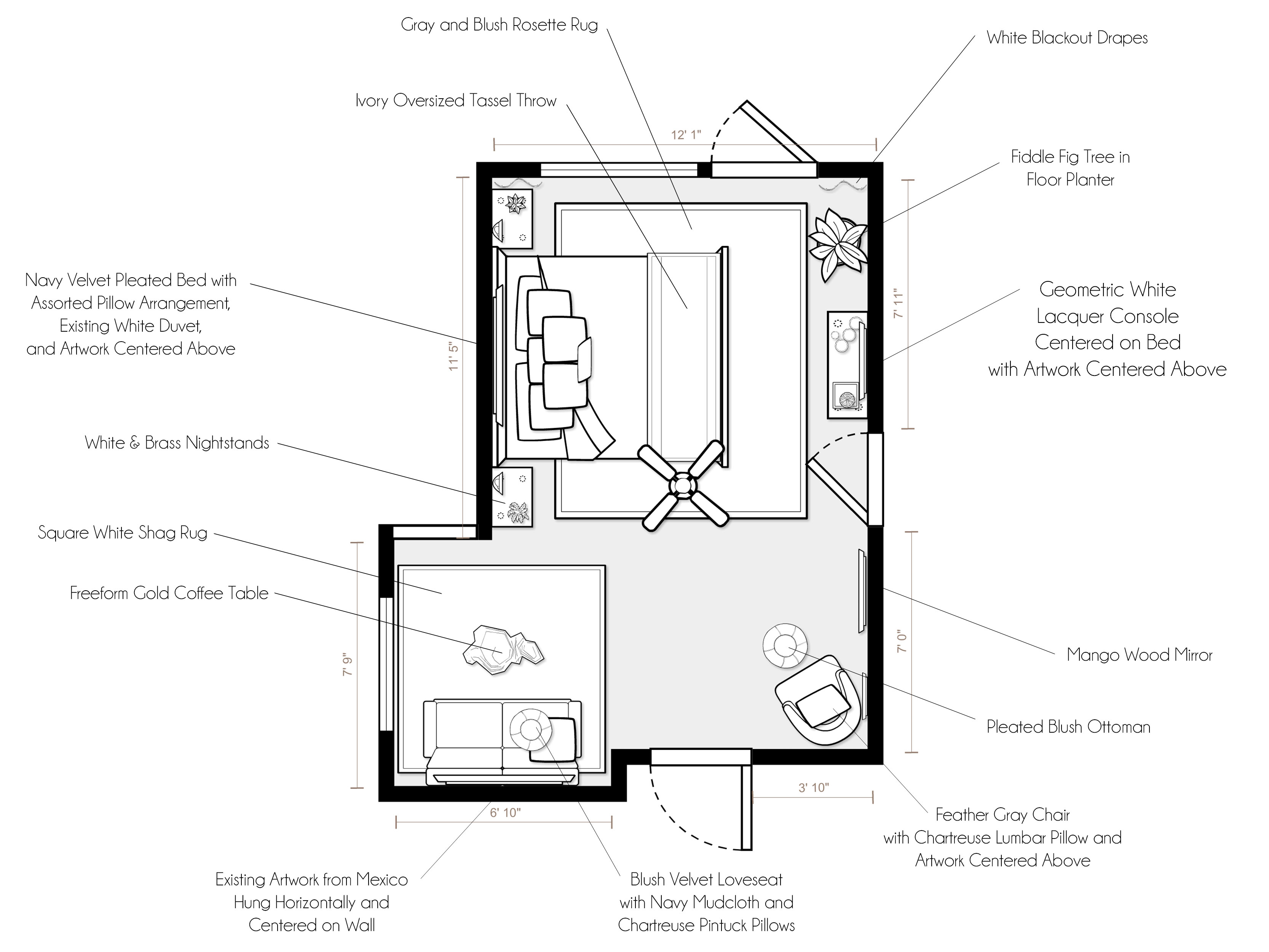
In other news, I just finished up an awesome project with the nicest client! After completing a long and gorgeous renovation on their home in San Francisco, DJ wanted help creating a perfect master oasis worthy of the time and energy they had already put into the home. They both earned a place to finally relax! The room was a blank slate except for a fresh coat of a blue-based gray paint, meaningful piece of artwork she got in Mexico, king mattress with a new white duvet, and some beautiful new hardwired sconces for over the bedside tables. She wanted the space to have a relaxing, cozy feeling with an airy, uncluttered sophistication. Color-wise, she was drawn to layered neutrals with pops of serene colors (like blues or rosy beige/blush), pops of bolder colors like chartreuse and orange, and a hint of contrast (like a great navy blue). Once again, I selected a few options with DJ for the main pieces and then put together two concepts for her review:

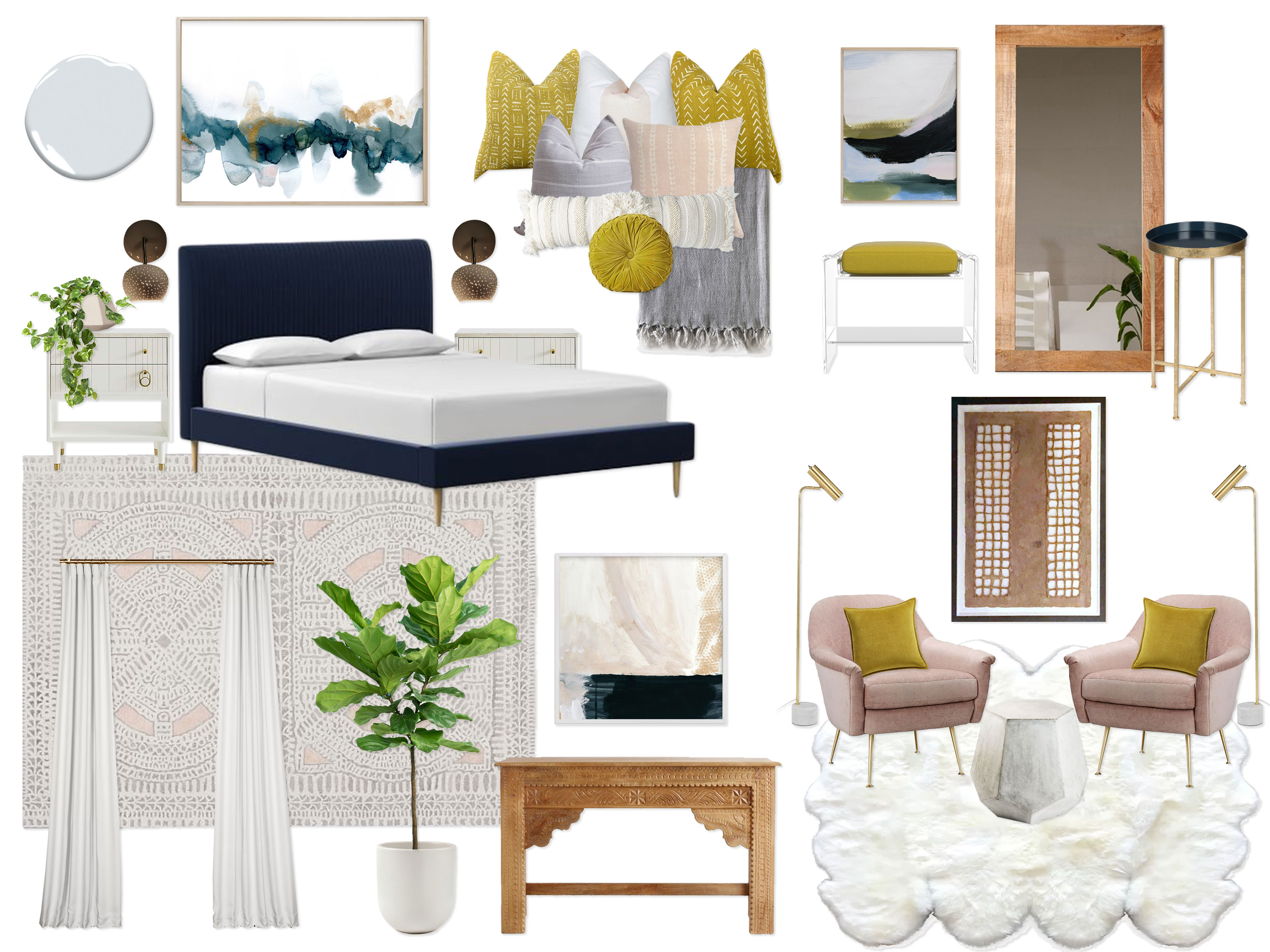
Concept 1: Navy, Gray, Blush & Chartreuse

(click image to enlarge)

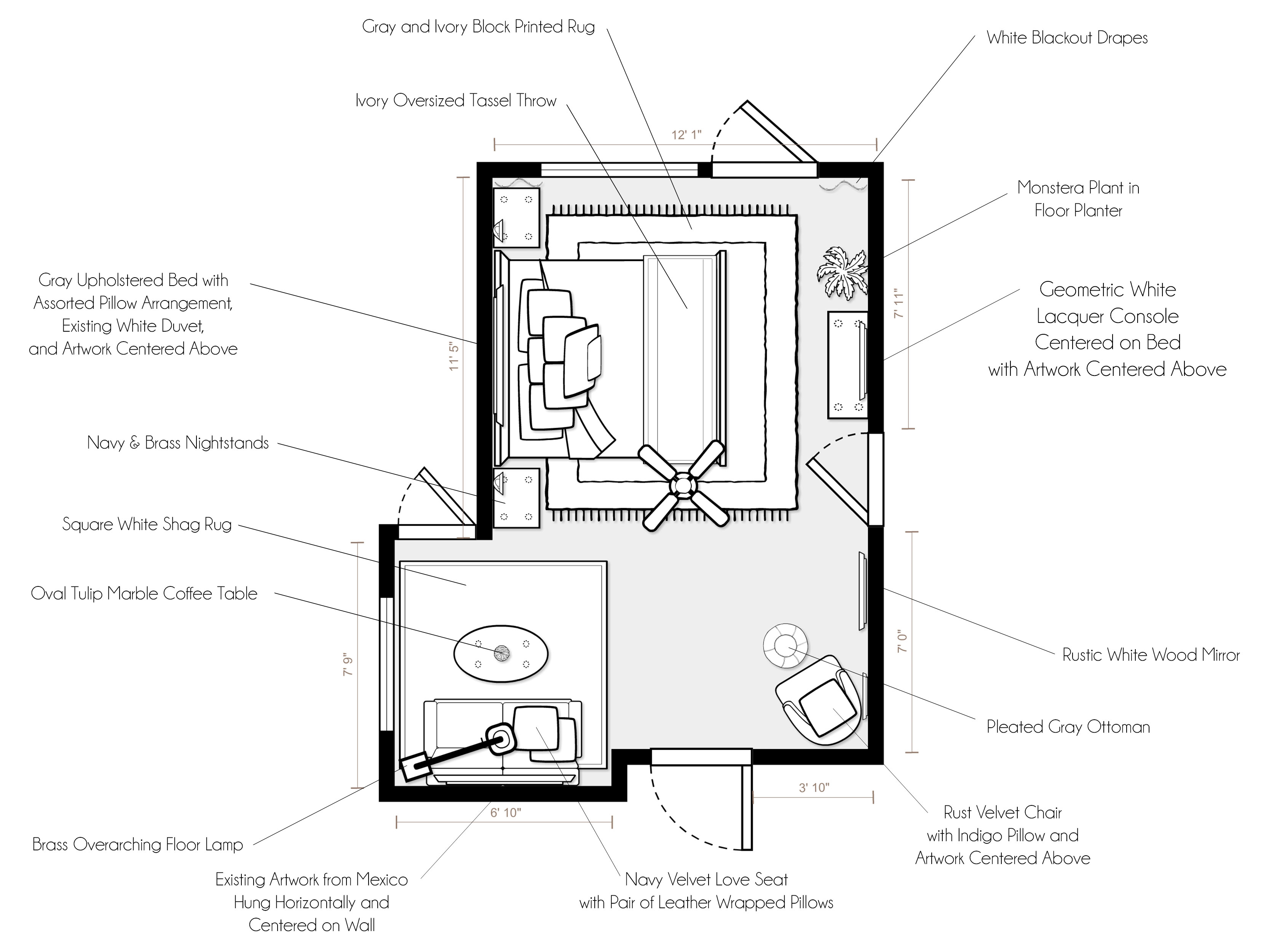
“Inspired by the gorgeous palettes of dynamic neutrals with pops of color and contrast in your inspiration photos, this design embraces the elegance of layered neutral tones (bright white, warm ivory, cool gray, and natural wood) with pops of high contrast navy and vibrant chartreuse, as well as metallic accents in brass. The existing blue-based gray paint color on the walls creates a crisp, serene backdrop for the entire space and keeps the warmer ivory tones feeling fresh. In addition, bright white accents throughout make the room feel light and airy, as well as tie the warm and cool neutrals together. The star of the show is the gorgeous navy velvet bed, complete with a pleated fabric headboard and brass legs. It is flanked by pretty white and brass nightstands, as well as your beautiful existing sconces. Giving the room personality, coziness, and visual interest are the array of amazing printed and mudcloth pillows in hues of white, ivory, chartreuse, blush, and gray, as well as a gray oversized tassel blanket draped across the bottom of the bed (which has your existing white duvet). Grounding the bed wall is a stunning gray and blush rosette rug, while an amazing piece of large-scale abstract art keeps the eye moving upwards. Opposite the bed is an incredible carved wood console with a complementary art piece centered above and a white ceramic bullet planter with a fiddle leaf fig tree ready to soak up all of that lovely light coming from the door and window on the west wall. Not to be outdone by the incredible bed, a jaw-dropping pair of blush and brass chairs float in the alcove with the view of Golden Gate Park, creating the perfect seating area for working or enjoying a cup of tea. A small geometric concrete accent table is positioned between the chairs to allow a small surface for laptops or beverages. To really bring this seating area to another level of luxury, a divine freeform faux sheepskin rug makes the whole space feel like it is resting on a cloud, while the unbelievable piece of artwork you got in Mexico (hung vertically) brings a rustic, down-to-earth quality to the moment. A pair of brass floor lamps sit behind the chairs for reading and working as well. The third vignette in this space is the dressing area, complete with a rustic, oversized mango wood mirror (can be mounted on the wall or leaned against it), stunning acrylic bench with a chartreuse cushion, another lovely complimentary piece of abstract art, and a perfect little catch-all brass & navy accent table located right at the entry for convenience. Finishing it all off, wall-to-wall white blackout drapes run along the west wall, adding an airy elegance and luxury. This design walks the fine line between modern & eclectic, colorful & refined, elegant & fun, and luxurious & humble with an elegance that makes it a perfect oasis for you to finally enjoy after a long renovation!”

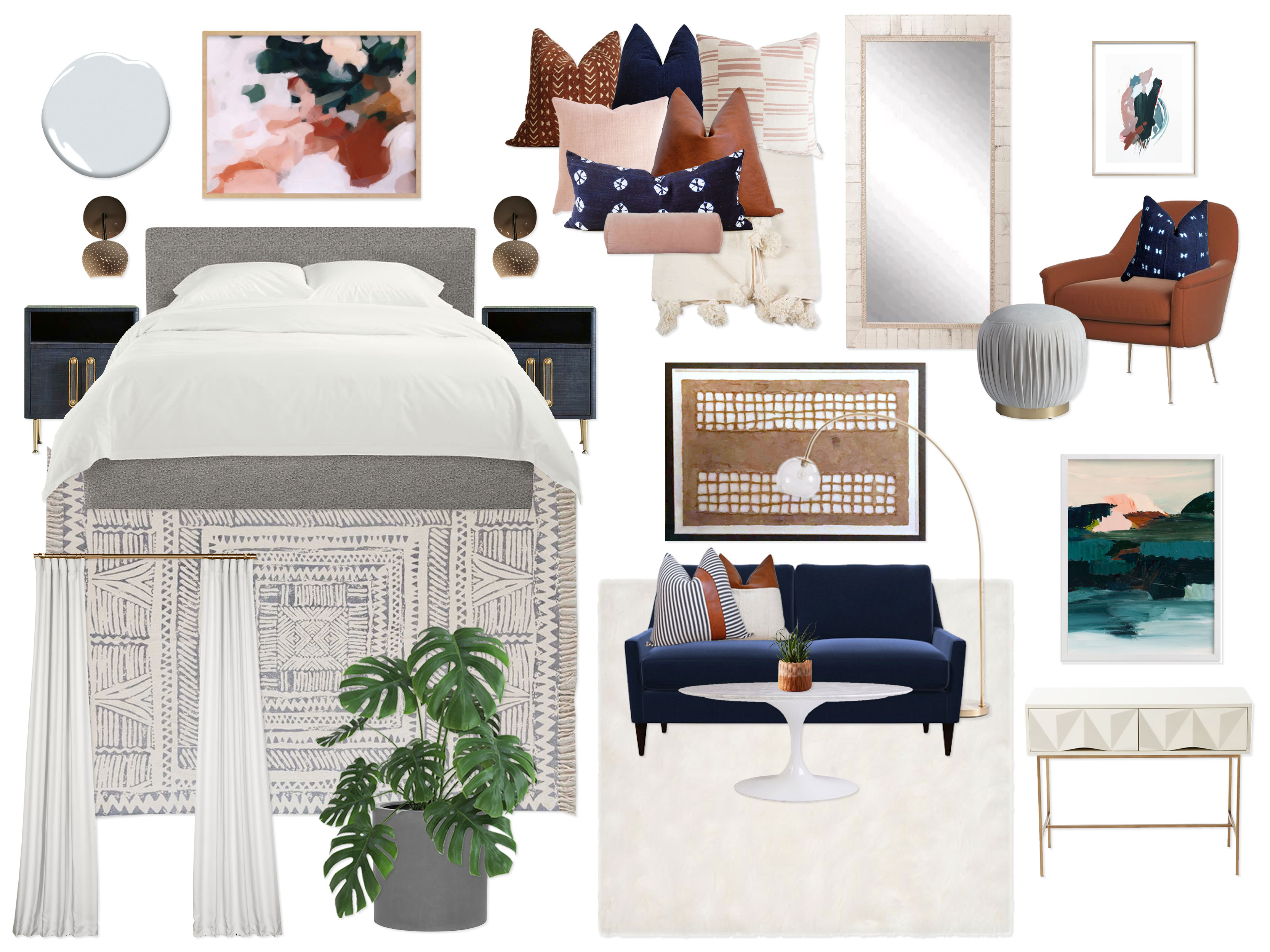
Concept 2: Indigo, Rust, Blush & Gray

(click image to enlarge)

“Sparked by your inspiration images with colorful yet sophisticated color palettes, this design embodies a refined modern vibe with a hint of a bohemian spirit, complete with a beautiful color palette of indigo, rust, cognac, blush, ivory, and gray, as well as natural wood tones and metallic brass accents. Once again, the existing cool blue-based gray creates a serene and crisp backdrop for this dynamic color palette. Setting the tone for the entire room, the lovely gray upholstered bed is outfitted with the most amazing dyed indigo, cognac, blush, and rust (mudcloth, velvet, and leather) pillows, in addition to your existing white duvet and an amazing ivory pom pom blanket at the bottom of the bed for layers and layers of texture. On either side of the bed sits two breathtaking modern navy & brass nightstands that feel regal and refined. Bringing a bit more of a free-spirited vibe to the space, a wonderful gray and ivory block printed rug has been placed under the bed. Hanging over the bed is a marvelous large-scale piece of abstract art that captures the color palette of the room perfectly! Opposite the bed is an elegant geometric white lacquer console with another lovely piece of artwork (same artist as the one over the bed) centered above it and a gray floor planter with a monstera plant to bring the outdoors in. Once again, not to be rivaled by the wonderful bed area, a magnificent indigo velvet love seat creates a little seating area in the south wall alcove. Complete with amazing hand-stitched leather wrapped pillows, a brass overarching lamp, a Carrara marble oval tulip coffee table (which is perfect for having extra space to work or read the paper over tea), a luscious white square shag rug, and your incredible piece of artwork from Mexico (hung horizontally), this seating area is as functional as it is unbelievably show-stopping! Just in case the whole family wanted to come enjoy the master suite (or if you wanted to really kick up your feet and relax with a book and a perfect view), the dressing area has an additional stunning rust & brass chair, indigo pillow, and gray pleated ottoman for ultimate comfort! Conveniently located next to a wonderful rustic white wood full-length mirror, the chair is also a perfect place to put on your shoes or rest your ironed shirt while you get dressed for the day. A third wonderful piece of artwork is hung above the chair to complete the moment. Once again, an entire wall of bright, fresh, airy floor-to-ceiling white blackout drapes make the room feel tailored, elegant, and soft. Calming, fresh, modern, packed with cozy texture, and complete with a punch of contrast and color, this elegant design creates a perfect relaxing sanctuary that has been a long time coming in your new home!”

DJ loved both concepts and decided to mix and match a bit! She wanted the color scheme of concept 1 (chartreuse accents), but with the overall layout of concept 2 (sofa seating area and dressing area with the chair & ottoman). We mixed and matched a couple pieces, as well as reselected a blush loveseat and gray accent chair since we decided on the navy bed.  Here is the final result:

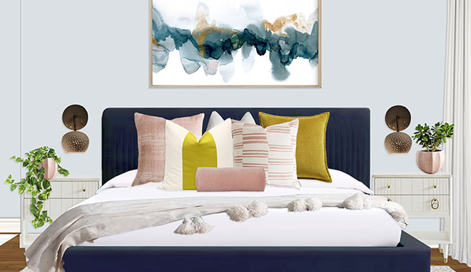
FINAL DESIGN

(click to enlarge image)
Setup Instructions:

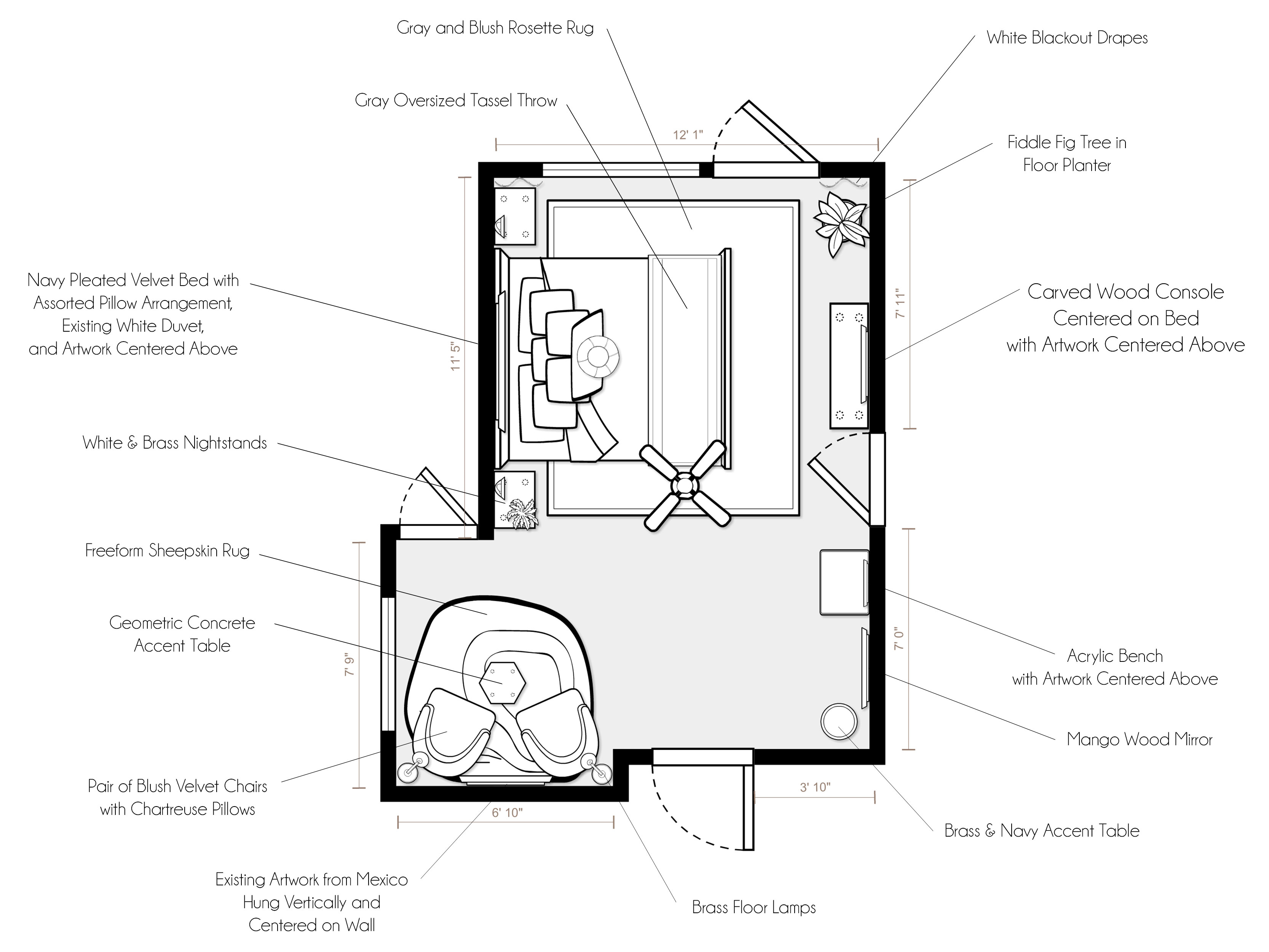
For specific product placement, please refer to your floor plan and renderings.

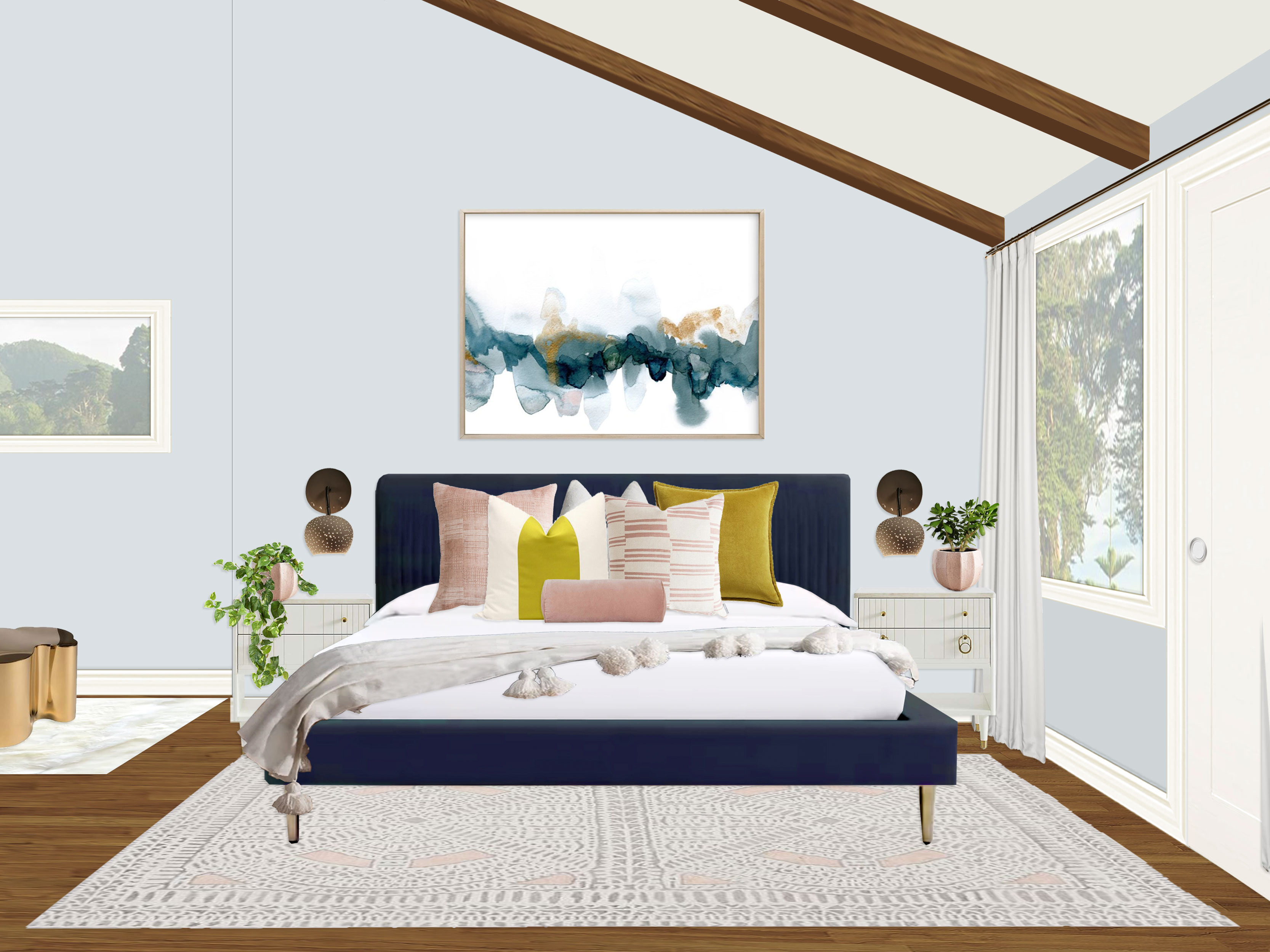
  • The star of the show is the stunning navy velvet pleated king bed that is centered between the sconces on the bed wall. However, if you can cheat the bed away from the window without it being noticeable, I recommend you try, as we want to leave as much room as possible for the drapery. Flanking the bed on either side are lovely white & brass nightstands.
  • Since the sconces will not be centered over the nightstands due to the width of the bed, I added matching planters on the outside of the sconces to balance everything out. The plants are mismatching, however, so the whole arrangement feels balanced but not perfectly symmetrical. The left nightstand has an ivy or pothos hanging plant and the right has a jade succulent (ask you local nursery which types are best for the light in your space, which I imagine is a lot of sun being a West facing wall).
  • Giving the bed personality, texture, and coziness are an assortment of printed and textured pillows (please see the rendering for recommended placement), as well as a gorgeous ivory pom pom blanket. These all sit on top of your existing white duvet.
  • Grounding the whole bed wall is the gorgeous gray and blush rosette rug, which floats centered under the bed and pulled out away from the wall so that the bottom of the rug roughly aligns with the edge of the balcony door just in front of the console (see floor plan for clarification).
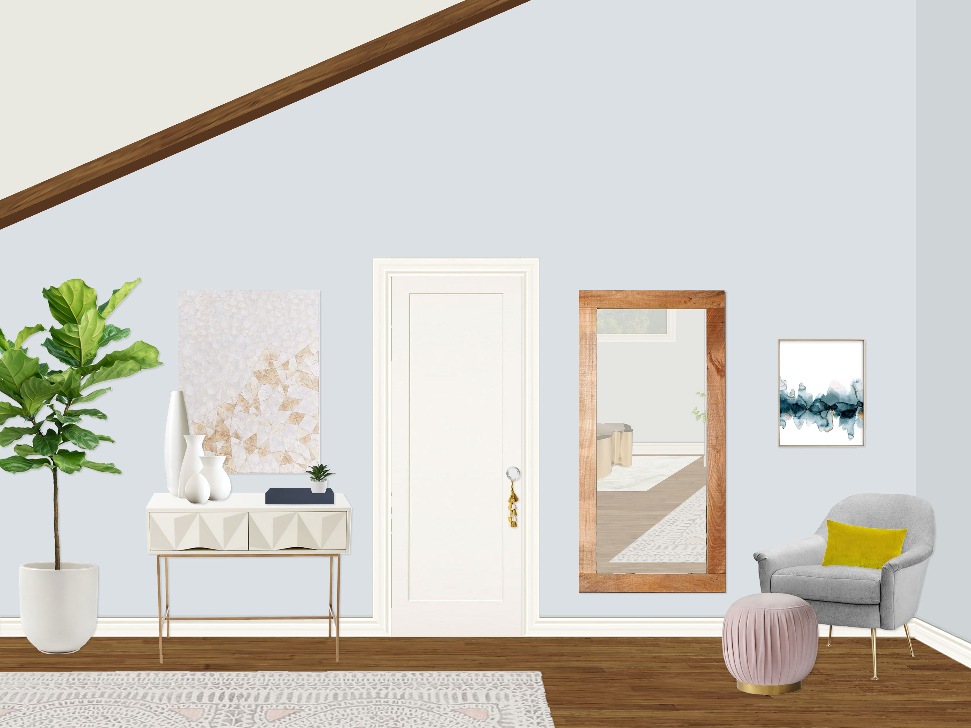
  • On the wall opposite of the bed (centered with the bed) is a show-stopping white geometric console with a lovely piece of artwork centered above (though I know you mentioned possibly using your own art or family photos here). The console is accessorized with four pure white sculptural ceramic vases, a navy lacquer tray, and a small succulent.
  • On the other side of your closet door from the console is a perfect dressing area, complete with a full-length mango wood mirror, heather gray chair for additional seating or relaxing, a pleated blush ottoman, and chartreuse lumbar pillow. I included art centered above the chair, though I know you mentioned wanting to do your own artwork or family photos here as well.
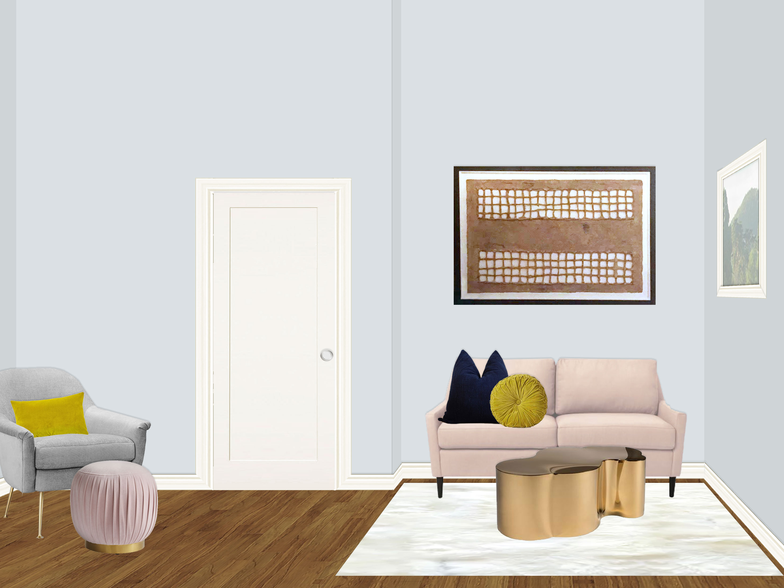
  • Finally, the last special moment in the space is the seating area meant for work or hanging out! The space is grounded with a square white shag rug (measures 6′-7″ square so it will just fit the space! Center it on the art/sofa wall, as well as under the window on the South wall). If you choose the freeform sheepskin instead, that is 6’x6′, so it will have plenty of room. I recommend pulling it out a bit from the sofa wall so it is only partially under the sofa so you get more that extends beyond the coffee table.
  • A stunning blush loveseat is centered on the wall, with the magnificent art piece you bought in Mexico hung horizontally and centered above. I recommend hanging the artwork so that the center of the piece lines up with the center of the window on the adjacent wall so they feel connected and intentional. A navy mudcloth pillow and chartreuse pintuck velvet pillow adorn the sofa and tie in the color palette.
  • The piece of jewelry in the space, the jaw-dropping freeform gold table is the perfect amount of glamour in the space, as well as being a practical surface for work and tea! I recommend turning the piece fully horizontal so that the widest length of the table runs parallel to the loveseat. This gives you the narrowest depth possible, leaving plenty of room for access to the second closet.
  • Finally, adding the last bit of luxury and elegance to the space, you have wall-to-wall and floor-to-ceiling white linen/cotton blackout drapes on the west balcony wall. Since the measurement from the top of the window trim to the floor is 6′-11.75″, I have selected 84″ (or 7′) long curtain panels, extended and inch or two for slight puddling on the floor by installing them with curtain rings (rather than right on the rod, which is how the panel length is actually calculated). The adjustable rod is to be installed centered height-wise in the very narrow space between the bottom of the beams and the top of the window trim, as close to the wall as possible with the adjustable mounting brackets. The adjustable rod should almost run wall to wall (leave an inch or two for breathing room though, as it shouldn’t touch the wall.) so that there is plenty of room for the curtain panels to gather beyond the outer edges of the windows so that your window view and door access are not blocked. The curtains should be able to fully clear the door and hopefully the window (though the space here with the nightstand is tight, so it may overhang a tiny bit depending on the thickness of the curtain. There are two extra-wide panels for fullness, one for either side when opened.”

Both DJ and I were thrilled with the results, and know that this new space will be the tranquil, cozy retreat her and her husband were dreaming of when they began the long renovation adventure. It is a space not just for sleeping, but for hanging out with her family, enjoying the stunning views of Golden Gate Park (!!) with a cup of tea, and finishing up some emails away from the hustle & bustle. I always love working with such sweet, fun clients, and hope DJ will enjoy this space for years to come with her whole family! And as always, if anyone is interested in working with me on one of their rooms, you can purchase a package on my Decorist page using my friends & family promo code Designer233073 that allows you 30% off!

Have a great weekend everyone! :)