Category Archives: E-Design

Mood Board Monday: Jennifer’s Teen Bedroom

Happy Monday, everyone! Okay, so I skipped last week but it was just one of those weeks… life was busy, and I needed a little social media break. In crazy times like these, stepping away from screens to breathe a little can be so necessary. But I am back and super excited to share this week’s Mood Board Monday because IT HAS AFTER PHOTOS that I will be sharing later in the week! Wooooo! I love when my clients send me photos when they execute the designs we create together. Such a fun moment to see it all come together for them.

On a side (but related) note, I really, truly get so attached to my e-design clients, even though I never meet them in person! I love working with every single one, as it is such a joy to get to know them, their families, their story, their hopes & plans, etc. Even if it is just for a few weeks or months that we get to know each other, it is such a special opportunity to be a brief but wonderful part of someone’s life and home. I cherish that connection as a designer; it really gives me a full heart. And then to get photos at the end with a note about how thrilled they are with their new space… it makes me fall in love with my job over and over again!

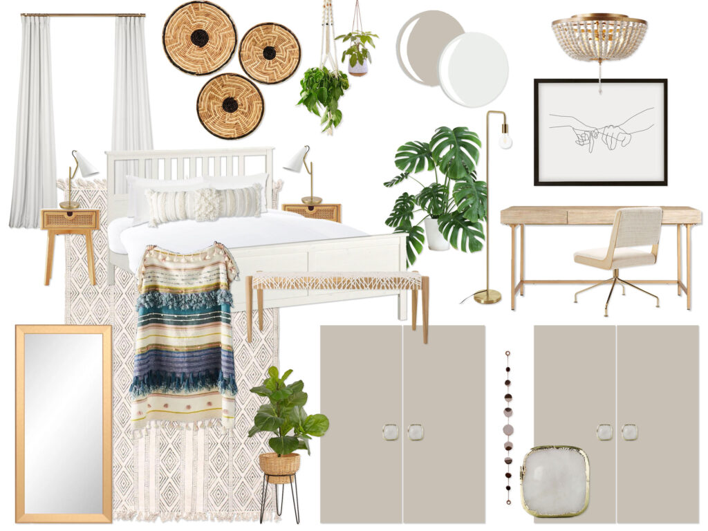
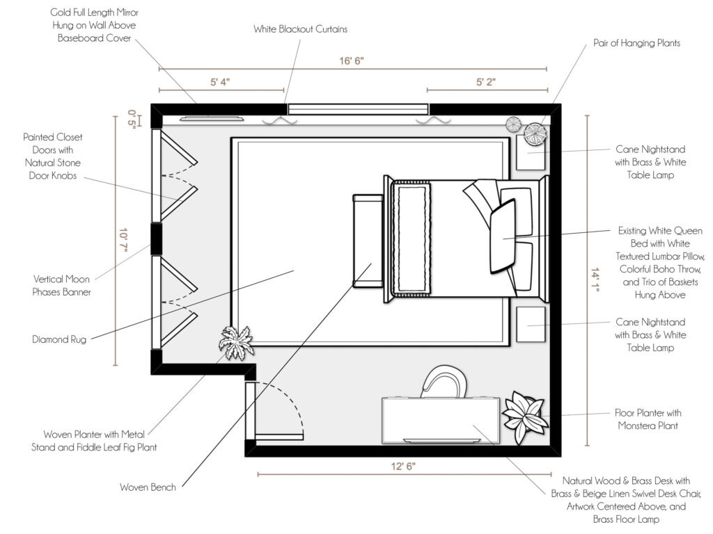
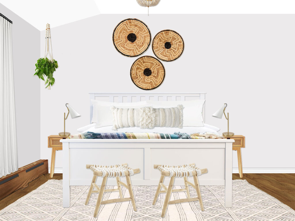
Anyway, just feeling sentimental, I guess! But let’s take a look at today’s mood board! I wanted to turn the tables a bit from the last Mood Board Monday that I shared, which was a total splurge bedroom. But this week is a much more modest budget and a perfect example of how to achieve a well-composed, re-designed room without breaking the bank! My client, Jennifer, was working on creating a grown-up bedroom retreat for her 14-year-old daughter but didn’t want to spend more than about $1000-2000 to do so. What’s funny is that the things that made the biggest impact in the space was a re-imagined layout and a fresh coat of paint, both of which are free or inexpensive shifts to make in a space.

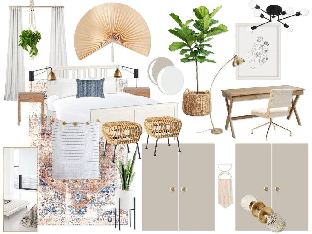
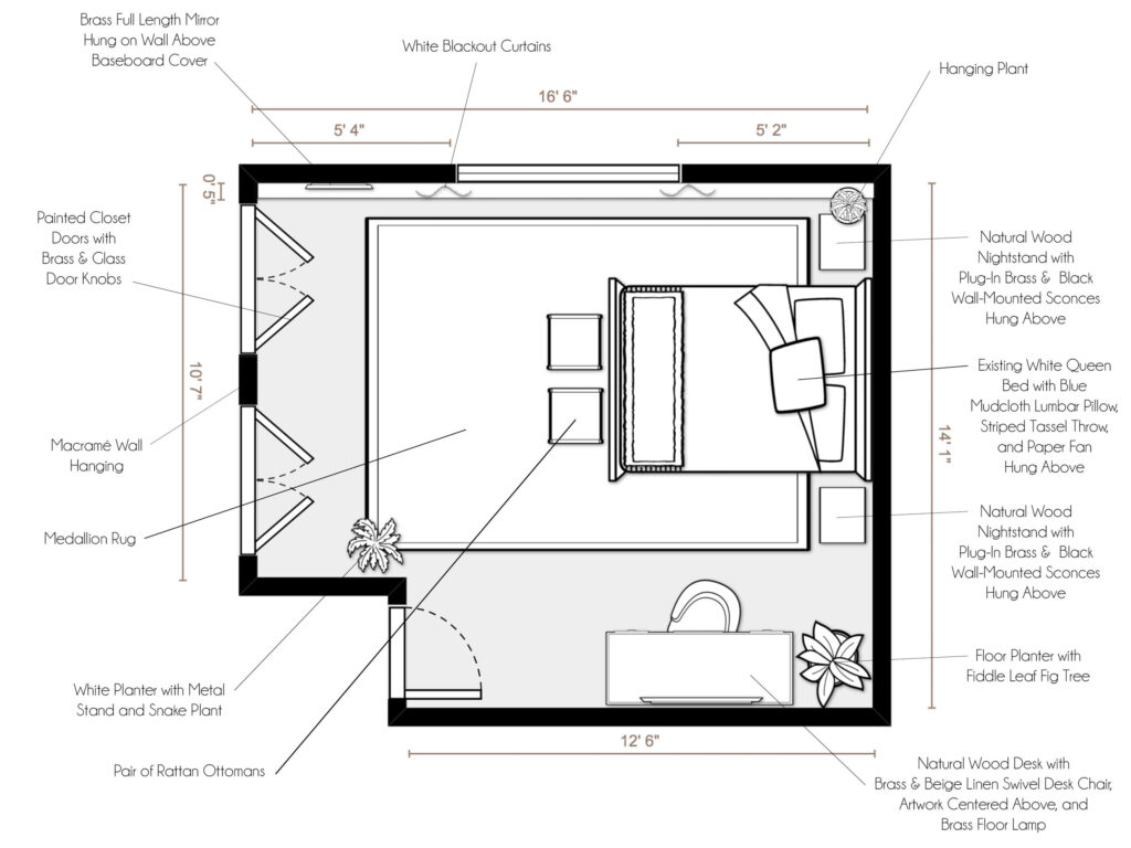
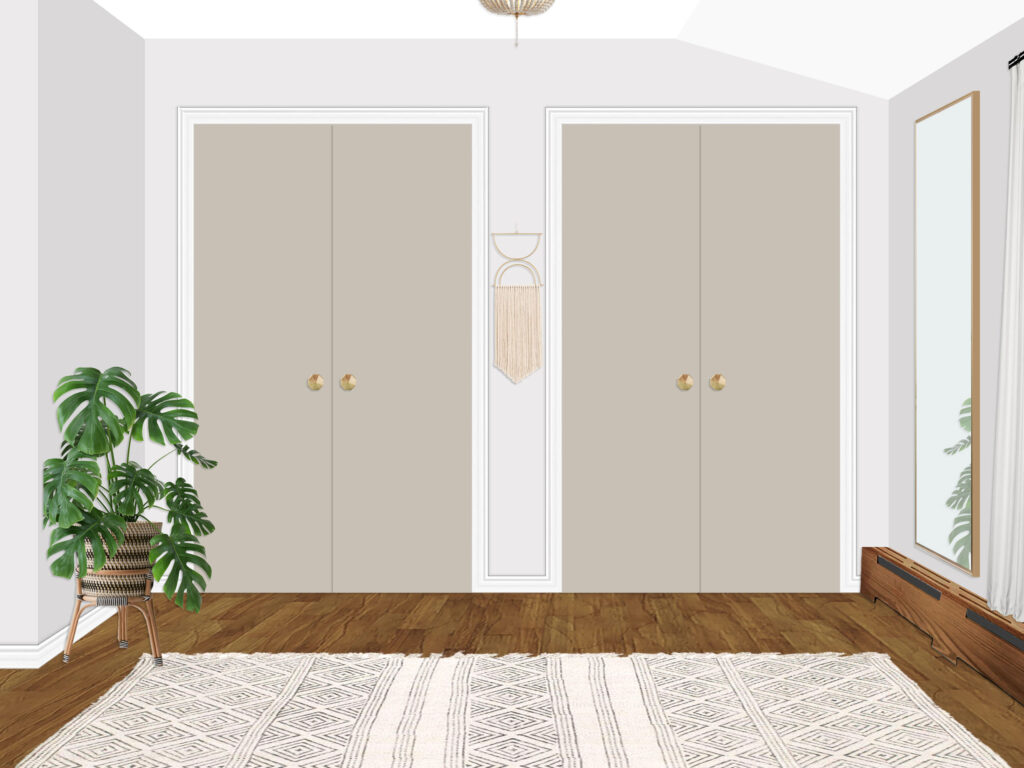
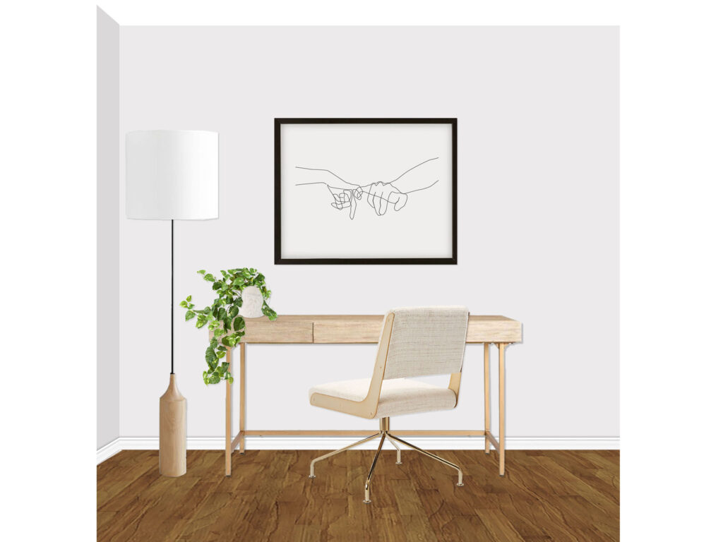
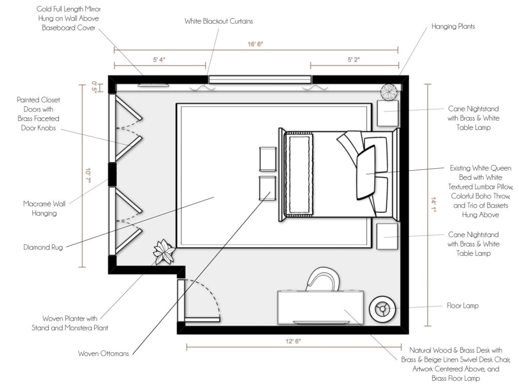
Jennifer’s daughter wanted a soothing, sophisticated grown-up space that used mostly neutral tones with pops of color… plus plants and more plants! She needed a sleep space, work space, and plenty of seating for friends. My first step was to shift the layout, as well as the door color of her wonderful double closets to make them a feature of the room rather than something the space was fighting against. This also created separate work and sleep spaces for her to thrive. Without further babble, let’s look at the concepts!


Concept 1:
(click image to enlarge)

Shop this Concept!


Concept 2:
(click image to enlarge)

Shop this Concept!


Final Design Renderings
(click image to enlarge)

Shop Final Design!


The client fell in love with concept 1, making only a few small changes to create a fabulous, sophisticated teen room. Her daughter was thrilled and suddenly the rest of the family wanted a fresh new bedroom space, too!

As always, if you are interested in working with me on a room, you can purchase a package on my Decorist page using my friends & family promo code ERIKADALE that allows you 30% off!

Have a great week ahead, friends! Stay safe & well.

Mood Board Monday: Jason’s Master Bedroom

Happy Monday! It’s mood board time! And as I mentioned last post, I now have shoppable designs! Woooooo! Below each concept and final are thumbnails of the products pictured (that are still available). Simply click on the image of the item you like and it will take you right to the vendor to shop! Also, for full disclosure, they are affiliate links so your purchase sends a very small finder’s fee my way for inspiring your purchase! Thank you in advance for your support if you click through to buy… I love you. :)

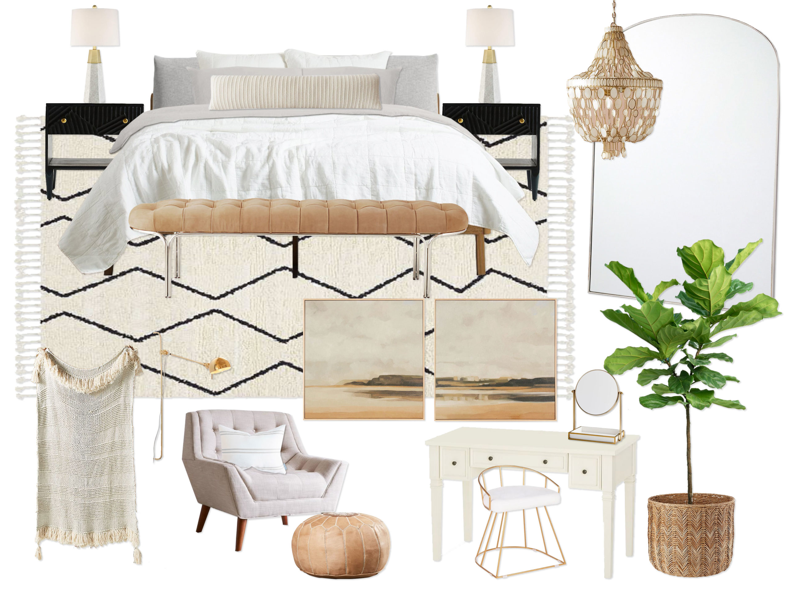
So let’s get to it! I have been doing a lot of living spaces lately, so I wanted to change things up and share a master bedroom design I did a few months back. Usually, I work in medium budgets and love the challenge of completing an entire space navigating the puzzle pieces of the finances (i.e. if we splurge a little here, where can we save?). However, one in a while I get a generous budget and can really enjoy multiple splurges for a really high-end space! Not going to lie… this one was FUN. There is a lot of satisfaction in getting to use not just one but many of your wish list products in one room!

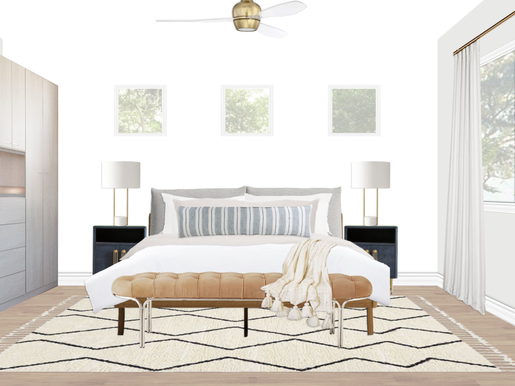
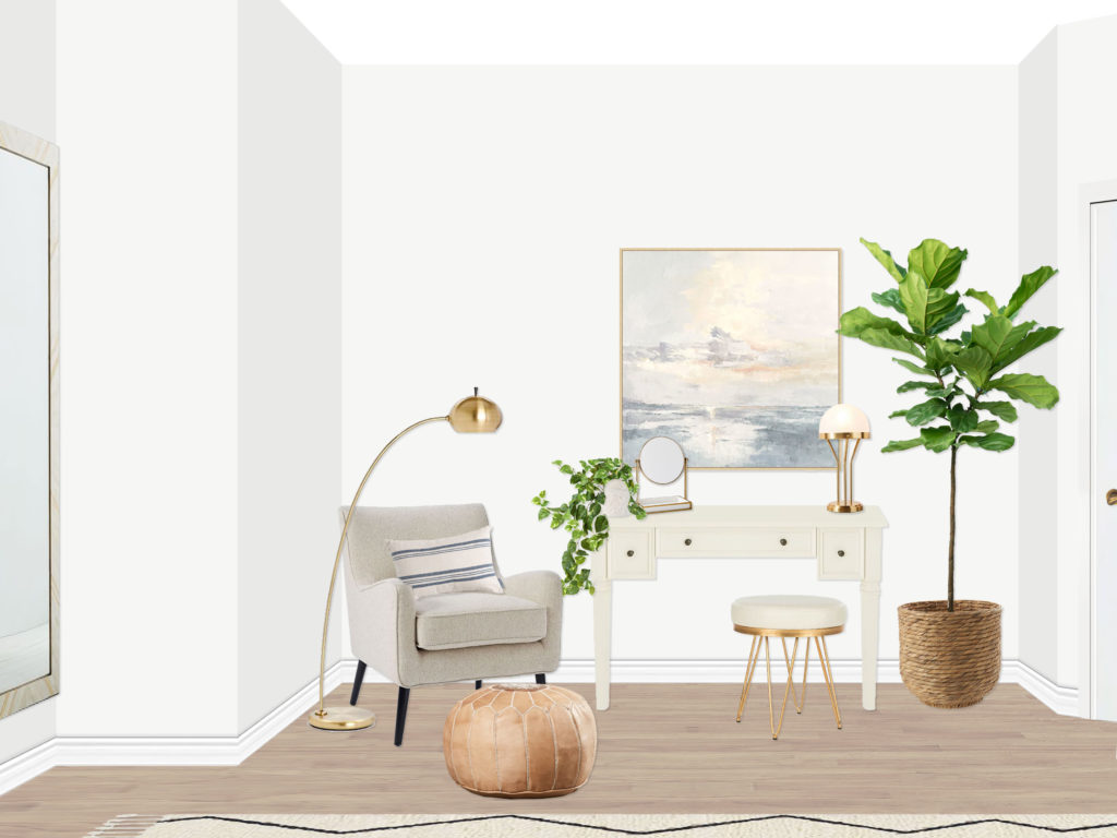
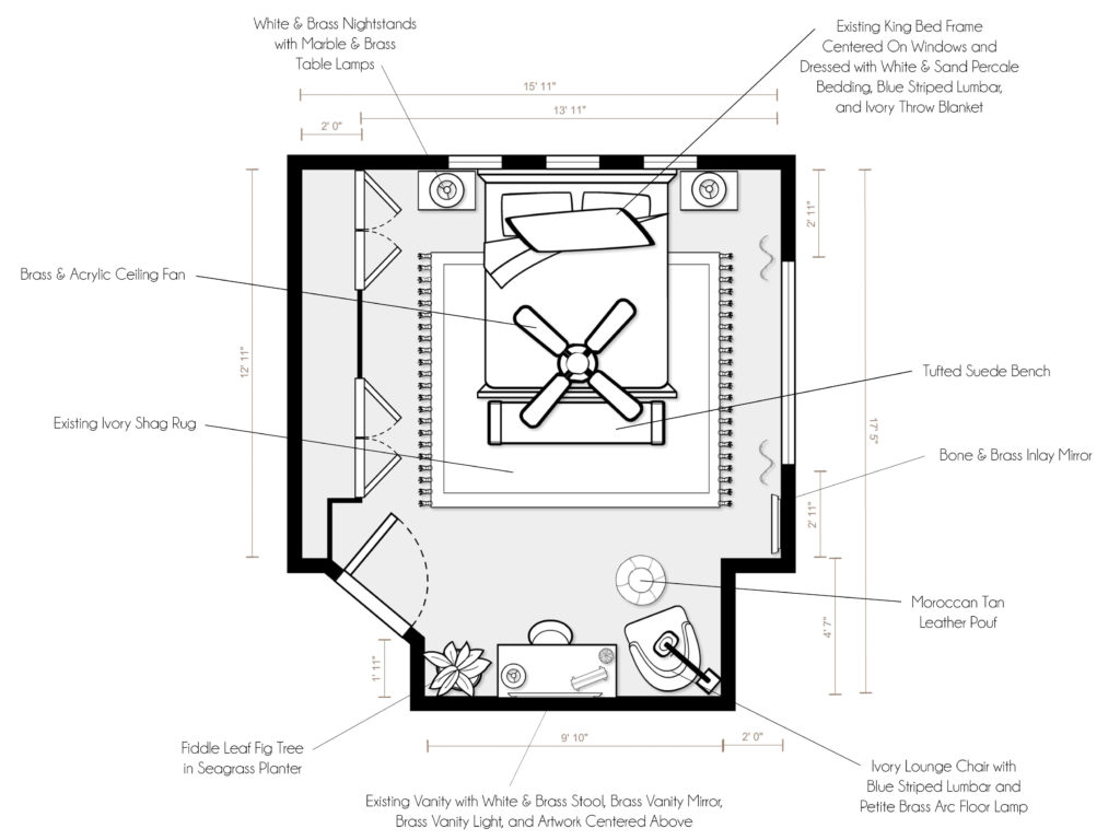
Jason’s family was moving into a new home (with just the rug, bed, and vanity) and wanted a master bedroom retreat that was truly an elegant, sophisticated oasis using mostly neutral tones and luxurious textures with pops of contrast and metallic brass accents.


Concept 1:
(click image to enlarge)

Shop this Concept!


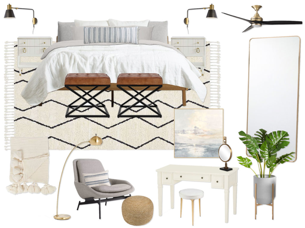
Concept 2:
(click image to enlarge)

Shop this Concept!


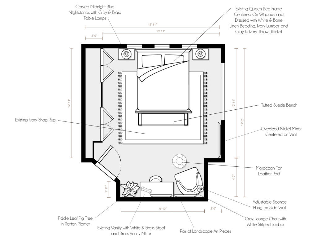
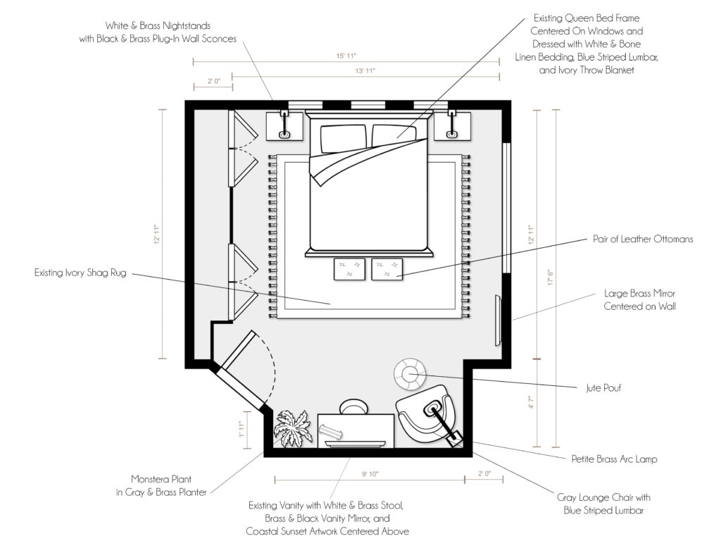
Final Design Renderings
(click image to enlarge)

Shop Final Design!


Can we talk about that bench and those midnight blue nightstands though?! LOVE. The final design was a fun mix between the two designs, pulling elements from each to create his master bedroom paradise!

As always, if you are interested in working with me on a room, you can purchase a package on my Decorist page using my friends & family promo code ERIKADALE that gives you 30% off!

Have a great week ahead, friends! Stay safe & well.

Mood Board Monday: Diane’s Living Room

Happy Monday! Thank you all for your helpful feedback in my Instagram stories yesterday about sharing my e-designs! I am so excited that you are excited, so I’m planning a weekly feature of my e-designs called Mood Board Monday. Since I have almost a year’s worth of work to share, let’s just get started, shall we?

Rather than start from the beginning, I wanted to share my most recent project first. This is mostly because I am still excited about it, I am still working with this client on another space (yay!), and the products are the most likely to still be in stock if you see something that inspires you! I am still working on the shopability factor, as many of you said you were interested in being able to shop my e-designs. So stay tuned on that. In the meantime, please don’t hesitate to ask if you see something you love!

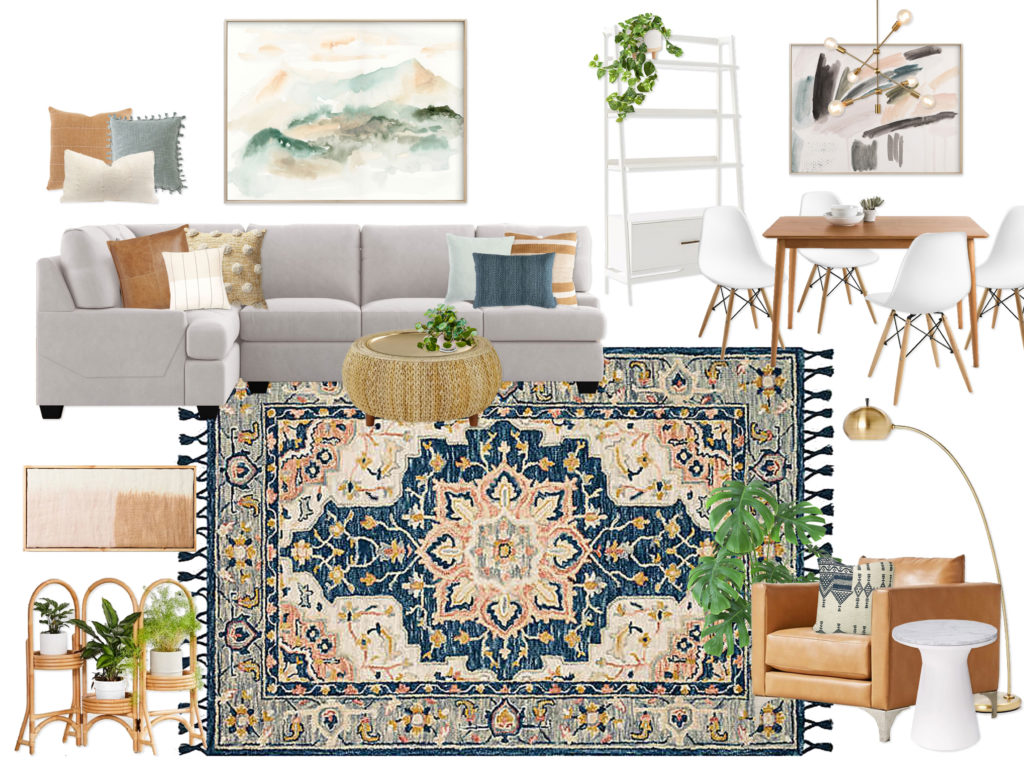
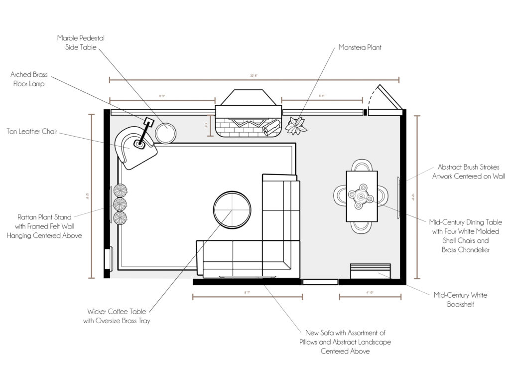
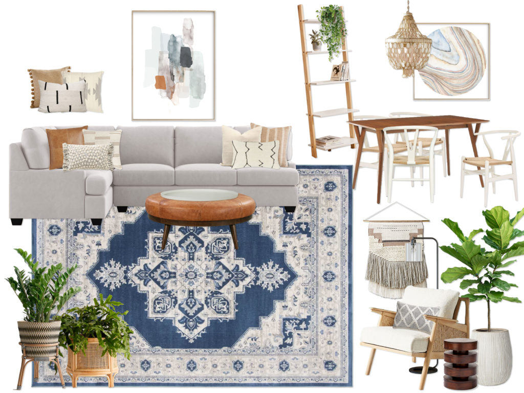
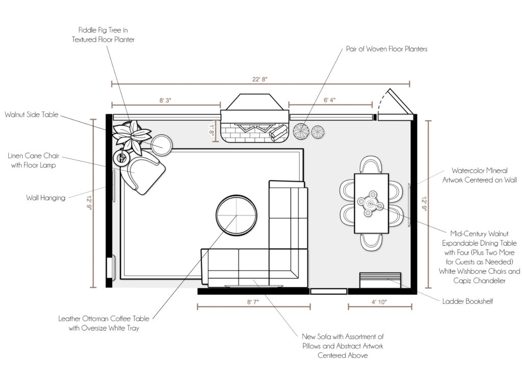
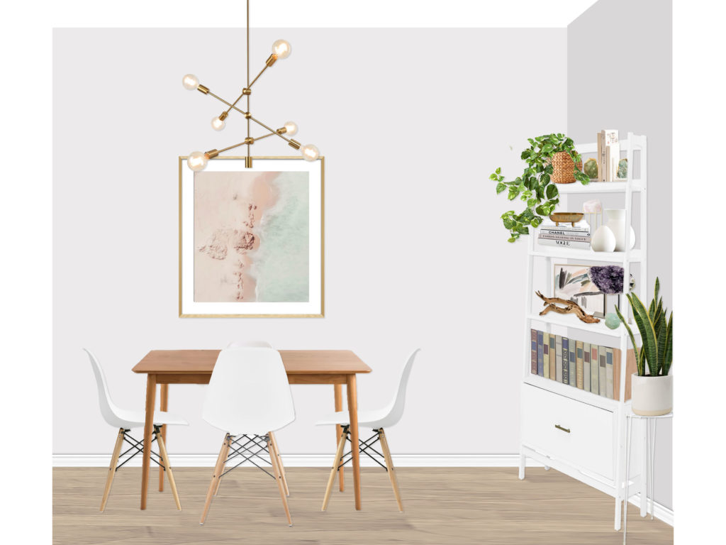
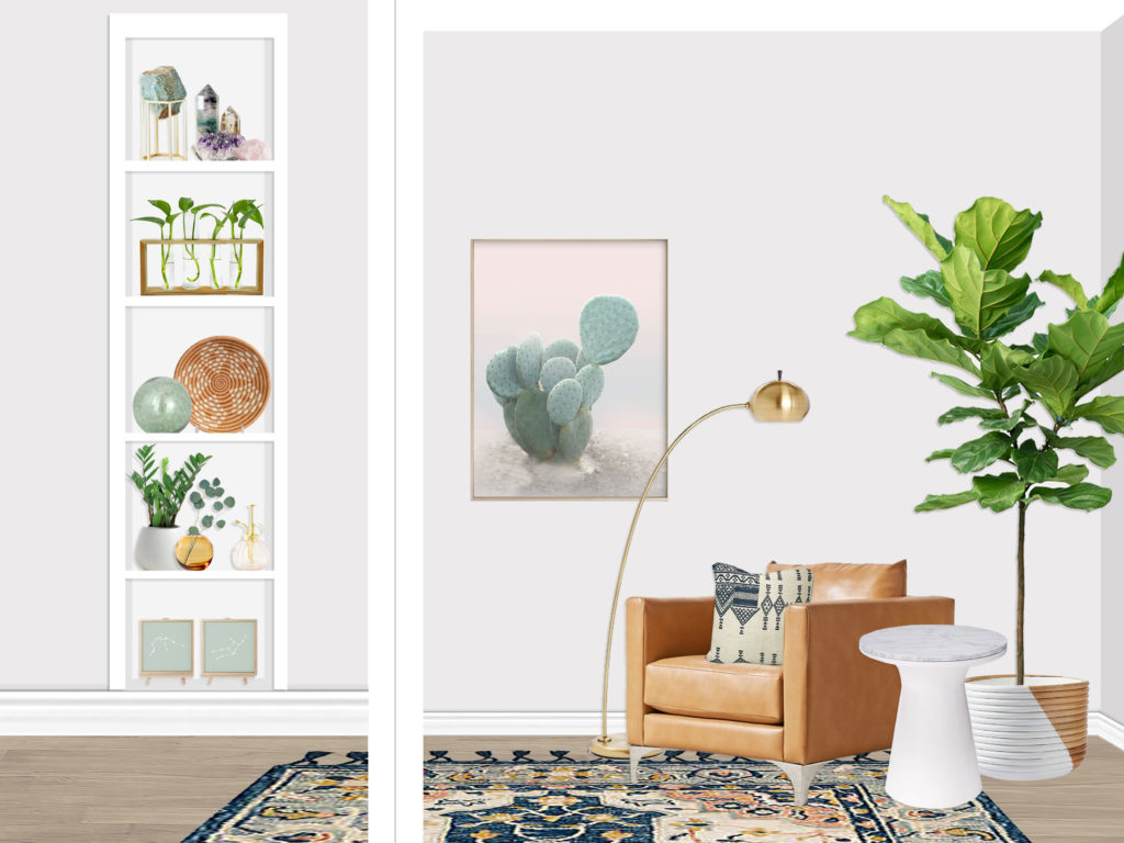
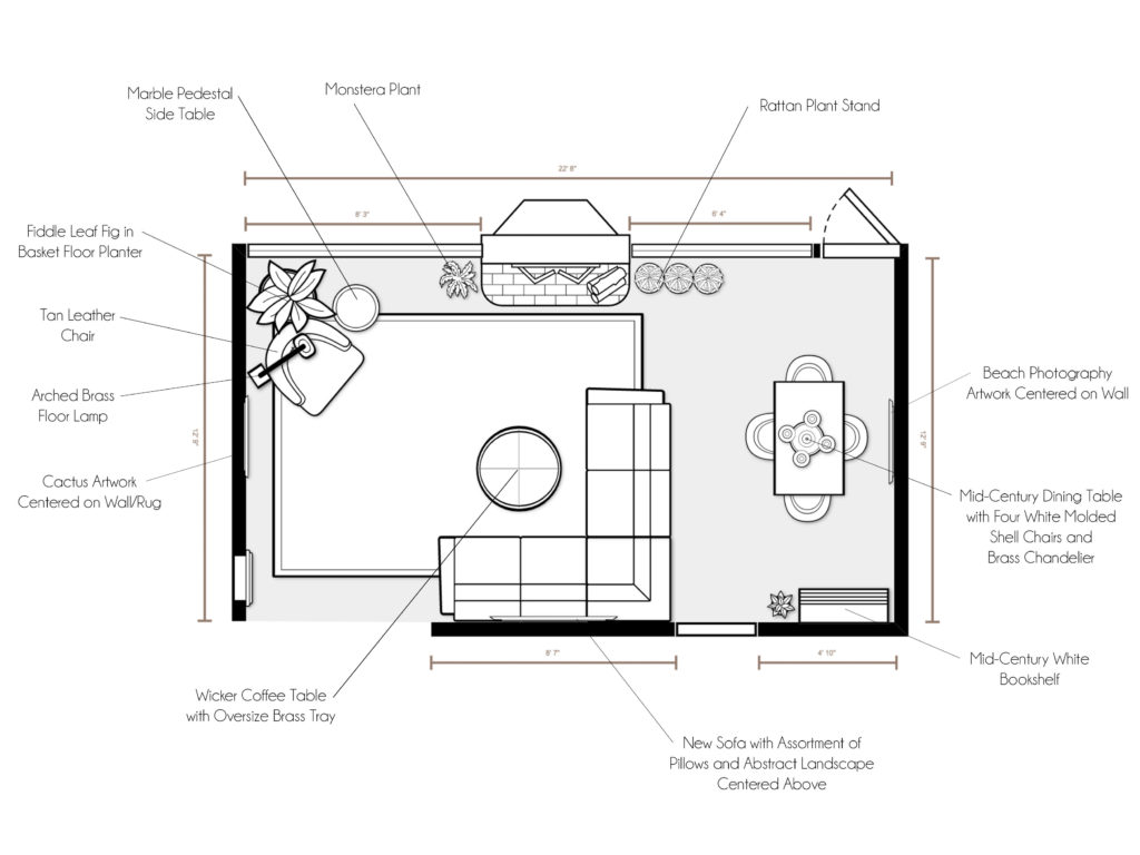
This client wanted to create a California Bohemian Mid-Century Modern inspired living area in their new home. The room had over 14 feet of window space (!!) on one wall, so the couple really wanted to focus the design around plants and greenery using mainly layered neutral tones with some pops of color (specifically in an amazing rug). They wanted the space to feel warm, cozy, and inviting, yet sophisticated and cohesive.


Concept 1: Sage & Saddle
(click image to enlarge)


Concept 2: Dynamic Neutrals with Mixed Woods & Woven Textures
(click image to enlarge)


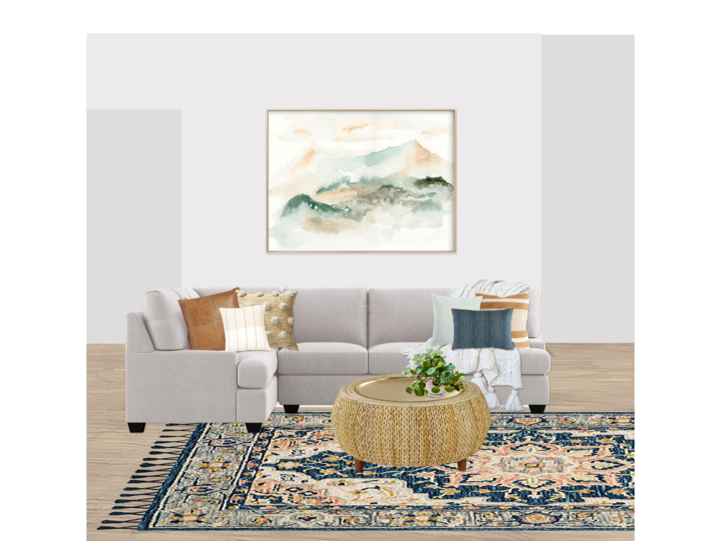
Final Design Renderings
(click image to enlarge)


The client was so thrilled with concept 1 that we only made a couple small tweaks for the final design! It was a super fun project, and I am excited to be working on a master bedroom design with the same client.

If you are interested in working with me on a room, you can purchase a package on my Decorist page using my friends & family promo code ERIKADALE that allows you 30% off!

Have a great week ahead, friends! Stay safe & well.