Category Archives: Home Decor

Shower Curtain Conundrum

In the spirit of pre-bathroom-makeover week, I thought I would share our thoughts on the item that will stand out the most in this space: the shower curtain. The bathroom is so tiny that the shower curtain (sadly) takes up a good portion of visual surface area in the room.  It is also the first thing people see when they walk in (and the only thing you see really if the door is open).  Let me remind you what it looks like now:

Ignore the sad, old, shrunken shower curtain that USED to be cute.  Since we are going with a grey room with yellow accents, the big question is how much yellow do we want here?  Also, we need to find a fabric or an existing shower curtain that works in half the space of a normal shower curtain (I chopped the last one I got in half). Lastly, we don’t want it to compete with the Beatles art that we will be hanging right next to it.

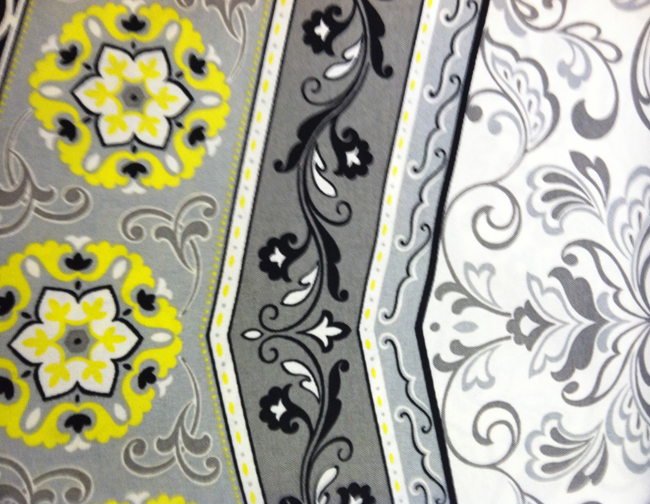
I went to Joann Fabrics to get some ideas.  I was looking for things more on the grey printed side but wasn’t able for find much.  So I took a few pictures of some of the gray/yellow prints that I found:
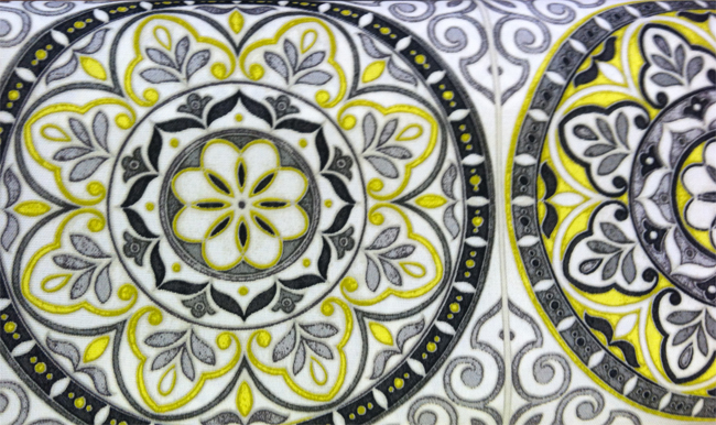
I like this but it would be too busy on an entire curtain. Perhaps a stripe along the bottom of a plain grey or yellow curtain?
Again, too busy with the alternating pattern but it would look cute as a stripe at the bottom of a solid curtain.
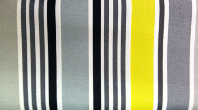
A little to boring and similar to what we have had for a while.  I’m over vertical stripes.  But perhaps it would look cute with horizontal stripes?
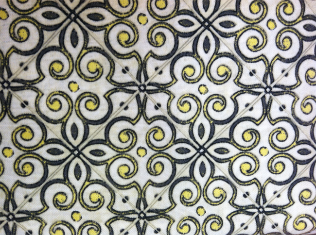
I like that the print is calmer on this but it’s not really jumping out at me.

I was a bit disappointed but there are definitely fabrics I could work with for at least part of a curtain.  So I started looking on online to see what I could find.
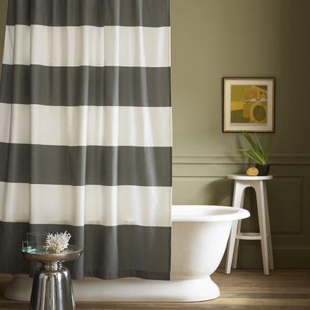
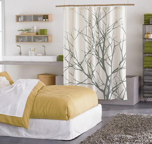
I love this shower curtain from West Elm but I have seen it EVERYWHERE. The simplicity is nice though.
Source

I also love this one from CB2 but they don’t make it any more. But I am sure I can find it somewhere if we decide to go for it!

Source (curtain originally from CB2 but no longer available)
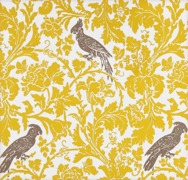
This fabric is Premier Prints Barber Slub Texture Yellow Gray Bird that I found on Etsy. I like the idea but the colors are both wrong.
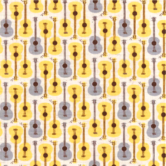
This fabric is Far Far Away III Guitars in Yellow/Grey by Heather Ross for Kokka that I found on Etsy. I love this print but I worry it could be too busy (the guitars are about the size of a quarter). Also, I don’t want the bathroom to be too theme-y with the Beatles poster.

I thought this would be super easy but I am beginning to think I may need to see the room actually painted to really see what balance to strike between grey and yellow.  I really love the CB2 arbor shower curtain and Walker likes the guitars (FYI, the seller on Etsy is mailing us a swatch so we can see if the colors are right).  So we will paint the room and see how we feel.

What are your thoughts?  Any other ideas?

DIY Puppy Silhouette Art Print

As you all know, my mom came to visit me last weekend. What you didn’t know was that it was her belated birthday trip! Even though the visit was her main gift from my dad and me, I also wanted to make her a little something from the heart.  She’s worth it! ;)

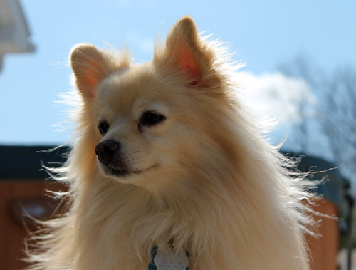
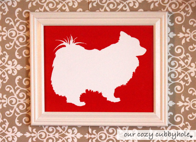
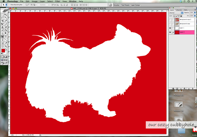
She loves her little rescue Pomeranian mix, Koda, perhaps as much (if not more) than her own children.  Okay, I’ll admit it… I understand why.  That dog is so stinkin’ cute and sweet! Koda has such an adorable shape so I decided to make a puppy silhouette art print for my mom’s office.

It came out great so I thought I would share the tutorial with you all! Shoot me an email if you have any questions!

Not a Photoshop person?  I will happily make a pet silhouette for you at our Etsy store!

DIY Puppy Silhouette Art Print

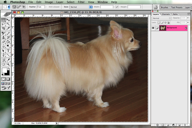
1. If you have the opportunity to take a photo specifically for this project, make sure the background is plain and contrasts with the subject (i.e. in front of a blank wall).  You can even take the photo with the subject standing in front of a bright window so they are mostly a silhouette anyway!

2. Open the photo in Photoshop and crop off any excess background around the subject (the less you have to deal with, the better).

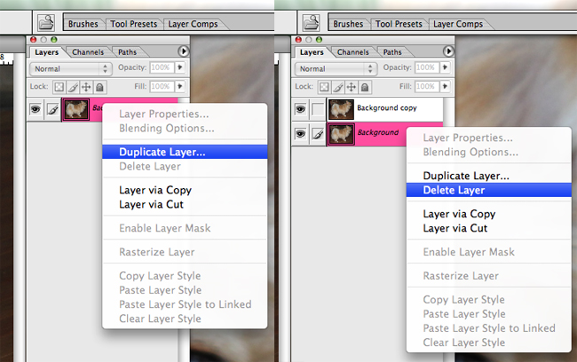
3. We must duplicate the “background” layer we are working with and then delete the old layer.  This will allow us more freedom when it comes to removing parts of the background because it will make deletions empty or non-existent instead of fill it with a color.

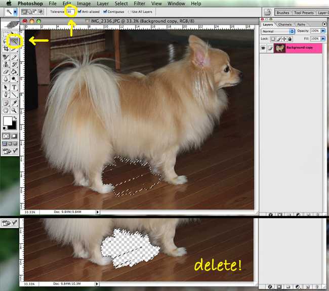
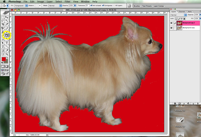
4. Using the magic wand tool, select areas of the background or foreground you would like to remove (either method works since we will be filling the both the background and foreground with color later).  Choose which area has the least variation in color to delete (i.e. If the photo is taken in front of a blank wall, delete the background. If the photo was taken in front of a bright window, delete the shadowed subject in the foreground). If you’re like me and you are just working off of an existing photo, your job may be harder. Play with the tolerance level of the magic wand to include a wider or more specific scope of colors in your selection.

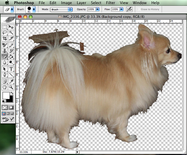
5. When you have done the basics, crop even closer to the subject if possible and use the eraser tool to clean up some of the mess that the magic want left.

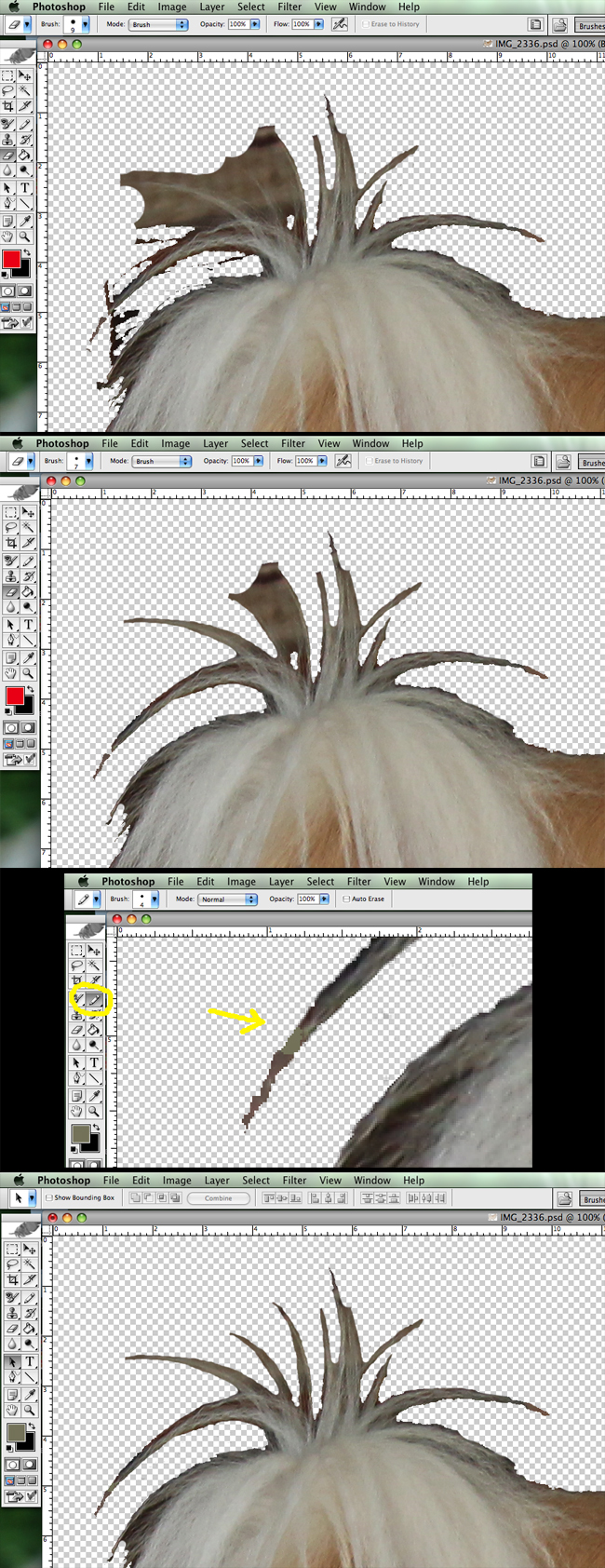
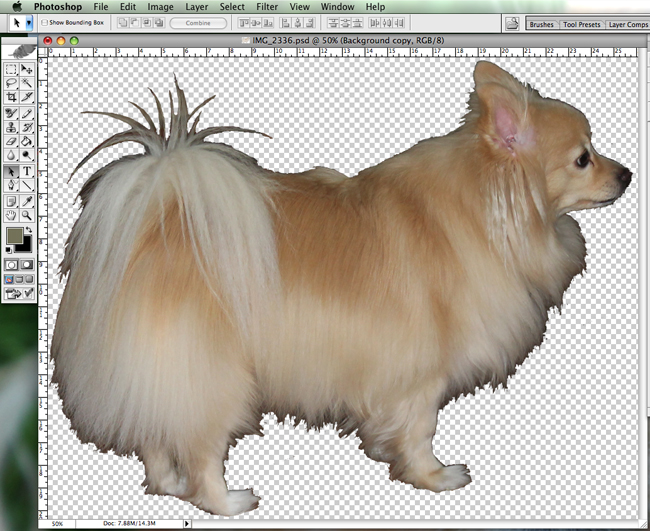
6. Now we are getting down into the nitty-gritty. If you took a nice clean photo, you are probably about done by now and can skip to step 7.  But if you are working with a photo like mine, you are just getting started. This is the part where you will need patience, patience, and more patience. Using the magic wand tool and the eraser tool, work out any detail areas slowly but surely.  I usually fine-tune with the eraser tool since the magic wand can only do so much after a certain point. I also had to use the pen tool to fill in a missing area on the tail. If you get into a difficult area that you can’t fix, shoot me an email and we can work through it individually!

7. Once you have the final foreground or background you’d like (remember- it doesn’t have to be perfect! No one will be painstakingly comparing it to the original so you can give yourself a little leeway), duplicate this layer in order to keep a clean backup.

8. Using the magic wand tool, select the entire area you have deleted (the background in my case) and then use the fill tool to fill the area with the desired color.

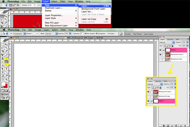
9. Create a new layer and use the fill tool to make the entire layer a color that contrasts with the color you just chose for step 8. Drag this new layer to the bottom of the layer list so it temporarily disappears behind the others.

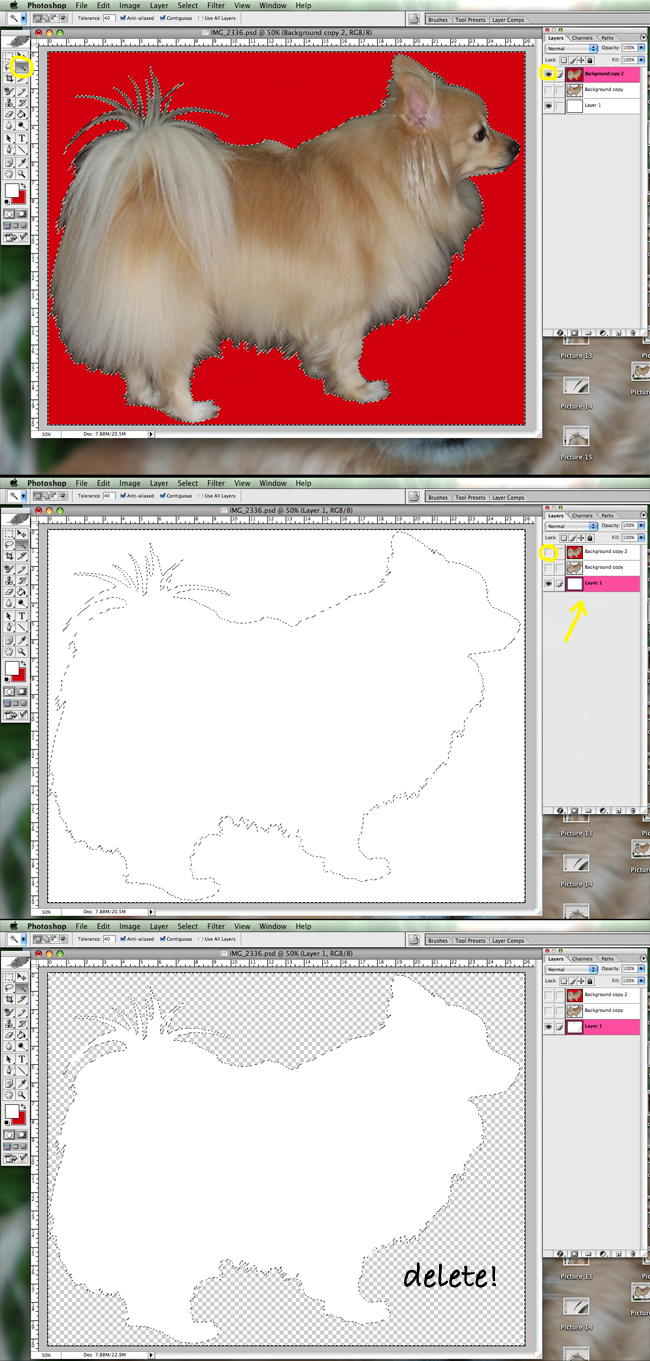
10. Here is where it gets fun! Using the magic wand tool, select the colorful area from step 8 (the background in my case) on your main layer. Without removing the selection from the magic wand, make your main layer (and backup layer if you have one) invisible by clicking the eye to the left of the layer.  You should see only your new, solid-colored layer from step 9 with a dotted selection of your silhouette. Make sure to have this layer selected on the layer list and then hit delete! What remains should be one half of your silhouette (the foreground in my case)!

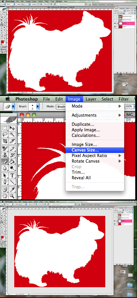
11. Similar to step 9, create a new layer and use the fill tool to make the entire layer the desired color.  Drag it all the way to the bottom of the layer list and you should have your silhouette!  Feel free to play with the canvas size if you’d like to add additional space around your silhouette.

You can use the eraser tool on the foreground layer to clean up little areas if necessary.  Worst case scenario, you have two invisible backup layers if you need to start over (I love having a security net!). You can easily change the colors by using the fill tool or making duplicate layers with various colors.

I saved my photo as a JPEG and then got it printed on 8×10 white card stock for $1.40 at Kinko’s.  ART FOR $1.40!!  Can’t beat that. I went and got a nice white frame from Michael’s and VOILA: a personalized puppy silhouette gift for my mom’s birthday!

It is so cute! I can’t wait to make one of Bo now.  :)

Record Crate: Take 2

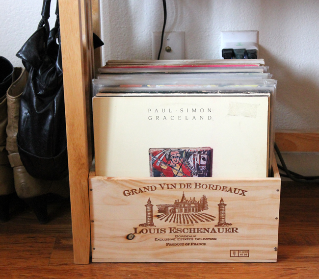
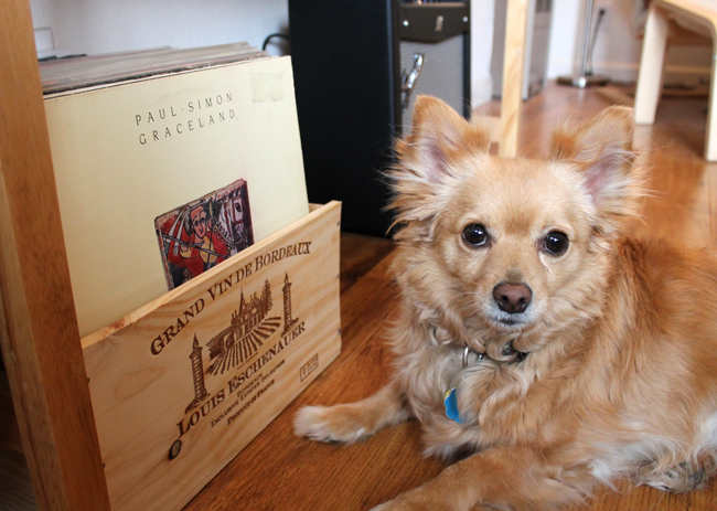
After the record crate debacle a couple of weeks ago, I have kept my eye out for a new storage solution for our vinyl.  A little research revealed that six-bottle wine crates would be the ideal size for us (13-14″x10-11″).  The ones we found online were quite pricey to ship but we also knew that none of the wine stores near us carried or gave away crates (we had asked around when we were looking for crates for our living room shelves). As if right on cue, the convenience/liquor store at the end of our street started carrying a wine that came in a six-bottle crate!  Since we are devoted patrons (AKA we drink a lot of wine), Sam, the guy that works there, put one aside for us. It was so nice of him! We picked it up yesterday and it works perfectly!  There is even room for another when he has an additional spare crate.  SAM SAVES THE DAY! :)