FIDM Winter 2013 Quarter Schoolwork Update: Computer Graphics
Happy Tuesday! I have been meaning to get this school update posted since last Thursday (after Part 1 and Part 2) but some insanely exciting stuff has been happening around here over the past few days! I am more than pumped to share the news with you later in the week (patience, my darlings!) but in the meantime, I want to share a few more school projects with you from my computer graphics class.
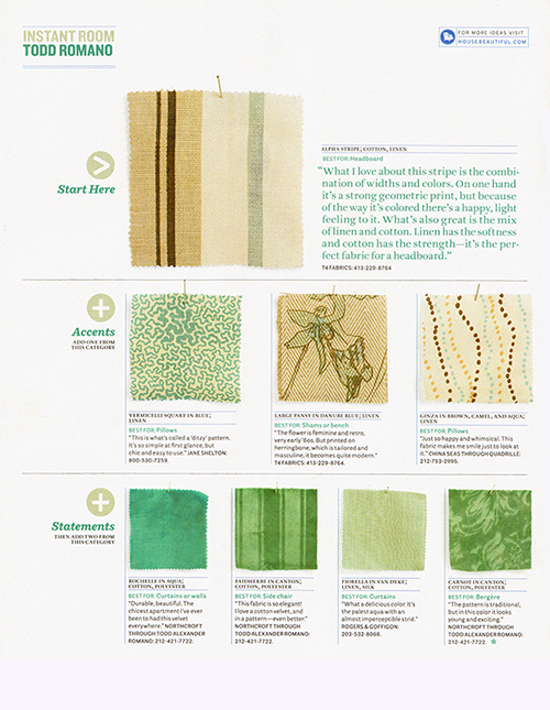
While I already know Photoshop pretty well, before the start of last quarter, I could not say the same thing about Illustrator, a vector-based program. Although the class used a bit of basic Photoshop, it mainly focused on using Illustrator to create presentations and layouts. One of our first assignments was to recreate a page from a magazine. Here is the original page from House Beautiful:
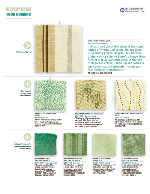
 And below is my recreated version in Illustrator. We had to do everything from finding similar fonts, creating the lines and shapes, and even adding the smallest details like drop-shadows and font textures.
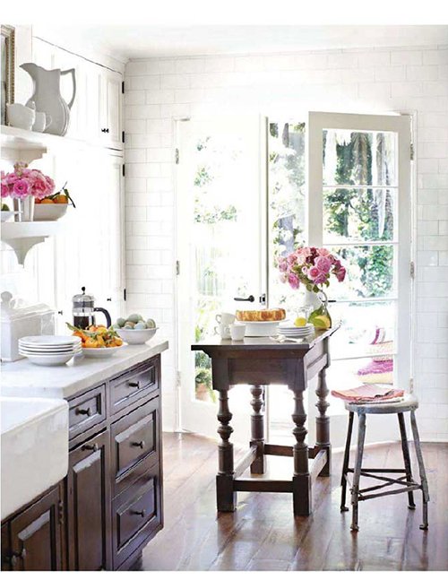
  Another fun (but time-consuming) assignment started with a photo from a magazine (thanks again, House Beautiful! P.S. This kitchen is designed by Chris Barrett for her personal home in Brentwood, CA. It is one of the few house tours I have ever seen that has multiple rooms that are practically perfect reflections of my taste! I could move right in… this woman is my kind of designer.).
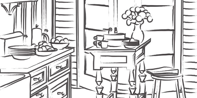
 Next, we used the Illustrator pen tool to trace the room and create vector paths that formed a line drawing of the room.
 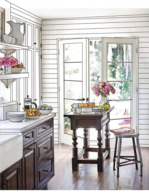 When I made the picture in the background invisible, I was left with a line drawing of the space! How cool is that!? I was able to later use this technique for another class. :)
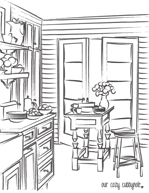
 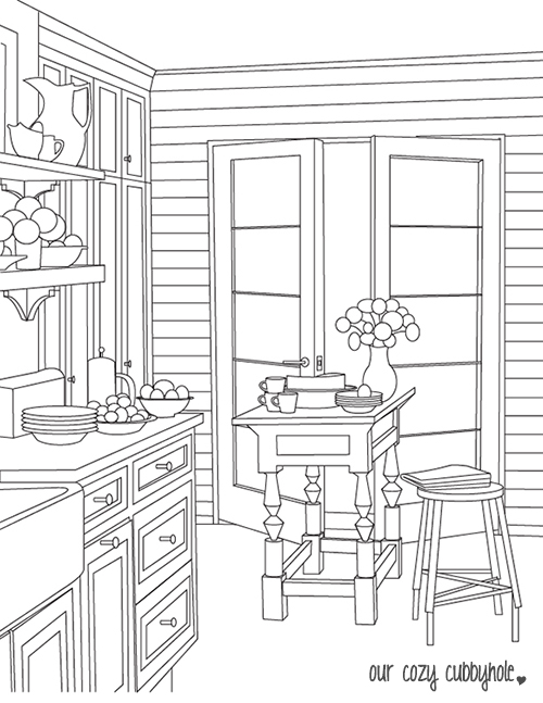 The fun part is that, since the lines are vector-based, I can play with brushes to change the look of the drawing.
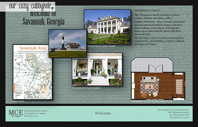
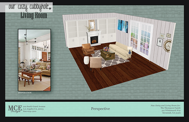
  Our final project in this class was a group project (I worked with the beautiful and talented Michaela from Michaela Noelle Designs, as well as another awesome classmate). We were to use Illustrator to create a 5 page design presentation that included a perspective rendering, elevations, a floorplan, inspiration photos, fixtures, accessories, and furnishings. We designed the entry and living room for a large home in Savannah, Georgia.
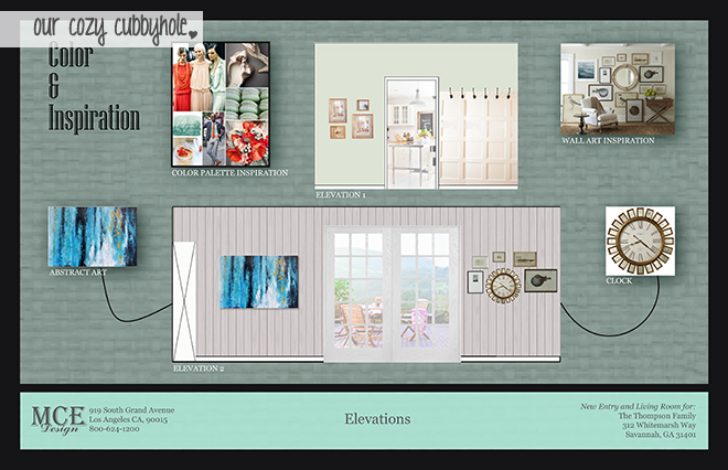
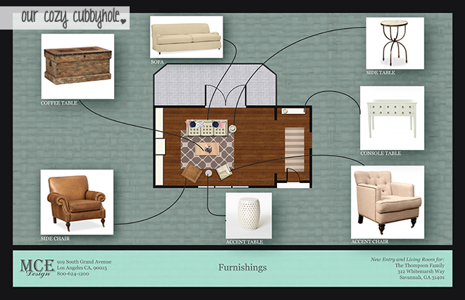
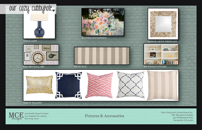 The rest of the assignments in the class were exercises to learn the program and aren’t very interesting to look at out of the context of the class… so I won’t bore you with any more!
I have one more school update for you and then we will be all caught up (just in time for school to start again on Thursday). It’s about time… I have a million other things that I am excited to blog about! So stay tuned. :)



13 Responses to "FIDM Winter 2013 Quarter Schoolwork Update: Computer Graphics"
Add CommentPingback: FIDM Winter 2013 Quarter Schoolwork Update: Sketching | Our Cozy Cubbyhole